It absolutely clear how insignificant we are
Vía Information Aesthetics

29/12/2006
28/12/2006
Easy to go, hard to stay
The fashion now is the infographics brain drain. And it's not surprising, not just for the quality od our infographics artists, but for the universality of the american offer. There are several webs to find offers for working there (althought they're not specially for people from abroad).
As an example, a web which publish continuous requierements is SND web. These are offeres for all around the worls, but the truth is that more than 90% are for USA.
Other web with this kind of information is fNews Artists Organization forum. You must be registered (it really worths), but once don you can access to the threads Who's hiring and Who's looking, and you can use a fake name to look for a job without giving your real name to the general public and avoid problems in your paper.
If you want to work in Europe, you can look for jobs in UK at journalism.co.uk.
But please, prudence, or in two years time we won't have infographics artists in Spain...
But, the truth is that, if any of us is looking for a job it easier to find it in USA than in Europe. It's a pity that we don't have in Spain employment systems like those, for example, at the SND-E website. OK, Spain has not the same employment movement than the whole USA, and that way of hiring here is different. But we must do something. We're always complaining about how hard is to fnd infographics artists. There are just a few. But we would have to look for them.
Other web pages offering visual journalism jobs
* Visual Editors, with a forum called EMPLOYMENT.
* Employment sectiuon at the Poynter Institue
23/12/2006
Another end year recopilation
We're reaching end year, and with it lots of recopilations on all tv channels. I won't avoid that, and I'll show you my favourite graphics of this yar (since this blog is working, september 2006). It's not a complete recopilation, because I just can take alook to graphics published on NPD or other forums like NAO or VizEds. They're not the bests. They're some that, for some reason, element or concept look something original, useful or outstandin for me. Ther isn't such thing as a preference order, just alphabetical. Show your favourites if you like too!!
El Hombre de Neandertal, Fernando G. Baptista
 A recopilation of graphics is not a good recopilation without something from Fernando. What I liked the most was the figure. His hand-drawing are outstandings and well known. But the figure goes beyond. It's not the first time El Correo 'builds' a creature. They made it with a giant squid. It's incredible that a graphics department like this one, with 3-4 people and with relevant 'casualties' like Javier Zarracina could stand with such high level, such in quantity as quality and, also, with challenges like this one (if there's something like a challenge for them). They're the best, and they keep getting better.
El Hindenburg, Marcelo Cáceres
 Clear and clean. Goes to the important thing, no superfluous data. You can understand all at the first sight. Good color use. Simple, but great
North Korea lights, John Duchneskie
 It's not a graphic, on the literal meaning of the word, is just a satellite image, but it informs as if it was a graphic. The information goes directly to the eye: North Korea poverty is clear, but they can afford nuclear weapons. John Duchneskie tells that he was asked just for a locator for an article about poverty in North Korea. He went further and publishe this. Is an example that we have to go further, we're journalists too.
Hormigas en la informática, José Manuel Ferrer
 The topic is very interesting itself, and the graphic make this interest affordable. It takes complex information and gets a visual, attractive, divulgative and understandable graphic.
Builders draw up new budget, Phil Geib
 This graphic was one of the first I talked about in this blog. Original, an attractive way to make a bar graphic.
Buillding a work of art, Jonathan Moreno
 It's not very original, but I can't feel other thing but a big empathy with Jonathan looking to the blueprints of the building. I can understand them thanks to him. And thst's our job!
El enemigo más duro de regatear, Fernando Róbato
 Other graphic shown here. Fernando Róbato's style is well known, but knowing the source of it made me to like this one more and more. He could just publish the wire graphic touching it a little, but he went further and made this great graphic, so important in a sport newspapers as his. He make tendinitis injuries understandable and close to his target
El Hombre de Neandertal, Fernando G. Baptista
A recopilation of graphics is not a good recopilation without something from Fernando. What I liked the most was the figure. His hand-drawing are outstandings and well known. But the figure goes beyond. It's not the first time El Correo 'builds' a creature. They made it with a giant squid. It's incredible that a graphics department like this one, with 3-4 people and with relevant 'casualties' like Javier Zarracina could stand with such high level, such in quantity as quality and, also, with challenges like this one (if there's something like a challenge for them). They're the best, and they keep getting better.El Hindenburg, Marcelo Cáceres
Clear and clean. Goes to the important thing, no superfluous data. You can understand all at the first sight. Good color use. Simple, but greatNorth Korea lights, John Duchneskie
It's not a graphic, on the literal meaning of the word, is just a satellite image, but it informs as if it was a graphic. The information goes directly to the eye: North Korea poverty is clear, but they can afford nuclear weapons. John Duchneskie tells that he was asked just for a locator for an article about poverty in North Korea. He went further and publishe this. Is an example that we have to go further, we're journalists too.Hormigas en la informática, José Manuel Ferrer
The topic is very interesting itself, and the graphic make this interest affordable. It takes complex information and gets a visual, attractive, divulgative and understandable graphic.Builders draw up new budget, Phil Geib
Buillding a work of art, Jonathan Moreno
It's not very original, but I can't feel other thing but a big empathy with Jonathan looking to the blueprints of the building. I can understand them thanks to him. And thst's our job!El enemigo más duro de regatear, Fernando Róbato
Other graphic shown here. Fernando Róbato's style is well known, but knowing the source of it made me to like this one more and more. He could just publish the wire graphic touching it a little, but he went further and made this great graphic, so important in a sport newspapers as his. He make tendinitis injuries understandable and close to his target
22/12/2006
First attempt: failure. But there's an attempt...
 Days ago we talked about Rocky Mountain News daring to use a A1 big graphic as the only illustration. Today, Diario de Burgos (Spain) tried something like that with this A1. I agree with Juan Antonio Giner in one point: I don't understand it at all. It is supposed to be a map showing the inmigrants procedence. But there's a big problem: countries are drawn with people icons, and it shows an idea, that the number of icons in the country show the nuber of inmigrants from there. But it is not that way. I love his kind of maps (or charts) that shows country sizes on statistical ways to give data. That's could be a good opportunity for that.
 But, it's always good attempting new things. This one was a failure, but it's a step. We need more steps.
20/12/2006
Bad examples
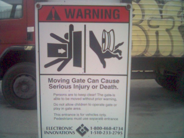
Flick-r revolucioned internet, as YouTube or MySpace have done. You can find everything on it, like this complaint of The boy who loved Bellum, not very happy about the icons used on these signals. If you read the text it looks like an advice to mind the door, just for cars. But, as a comment said, it is likely to advice about the risks of being squashed by a giant credit car or having your hand damaged by a yo-yo.
Other calssical example about wrong icons are these on the Tokyo underground

It's not trying to explain the reproductive cycle of a seating person. Just explains that you have to leave free the seat for people with broken arms, with toddlers, pregnants or withpout on leg. What I really think is that the japanese designer who made that was looking for some relevance.
Other times is just that the pictogram is not the best election, thinking about sensibility, as this signal of San Diego (USA), advicing about the risks of illegal inmigrants crossing roads on a hurry.

Or this one from Estonia, asking for not throwing babies to litter

All of them have its particular problem, but my favourite one (excluding the classical japanese) is this one

It mut be a gas accesible for disabled... but looks like another thing
19/12/2006
Hard data, good graphic
 Professor Hans Roslings, teacher of International Health at Karolinska Institute (Stockholm), tries to show us how really is the world we live in. All we have the date, at , in UN, OMS and other organizations issues about infant mortality, poverty and starving. On newspapers we've got this 500 page issues resumed in a 4-column article, and, i fwe're lucky, with a graphic showing some data. But Professor Roslings wants this data affordable for everybody, and he resumes them on these graphic at his web, Gapminder. They're translated to several languages and there's also a Google tool to make them more accesible to everybody. No 3d, basic color pallette. But it works. Explains and gives a clear idea for people, tired of news about kids starving in Africa. Nob spectacular visually, but in the result, it is.
Vía Shane Richmond
18/12/2006
How Humans Work

John Grimwade always starts his instruction in Show Don't Tell showing this 23x15 cm graphic, designed by Carl Sagan and Dr. Frank DraKe, whih is the plaque placed on the Pioneer, waiting it reachs any extraterrestrial intelligence. This plaque tries to explain who and how we are and where Earth is, waiting aliens will contact us and that they would do it in a frinedly way. If I have to tell the truth, I must say that I can't understand it, and that's knowing what's trying to tell.
Looking for it on the internet I found out the meaning:
Two little circles on the left: They try to explain something about neutral Hydrogen. No more comments.
What's behind the figures is Pioneer's silhouette. This way they show our actual size and shape... If we're a white young good looking naked man and woman... The man is not saluting, is showing our amazing prensile thumbs
Points on the right of the figures number eight in binary
Drawings below shows the pathway of the Pioneer... I think that not showing a real scale is a big mistake, but i'm not Sagan...
Star on the left shows the relative position of the sun respct to 14 pulsars and the center of the galaxy
It's obvious than realty is deeper than that, but I don't dare go deeper with my science knowledges
But, the problem is, I can't understand the graphic and I have readen an explanation. But I know I'm not the target, they're looking for intellenges bigger than mine. And is also truth that it's very difficult to explain such complex thing as humanity, our chemichal composition and the Earth position in the universe. Actually, we don't really have all the information about that, and we also don't know what are the previous knowledges our target has... maybe they're blind!
But, sinceresly, I couldn't do it better, and, as Grimwade asked always, if someone dares to design something else, please show it!
More, on Wikipedia
16/12/2006
Porno-graphic
This year everybody talked about it at Malofiej. Playboy Magazine, on its brazilian edition, had an entry made by Luiz Iria, Alexandre Jubran and Caio Guatelli. The topic was explaining how a roman orgy took place. No tabus, no clothes. As a graphic is not an amazing work, is just a photo collage with texts... a photo collage with photos we're not used to see at infographics Summits. As original proposal, is great. Today I found it out finally on the internet (there's no photo with naked people out of internet), take a look and make your own opinions. If you encourage people to "Show, don't tell", this graphics, above all, SHOWS
15/12/2006
Grande Reportagem shows the way to Les Echos


Much of you would remember the advertising campaign "Meet the World", of Grande Reportagem reproduced upper. On it, they used flags from different countries to ahow statistichal data of themselves. It was a great success, awarded everywhere by infographics and advertising worlds. Now, other media company, Les Echos starts a campaign with the same idea: "Understand the Economy, understand the world". Here you are!


Via Innovations in Newspapers
14/12/2006
Graphics about everything
 One of my fauvorites blogs is Information Aesthetics, about original ways for visual representation of data, statistichs or every little thing. Should be an obbligatory visit for every infographics artist, as the online version of divulgative books about practice and theory of graphics, these ones that always show the famous diagram of Napoleon's russian campaign. At this web you can find all sort of graphics, as some showing the connections between USA postal codes or Underground maps based on time better than distances. A recopilation of original and refreshing ideas. A must see!
07/12/2006
Sports graphics... and beyond
 Statistichal sports graphics are a great amount of work in my newspaper. We publish reconstruction of the goals and best opportunities, a tachtical explanation of the matches, previews and charts, before and after the matches. I hope my director won't find this special coverture made by austrian newpaper Der Standard made by World Cup 2006. In this graphics are analyzed by diagrams all the ball movements between players and how much each one touches the ball. Taking this graph as example we can see that Lahm was the starring for Germany and laterals were who took the ball to the midfield, the midfielders played with Klose. You can also see that the typical swedish play was Edman to Linderoth and this one to Larsson. Clear, informative, and a superb explanation of how the match was, although I wouldn't like to be who recopilated all the data...
If you wanna know more or watch more examples (and you speak german), go to the FAS web (Network Analysis for Science & Business)
06/12/2006
Clone Wars

 Firt of this graphics was uploaded this december, 5th at Newspagedesigner, signed by Christopher Arnold, from Scripps Treasure Coast Newspapers. It was told to be with a piece about fluor in water and tooth risks. Eight hours later, Cindy Jones-Hulfachor, from South Florida Sun-Sentinel, uploaded the other one. She assured that this graphic was made by her six years ago, with an information about how to solve some tooth problems.
It's not the first time this happens. Just some months ago, Amir Shaik, from The Times of India, uploaded in NPD the first one of the other pair of images, completely different of his own styles.

 The second one was uploaded by Steve Wilson, from Fort Worth Star-Telegram, just few days before in the same web. Amir just flipped the image (changing heart side) and erased the nipples. Plagiarism was clear. Steve wrote Amir asking about it, and all the indian said was that he's very young and he loves Steve's graphics.
There are evident things. It's a usual practice, fomented by big bosses, just copyng other graphic information. Some ask for a copy of the graphic itself. You could try to justify it talking about lack of time, putting the blame on your boss and a thousand excuses. It's not ethical, but if you sign it with the real author as source could be forgiven. Soemtimes, bosses just don't permit you to add another newspaper as source... But what you can't never do is signing it with your own name.
One step further is the "Print screen" button, unadmissable. But just sign it and upload it with your name is going tooooooo far. Posting it to competitions could be the biggest shame. But it's not so unusual. I remeber my Malofiej staff times with several graphics showing Bin Laden's cave... There were some idetic graphics... And I can't imagine Bin LAden offering his house blueprints to media... I also remeber a illustration of a taliban made by Emilio Amade (I think) for El Mundo just after 9-11, which became the standar taliban in lots of graphics all around the world. It's not exclusive of infographics world, but it's something to worry about.
05/12/2006
Cover infographics

A good photo cover sells the paper, but it's also true that just a few dare to do it with an infographic. And never so big. High bet by Rocky Mountain News (Denver, USA). Peolpe could say if this is a mistake or not, but is brave, something we really need in journalism bussiness
02/12/2006
Break point, Marca.com
 A post published weeks ago talked about the lack of online graphics in Spain beyond elmundo.es and ELPAIS.com. Marca was one of the pioneers of online grahics in Spain, but now the beast was sleeping. Now they try to come back, as this Roger Federer Specialshows, including two graphics. Well, they name them graphics, but they're not really full of interactivity. In the first one he is compared with Rafa Nadal, but you just can select from some optinos to show data. Almost the same in the second one,comparing Federer this time with history's bests. No real interactivity now, but is a good signal, we hope it will go ahead
Subscribe to:
Posts (Atom)