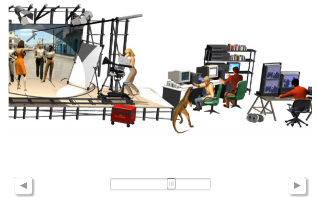
 Even the gratests make mistakes. I don't like too much to criticize people who knows so much more than me, but I think that online graphics team of ELPAIS.com went wrong with his graphic about Goya Wards (the spanish Oscars). The graphic is a 3d reconstruction of "awardable" categories of this edition. You can see the cinema team working and clicking on every character to get to the nominees. The result is spectacular, but not very clear. You've got to click every character, because some categries are not very clear. Maybe a simplier solution would have been clearer, or faster. It looks like someone forma above asking for "something original and not the usual tab". Something the usual is usual because it works

30/01/2007
When a graphic doesn't make it easier
Even the gratests make mistakes. I don't like too much to criticize people who knows so much more than me, but I think that online graphics team of ELPAIS.com went wrong with his graphic about Goya Wards (the spanish Oscars). The graphic is a 3d reconstruction of "awardable" categories of this edition. You can see the cinema team working and clicking on every character to get to the nominees. The result is spectacular, but not very clear. You've got to click every character, because some categries are not very clear. Maybe a simplier solution would have been clearer, or faster. It looks like someone forma above asking for "something original and not the usual tab". Something the usual is usual because it works
27/01/2007
Same question, different answers
 This is yesterday cover from The Globe and Mail, Toronto. And this is the graphic offered in its web. I agree with Juan Antonio Giner's appreciation. great cover, poor grahic. But it's not just that in what I agree with him. In his blog Innovation Giner insisted several time about the idea that web is the future of journalism, as Los Angeles Times think now . It should be that way, is the showcase of the newspaper, reaches the reader before the paper. Much bosses think web lifts paper readers. Maybe, but having a better web won't lift more readers. They're different targets, differents ways of consuming information. Portion of the pie you won't eat will be eat for another, and this another is not going to be the print edition. It's the same in graphics. In this cover, a double spread graphic about global warming in Canada is announced. But online graphics just show (poorly) how global warming works: Are web visitors more interested in that than in global warming effect in Canada?. I don't think so. Same company, two differents answers. Does it make sense?
Obviously, via Innovations in Newspapers
26/01/2007
Mi worst graphic: Aberrocal
 Antonio Berrocal (who's preparing his personal web, just thepreview is great) works as infographics artist and illustrator inMálaga Hoy. He sends this graphic from september, 2006, very recent, and explain its mistakes:
- The photo is bad. Left of it is out of focus and streets and rivers are not appreciable, althought they have their names on
- The map of Malaga should have some identificative points, as streets, dock, river... Just as shadow zones above the map. Neither I can be sure of the extension and situation of the zones I drew myself
- There are no cypher data about extensions to understand the magnitude of the zone
A mess, unclear and uninformative
Two colors are enough
In my opinion, one of the most important things to create a style is the color selection, I consider it one of my big problems. But some people make an art out of it. One of my favourites at this discipline is Chris Morris, art director of Las Vegas Sun


He just needs two colors (gold and black) to get graphics and illustrations with a different and homogeneous style at the same time. Very smart. It shows that, sometimes, variety is not the best choose. Less is more? This time the answer is yes


He just needs two colors (gold and black) to get graphics and illustrations with a different and homogeneous style at the same time. Very smart. It shows that, sometimes, variety is not the best choose. Less is more? This time the answer is yes
My worst graphic: Jose Manuel Ferrer
José Manuel Ferrer es el infografista de Granada Hoy. If you take a look to his graphics you wouldn't imagine these ones are his, but he signed them: "with I made them, I was proud of them, I thought they were good, but time's put everything in it's right place, and I've payed for it". As always happens. He doesn't choose a graphic as his worst, he chooses four
25/01/2007
What Bush said
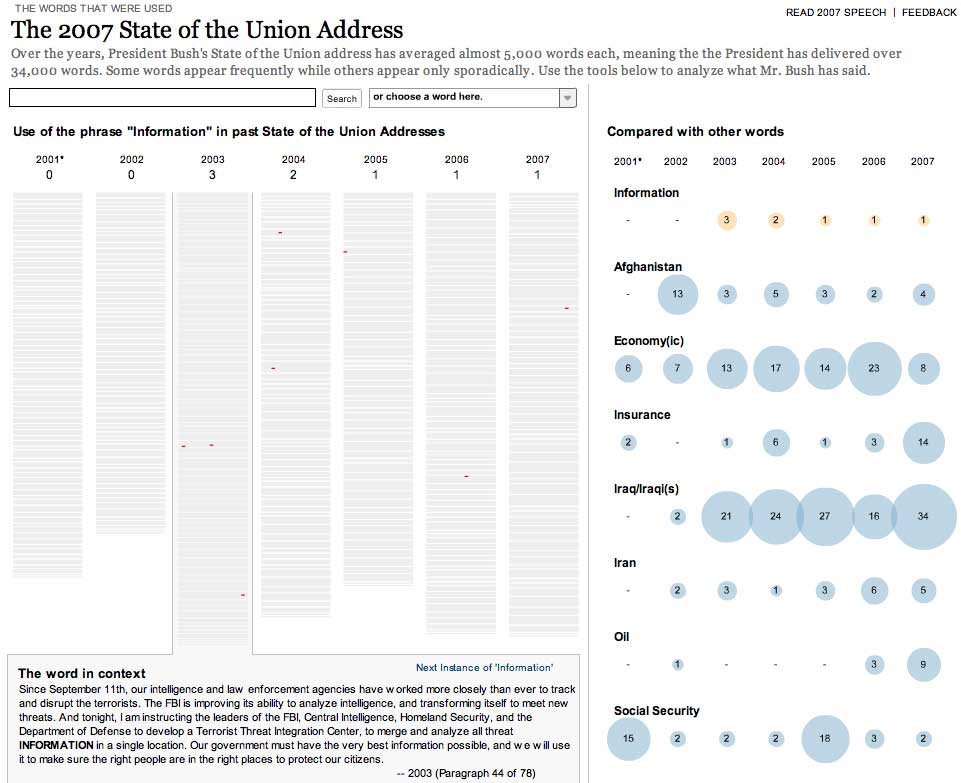
The New York Times online graphics are sometimes a technological affair beyond infographics. The information they provide is so interesting that deserves time to explore them. This time, the analysis is focused on the annual speech of the president about the state of the Union. Year by year, form Bush's first speech, we can look for words over the texts, watch the frequence of its apparition, the context... Visual information provided is very clear: over grey columns, analogy of the speech, words searched appears in red, showing the repetition and the place where it was said. On the side, frequency can be compared year by year with other words, now on the media everyday: 'Oil', 'Iran', 'Iraq', 'Economy(ic)'... Other great graphic? Or more than it?
If you want to take a look, click here
If you want to take a look, click here
24/01/2007
One life in numbers
Astronomy in Milwaukee
It looks like you've got two big papers redesigned at the States everyday. This time was Milwaukee Journal Sentinel. It's not usually to show graphics on this redesigns presentations, although most of them have a much more visual redesign. This wasn't a exception, but there's a good detail: the weather page. Upper zone of the page shows bars that explains time for dawn and dusk, nt just for sun and moon, but also other planets of the solar system (sorry Pluto, you're not in this club any more).
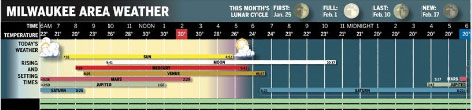
I don't really know how much people would be interested in this kind of information... Maybe Milwaukee it's a great place for astronomy. But I don't really think either mucho more people would be interested on many of the data whe show on our weather pages: isobars, temepratures of all around the world (do we really have to know the temperature at El Cairo everyday????). But this one is original, and that's a good point.
To take a nearer look, you can do it at Visual Editors
05/01/2007
USEFUL infographics
 The Sun says that this is a real envelope. The map is the address. And, the weird thing is that this letter reached its target. A strike of luck, because a postal worker recognized the addressee, but is incredible anyway. You can't say graphics aren't useful!
 Via Visual Editors
New appointment with Chapel Hill
 It's going usual in this blog to advice about watching the new works of Alberto Cairo's pupils at Chapel Hill. This time was free subject. Mi favorite, this time, has been Lawson Parker, with this graphic about the kinds of muppets in Sesame Street, a doubt I had since I was a toddler. I must confess I really suffered when I put on the place of the man being the yellow big bird hand up.
Alberto has also actualized his weblog with other contents, as a a book review, Mapping the News
04/01/2007
Infographics in real time
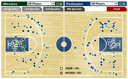 It's not a new thing. We've seen it for years, but maybe there's someone who doen't know.' NBA officila web (Also ESPN does it, the photo of this post is from there) offers a real time service called Courtside Live, whoch shows a scheme of the court y place on it, during the game, icons showing form where player throw, and if they get the basket or not. You can show all the players, just one, one team... This way, you can follow the match without watching at it, analyzing it: where is the most active player, if a team is scoring more from from the outside... As Der Standard made at the World Cup, but online, real time and basket.
 José Manuel Ferrer, from Granada Hoy made something loke this with CB Granada, his hometown basket team. But was not real time, althought it was very useful to its readers
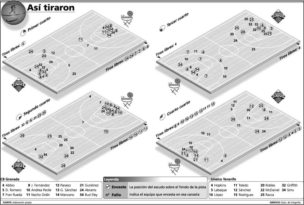
In Spain there's only a real comparison. What Marca.com, made years ago, uploading to its web the goals from the soccer matches, explained with icons. In these times, when watching sports is always a expensive task, this service could be very useful
02/01/2007
Faces of the death
 That is the name of an interactive feature published by The New York Times web talking about the milestone of 3000 american soldiers dead in Iraq war. Complete, exhaustive and very interesting, as Times web usually does. They know how to use interactivity to analyze all the numbers and give a "human" touch to this issue. And easy to understand. A must click
Subscribe to:
Posts (Atom)