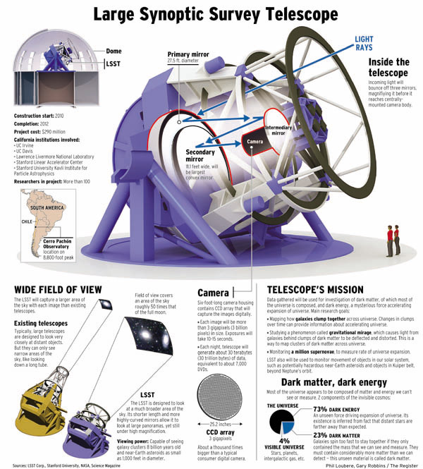
28/02/2007

The silver, the discussion and the joke

This graphic was publishe on The New York Times A1 and won a silver medal on SND contest. It has beeen a great controversy. OnNAO forum there is a thread with more than 60 replies about if it deserved the prize. Some say that it deserved the medal, by it simplicity, origiality, clarity, being ran on A1... Others say just the oppositte because they think it's not original, and, despite it's a good graphic it's not silver meda worth. There is a poll, and No is winning 22-4. The graphic was called "The little graphic that could" (win gold) on this video


But the best of all this arguing (usual after all the contests) is this "answer" from Moral Volcano

27/02/2007

SND Awards 2007

Here you are a little recap, these are all Awards of Excellence. Don't doubt sending yours or others you know. I'll be updating...

Via NAO, NPD, myself, others..

26/02/2007

Graphics depending on the size of the story?

It looked like online grapics is Spain were being relegated by video. But now, as the big trial of Al Qaeda train bombs in Madrid begins, spanish media remerbered the had online infographics artists. But looks like the big story to tell was how is everybody sat in the trial. Personally, I don't thinks that's the big thing. OK, it's important, but not so much. There were other information to present.


And so did elmundo.es, with its 3-graphics special, that explains, not just the places where people sat, but also all the crimes imputed and who are the accused. This information that could looks like not as a great graphic is perfectley explained, with not spectacular interactivity, but there were no need of it. On my opinion, much more interesting than the other.

But is not that what worries me. Is the fact that just now is when newsroom had infographics artists on mind. These lasts months have been much more "graphicable" stories which didn't get the graphic and just got a video which didn't go deep. Why now? Because thsi is a big stor and we have to show how many resources we have?
Is the print fight carried to web. When bombing happened, most of spanish papers gave a double spread graphic to explain it. And the information dind't need it. We know it now and very much knew it then. The thinking was: terrorist attack=double spread. It worked on 9/11 because tehre were much more things to tell, but not this time.
It didn't work then and it's not working with the trial. Offering the graphic of where is everybody is a good idea, but we had more interesting garphics and we forgot them bacause the story wasn't so big, and that's the real problem.

Examples
* elmundo.es
* ELPAIS.com
* Vocento

25/02/2007

Visual Journalism Bibliography

Poynter Institute published on the design/graphics section of its web a complete guide of online resources and visual journalism bibliography.
To get to it, here is the link

23/02/2007

Ed Gabel leaves Time

Ed Gabel, Associate Graphics Director of Time Magazine has joined hisformer team-mate and former Graphics Director of the same publication in his own bussiness. Going clear: Ed Gabel goes to Joe Zeff Design, where he'll work with Joe Zeff and Chris O'Reilly.
Here you are Ed Gabel's portfolio and a pair of details of it


Via NAO

22/02/2007

Welt am Sonntag wins SND gold


Just eight golds on this edition of the SND contest, and three of them went for infographics stuff.

One of the winners of the awards has been the german newspaper Welt am Sonntag for its "ambitious graphics storytelling".

El Mundo obtained two of the maximum awards, one in the Miscellaneous category for its graphics emailed to succriptors about the Spanish Civil War, pretty full of graphics, and other for this megagraphic about fashion's history


Congratulations for both

All the golds, here

First, the reader

That's what 
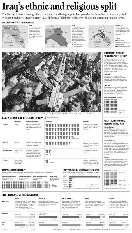
The Dallas Morining News staff thinked when they did this graphic about ethnic and religious differences in Iraq. Take a look to these graphics.


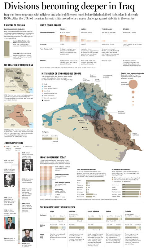
At first sight, the first looks like a more interesting graphic, more visual. But DMN graphic staff though than going this way would be a mess for the reader, so they decide to clearer and made the graphic of the right. Most of the times we sacrifice a clear graphic because we want a spectacular one, and we're not supposed to do it. Readers go first.

Sergio Peçanha, graphics director at The Dallas Morning News, explains the process himself:

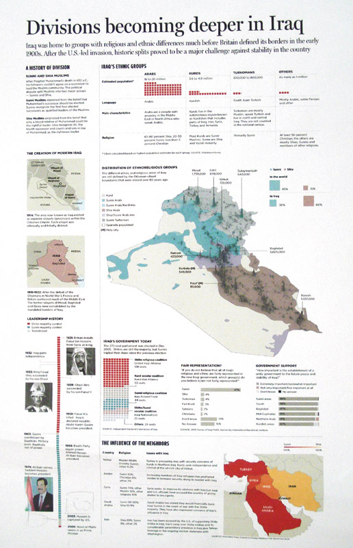
"In the first graphic (left of the two above) you'll see we had the graphic pretty much ready, with that map at the center. But when you tried to read the graphic, we were making it very hard on the readers. We started with the Sunni/shia divide, then a couple of historic maps and a timeline.
On the right side, we had Iraq's ethnic groups and the 3D map, showing population and ethno-religious groups in the country. The circles on the right showed the deaths among Iraqis in January (Baghdad is the big circle).
At this point we decided to make the graphic more linear, it was very heavy to read. So redesigned it, simplified things and cut some of the information. We felt there was too much stuff stuck in the graphic.

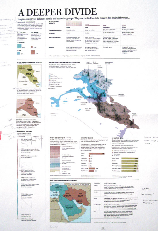
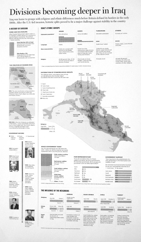
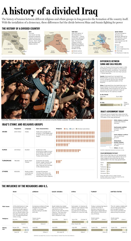
On the definitive graphic (right of the two above) you see the final graphic. We grouped history of the borders at the top. That shows that when Iraq was formed, it's borders were merging together several different groups. That's a recipe for conflict.

Then, at the right, it's the difference between Sunnis and Shiites and what they want in the conflict (we didn't have this last part before). Finally, we added a photo that we thought would display the rage better. Below the photo we have Iraq's ethnicities. At the bottom, foreign interests."

You can take a look to the whole process here


Thanks to Sergio Peçanha fo all the infomation and the images and he and all his staff for this great lesson
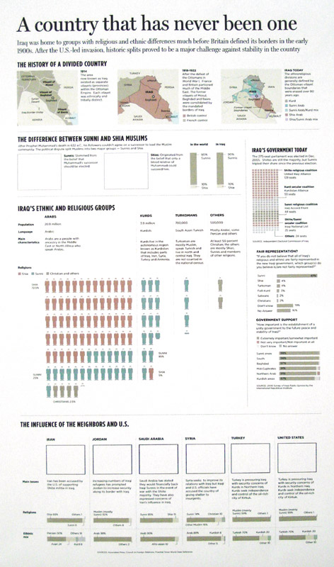
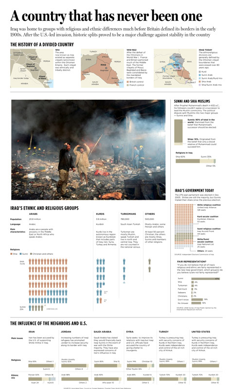
20/02/2007

Infographics beyond newspapers

After some days enjoying the carnival of Cadiz I ave come back to my real life, and I have done it with my german lessons. As I am at basic level, I'm learning how to tell the time. To explain the german system (a great mess) our teacher made us this graphic (more or less, that's just a reconstruction)

I am suppsoed to be the infographics designer of my class, but I should assume that my teacher gave me a good lesson. I understood it at first sight, with no problems. I can't remeber which infographics guru chose teh clock as the best infographic in history, assuming that is a complex system to learn, publishe on the article 21 infographists, 21 graphics of the 10 Malofiej book. This is a good way to explain it.
Much times, there are graphics made up by teachers, scencists and other professional taht give us great lessons. Graphics explains things, an this divulgative labour is necessary also in other professions. My german teacher is a great ocassional infographics designer, as I learnt today. And would be lots expalining budgets, scientific theories or history lessons.

15/02/2007

The power of graphics


This graphic, made by Massachusetts Institute of Technology sciencists, explains the trayectory of the missile of the chinese antisatellites program. The (understandable) secrecy of Chinese government about this program makes Google autocensoring and not publicating it. t's not a big surprise about Google's condescendency with chinese government, but it another example.

More on World Tribune

Vía NAO

Las t day


Remeber than today is the last day for sending entries for Malofiej contest. That's not like SND contest, here the deadline is for sending, not for arriving. Good luck to everybody

14/02/2007

diariodecadiz.es, local online news

diariodecadiz.es is introoducing today online graphics, but one about Holy Week theater boxes at Cathedral Square (a verly local one). I recognize this is not a good example, but its objective as local service is done. I could blame lack of time (it was assigned yesterday at afternoon for publishing yesterday at night) for the lack of quality, but I think inexperince is the main guilty, so we accept all kind of critiques and ideas to improve them.
It's not the first online graphic of Grupo Joly, diariodesevilla.es had its steps on this way.
It's not precissely marvelous, but it's an online graphic on a liitle local newspaper website (100.000 users month) offering a public service and it's a try, and we need more.

12/02/2007

Arizona Republic A1s

I've talked several times about A1s graphics, but this is a clear example about how to make them fit great.


Examples from Andrew Long's portfolio, Arizona Republic

09/02/2007

An infographics joke

They do exist!

War twins

Just five days between these two graphics. First one is form The New York Times, published on February 3rd, a very complete and exhaustive graphic. The second one is the The Independent cover published two days ago. The truth is what I like the most is the second one, but they had most of the work done.. Inspiration was not a problem for them


Vía Innovations in Newspapers

08/02/2007

Malofiej 15 program

Spanish Chapter of SND published today the Show Don't Tell!, Interact don't tell! and Infographics World Summit program for the next Malofiej. Instructors for "don't tells" are Juan Velasco, Javier Zarracina and Geoff McGhee, and conferences will be given by Luis Miguel Taklim, Matt Ericsson, David Gray, Don Wittekind, Cóper, Alejandro Tumas, Aitor Eguinoa, Heber Longás, Paige West, Karin Sturm... and Mikel Urmeneta (Kukuxumuxu)

Dates:
Don't Tells: Sunday 25th-Wednesday 28th March
Summit: Wednesday 28th-Friday 30th March

07/02/2007

SND.ies winners

Latest SND.ies winners were announced last week. This is the list of the winners, with ELPAIS.com, washingtonpost.com (2 times) and AP, St. Petersburg Times and nytimes.com:

Breaking news

Conflicto en Oriente Próximo, ELPAIS.com (which is impossible to be watched right now). Judges remarked the excellent graphics of the special
Crisis in the middle East, washingtonpost.com. Described by judges as "a truly deep site with an amazing amount of photos and content."

Non-Breaking news

Stem cells research, St. Petersburg Times. Awarded by it originality and deepness
Accidente de metro en Valencia, ELPAIS.com. The good use of the pop-up information and the video animation where the reason for this award
Elections 2006, washingtonpost.com. The words of the judges were: "A fantastic way to compile and present data. The design is clean and manageable, it does not overwhelm the user. The related content, from demographic data to biographies and full voting records of current Congressional members, is very helpful."

Non-Breaking features

Katrina Coverage, AP, for all the awesome package
NFL penalties flags database, nytimes.com, an example of the importance of the online graphics.

06/02/2007

Great example


Great graphic this one made up by Alberto Cuadra and John T Valles, from Houston Chronicle. It's one of this graphics with which I think I can take some learnings for my day to day. Details what makes this graphic worths the time:
1. Siimplicity, clarity, usual victims of 3d
2. How easy is to follow the information thanks to the colors
3. 3d queality itself
Congrats, Alberto and John

05/02/2007

Alberto Cairo is preparing a new book

Alberto Cairo is preparing a book about infographics. So we can now celebrate!. You can take a look to some examples at his weblog, but I show you one of them I "lifted" here...


It looks great, as you can see yourselves. Now all he needs is a editor, but I don't think it will be a problem...

That's what a graphic should show

Innovations in newspapers showed this sunday a recopillation of The Independent A1s, which worths to have a look. Between this amount of atratctives covers, maybe professional thinking, but this one was which take my attention


A main idea to sell the paper: clear and visual. We've got a lot of pages talking about North Korea nuclear weapons, but here's where we can see directly the risks, whihc countries are affected and how much they are, teh range of their missiles... Information not able to show with just a big head and a photo. Yes, we've seen this graphic like a million times, little, acompaigning an information. But here, it's the starring and IS the information. A good image worths 1000 words, a graphic maybe more...

My worst graphic: Gonzalo Hernandez

You can "discover"Gonzalo Hernándezat his web. He works in Cancun (México) (place where woking is harder) deveoping the visual resources and infographics department ot the Periódico Quequi Quintana Roo and he's a collaborator of Economía and some publications f the USA. Maybe you also have seen some of his works on the Enciclopedia del Franquismo (Franquism Enciclopedy) published by El Mundo.
These are the good thing, now we're focusing in the bad ones (it's a joke). Gonzalo sends two graphics made for Prensa Libre (Guatemala) years ago.


This first talks about problems caused by trash. Gonzalo talks himself about it: "it's a colorful carnival, editors didn't read the texts -and I didn't ask for it- head and introduction text is trapped in a color which does not allow a clear readinge.... I didn't know or I just didn't try to administrate well this information. I wanted to get all the information in the graphic and the final result... is terrorific to try reading it!"


He talks also about the second one: "It's about natural diversity of Guatemala forests, threatenes by men...this one is worse..it's like a monument to disorder..main text is very far from head, the Guatemala map is literally into an information chaos, the visual navegation concept arrived here, and came back the same way"

In my opinion, these are the typical mistakes we have when we're full of information and we don't have the time or simply we don't really try to analyze what's the main thing, how do we want to explain it, what shoud be on a graphic and what's not and how are we going to make understable all the data. Problems grow when we have a double spread. But we can learn a lot from mistakes

01/02/2007

Team power

I've talked several times (always for good) about NAO forum. but this is a clear example of why it's so valuable. This is from months ago, althought I found it put now. Phil Loubere, brilliant infographics artist from Orange County Register (fromer San Jose Mercury News and former Seattle Times)was developing a graphic about LSS telescope and uploaded the graphic to share opinions with forum partners


After some advices, Phil decided decide to change the 3d view. Other pal suggest including the explanation of how it works in the main illo.


After som advices, thinka about it all and get some benefits from the chat, this was the final result two days after. It's good to consult when you got someone to advice you.