31/05/2007

Problems with "metagraphics"

I'm preparing at the momet one of those "metagraphics" ofthe kind How does a newspaper work (not the one below). And I noticed some problems with these graphics:

1. Don't matter if this is topic you control, all that you know about working in a newspaper. Thsi time you're going to lie and you know you're doing it. You should change the headlines "How a newspaper works" and write "How a newspaper should work but we haven't managed yet"

2. Nobody in the newsroom agree with the definition of his job. And they can't explain it in less than half page. And you just have two lines for each.

3. Every single department (and even person) wants to appear in teh graphics. It doesn't matter if marketing does not work in the newsroom. It doesn't matter if security guards have nothing to do with the journalistic process.

4. This is gonna be the graphic most people in the newsroom want to check before its publication. Everybody will change things. These kind of thing that happen also with circulation data graphics.


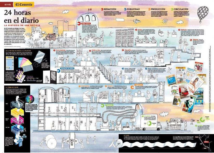
GRAPHIC: El Comercio (Perú)

30/05/2007

New graphics for new Eleftheros Tipos (3)

One week from the re-launchment and graphics team of ET is doing a great job. Clean and clear.


To take a look to compelte editions in pdf, visit thepdfViewer

Vote in NAO Quarterlies. Last days

If you have not already vote in this great initiative of NAO, you have until friday to do it, just clicking here.
Final result are expected for monday.
Good luck everybody

28/05/2007

Future Boston, graphics of the future

On of the main steps for the infographics department is to coordinate online and print graphics, to seize all that you can fr both without double efforts. Uno de los grandes pasos que tiene que dar la infografía en estos años es conseguir coordinar los departamentos de gráficos para papel y online para sacar el máximo provecho a los dos medios sin doblar esfuerzos. Something that The Boston Globe graphics department does very good since Javier Zarracina's arrival (I may say I didn't know too much about this department before his arrival).

A good example are the graphics they have made for a magazne about Boston in 2017. These are some of the infographics they published on the print edition


They deserve a post by themselves. Clear, great use of color as a guide, amazing renders, useful information for the reader... And now take a look to the online versions:
- The big dig's payoff
- On the waterfront
- The green giant

They add value thanks to interactivity, as this day/night funny button (remember graphics for Bart and Lisa) /. Both departments integrated (and the need of separating both departments is other big question). And great quality graphics. Just a but: I would like to see the whole graphic at first sight and then zoom.

Good example about the next step we need

25/05/2007

New graphics for new Eleftheros Tipos (2)

Here you are some samples of the new graphics of Eleftheros Tipos, the newspaper just "re-made" by InnovAtion. This serie shows a more accurate version of what they're doing right now since the new release.


The paper has suffered a complete revolution, and graphics must have the same way. Old ET combined graphics and photos with tables and texts, using a lot of colors, creating a confusing and overcharged style (take a look on this old post). Bet for clear and clean graphics and color as a guide for information it easy to see on the new style, perfectly used for the ET infographics team.

Elections graphics


Infographics artists of Spain are full up of work. This useful, necessary but mostly of the times boring works. All beacuse of the municipal and regional electios of this sunday. Pies, pies and pies. But, pies apart, sometimes we can find different propossals to cover the elections, as this interactive graphic by ELPAIS.com showing the most important facts of teh campaign and precampaign and make a lot of multimedia content easy to acces.

Talking about election, here you are some advices from Jeremy Gilbert (Poynter Institute) in an article about what we have learnt from 94' northamerican elections. He talks about general focus, but I can see these advices also useful for graphics:
- Explain the news, don't just report it: this is valid not just for elections, but for every single graphic we make
- Use different story forms: we've got a good example above form ELPAIS.com
- Be sure of your numbers: escrutation percentaje on the pie we pubish is a must
- Weigh the local, state and national angles: it's not just our city, we've got to think wider and use a bigger context to explain what's happening here, the famous "think global, act local"
- Integrate the Web and other media: peolpe want to know the results now, not tomorrow morning
- Don't forget the importance of graphics
- Finally, make a plan. Make several plans. Make a plan for scrapping your plans: ewe've got a little time for reaction if there are surprises

24/05/2007

New graphics for new Eleftheros Tipos (1)

Here you are some examples of the completely renewed Eleftheros Tipos (here you can take a look to the first issue). There aren't a lot yet, but enogh to notice the concept: clear, simple and clean graphics, in armony with the outstanding new design. The greek paper has six infographics artists in staff, with Kali Labrou as head of the department.
I will add more, with comparisons with old model.


On new infographics concept has worked Pablo Ramirez and myself, based on the great design conceptsfor the paper developed by Javier Errea

Measuring the world


Nikon offers this interesting and useful web, Universcale, showing size comparisons between objects from protons to the whole universe. Very useful for those graphics trying to explain actual sizes using more than football fields..

Thanks to Carlos Gámez for the link!

PS. I announced I would post somo graphics of the new ET, but I fcouldn't do it yesterday. I will upload some as soon as possible. Mi apologies. Meanwhile, you can have a look to some of the new pages

22/05/2007

The way Eleftheros Tipos was

Tomorrow, Wednesday 23th, it's the release of the new Eleftheros Tipos, a new journalistic concept for one of the lassic newspapers of Athens. This InnovAtion project is a big step on the change of the journalistc market in Greece.
As we say, Show don't Tell!, and as this blog is dedicated to infographics, I show some of the graphics thet were done on the old Eleftheros Tipos. From tomorrow, I'll be uploading some of the new graphics that will be publishing and talk something about the change, in which I had the honour of collaborating as consultant, with professionals like Marta Botero, Javier Errea, Juan Señor, Michael Fairhead, Gabriel Sama, Pablo Ramírez and, of course Juan Antonio Giner, and all the newsroom of the journal.


If you want to know more about the project:
- Innovations in newspapers: THE NEW ELEFTHEROS TIPOS: A NEWSPAPER REVOLUTION IN GREECE (1), (2), y (3)
- Maquetadores: ¿Quién es Eleftheros Tipos?, Las primeras del antiguo Eleftheros Tipos

And also the TV spot and a gallery of new pages. More tomorrow.


Romario's 1000 goals


An original and very visual way to explain an information. This time, Romario's 1000 goals on his whole career. Great graphic by O Globo

VIa VIsualmente

19/05/2007

Freehand, RIP

What all we thought when Adobe acquired Macromedia it's now official. Adobe won't develop a new version of Freehand. Bad news for Freehand lovers and even worse for Illustrator detractors (that usually are the same people).

The new Eleftheros Typos


This wednesday will be released the new face and editorial model of the Athens newspaper Eleftheros Typos, a project of InnovAtion on which I had the enormous pleasure of collaboring, on infographics area.
To know more about it, I strongly recommend you to visit Juan Antonio Giner's blog talking further about it.

11/05/2007

Something's changing in Venezuela

One of the countries growing on infographics is Venezuela. One of its great representatives on the web is Nicolás Ramallo and his recent blog Haga clic para continuar, focused on online graphics. Nicolás won a Malofiej Award this year for a graphic about the Germany World Cup of Football (Soccer). His newspaper, El Universal is also developing great graphic on print, as this one about the Aquatic Centre for Beijing Olympic Games.


El Universal is not the only reference in Venezuela infographics, although other if their big men, Nelson Fernández works in Panamá, in EPASA, where he develops this personal style


Nelson Fernández will be this july in a workshop in Maracaibo, in the First Meeting of Graphic Design, that will take place july 16, 17 and 18th, in the Ctatholic University “Cecilio Acosta” and teh Theatre “Niños Cantores del Zulia “, both in Urbanización La Paz, II etapa, calle 98 con Av. 54-A, Maracaibo, from 9:00am to 12:m and 2:00 to 7:00pm, if you're interested.

Other of the new infographic webs of Venezuela is Asesor Creativo, made by Omar Hernández and Johanna Marín. A wire agency giving its firsts steps on the southamerican country.
As Alberto Cairo says, there's something in South America to have such good infographics artists...

09/05/2007

El Periodico, opening a path in Spain

Many times I've talked on this blog about the decission of opening the newspaper with a graphic, and most of the times was about papers from abroad (I'm talking from Spain) and for having a little complaint about the lack of these inniciatives in my country (some have tried, but still just a few).
In this ocassion, El Periódico, in a continuous effort to innovate on its cover (sometimes winning, other not) today "dares" to publish a A1 Graphic, about the extremely small and illegal flats which are appearing in Barcelona. A visual explanation for a topic that really worries people (with our mutual friend James, from Poser)
On inside pages they explain again the same information, but on a different way, giving other way to distribute such tnuy flat.
They care about an affordable and visual explanation of the data. Well done.

But, Spain is not yet a place where this kind of innitatives are easy to find. These risks (are they considered) are not common beyond sports papers, meanwhile in USA (and not only there) they have its space, as we can see just taking a look to today covers on Newseum. Some use the graphic as main illustration, other don't, but the vocation to explain the data from the beggining do exist.
We don't have to use a graphic on A1, but we have to give to the information the resources they need.


Via Paco Oca, Maquetadores

08/05/2007

Cartoons are Visual Communication too


Some of my favourites cartoonists are Pinto & Chinto, whom I work with at La Voz de Galicia. And one of the thing I like the most of them is that the explain complicated stories clearly, simplely and without words. A real Show Don't Tell. His mission is very close to graphics, although they can use a little of opinion...
For those who doen't know the topic of this cartoon, I may say that's about the radical basque party related to the terrorist group ETA, Batasuna (here preented as HB, his old electoral trademark), can't be on municipal elections of may cause they are now illegal. Their startegy is to use a different party to do it, called ANV. Justice was deciding if this relation between ANV and Batasuna is real to make ANV illegal too, but a problem with the issues made ANV illegal in most of the cities but still legal in a few.

A big story in words, an so short in cartoons... Visual communication


You can follow Pinto & Chinto on this page

Some questions about online graphics

Why do I have to click on eight different places to have all the information if I could have it all avaible together?

Why do I have to wait for the hand to tell me where do I have to click?

Why do I have the graphic on a different page, separated from the new, if it's perfectley possible to have it all together? (The answer "beacusae that way you get more visited pages" is not a journalistic reason)

Why most of the online graphics have the same size if they're explaining such different things?

Why sometimes are they called Animations, when they're much more than this?

An other that will go on...

(Thank sto Manolo Romero and Raqul Feria, who asked the first question)

05/05/2007

Gude's IG Conference posponed

As Update blog reported, theIG Conference that Karl Gude and Kevin Hand were preparing at Michigan is posponed. Gude will try to organize it for the next year and, possibly, in New York City. I hope it will take place and we're talking about posponed and not cancelled, as it looked like one of the bests proposals about infographics of the year.

04/05/2007

South America, cradle of infographics artists

I'm not the first talking on him, but I had to seize the opportunity to show the amazing work of Robinson Choquetaype, that could be watched at his web Macktub....R). He can combine different styles, and you can see on his jobs those who he has as his inffluences: Xabier Díaz de Cerio, Javier Zarracina and Fernando G Baptista


03/05/2007

Campaign funds for dummies


OK, a great graphic by nytimes.com, complete, with big amounts of information clearly expressed, but also simple is not a scoop. But is always something worthy to talk about. This time it explains where the campaign funds for the candidates for the USA presidency come from. And it's not just the where, but also the how.
And linking it with the previous link... former students from Chapel Hill involved in the graphic...

CLICK HERE TO WATCH THE GRAPHIC

Beyond Chapel Hill

Alberto Cairo talks again on his web about his pupils at Chapel Hill, who never stop impressing me. The new Alberto's post talks about these little monsters' fisrts jobs. These fierces got class, and their firsts steps are at The New York Times, National Geographic, Time Magazine, MSNBC... whihc should be an unreachable goal for lots of us.
Have a look at those grahics, it really worths.
And also, that's not the only reason Alberto's has to be happy now...

02/05/2007

Animation=Information (it should be that way)


Some of you would remember this graphic by John Grimwade, published five years ago. A powerful image, with information that explains the big problem of the air traffic congestion at the USA at first sight.
With time (althought we're talking just five years ago), things change, and we have more tools for explaining same data. And these tool should been used always to improve Same code, same icons and just using animation, this graphic shows much more information,a s you can watch at this NASA video (click on image to watch the video)


A good example of animation providing information, and not just as decoration.

Via Enrique Dans