Fiveteen days (maybe less) of holidays without internet.
When I'll be back, we'll have new design for the blog, as the one of the spanish version.
See you!
24/07/2007
23/07/2007
Sao Paulo plane crash and Google Earth
The tragedy which took place days ago in Sao Paulo was the last big "breaking news" event for all around the world graphics teams. And has been an opportunity to see how they use Google Earth in order to explain the facts.

ELPAIS.com
- Acceder al gráfico
The reconstruction made here is very complete. They use Google Earth as a base to show us excatly how the accident happened. The don't jst use the aerial view, they integrate the Google Earth image on a 3d animation.

elmundo.es
- Acceder al gráfico
Here, the reconstruction is more technical, using a cenital view. The result is clean, and also offer a lateral view explaining how the plane went over teh avenue and finally crashed.

Público
In the blog Innovations in newspapers you have an analysis about this graphic from Público (Lisbon), with good words about how they "localizaed" teh information, showing satellite images of Lisbon airport compared with Sao Paulo airport. teh reconstruction is clear and simple, but they use Google Earth (or other satellite imaging system, that's not the main thing) to give a WHY, so you can see Sao Pulo airport is to small.
Three different ways, with their good and bad things, but showing that Google Earth is an already assumed tool on teh graphics department, online or print
Tags:
Technology,
Trends
22/07/2007
NAO 2Q 2007

YOu can already send entries for the 2Q 2007, the trimestral and free awards of theNews Artists Organization.
All entries must have been published between April, 1 and June, 30, 2007. The main change is the supression of the best wire graphic use category, due to the problems tof judging without having the original reference.
- Send entries too 2Q 2007
- More information abut NAO Quarterlies at Infographics News
Tags:
Awards,
Communities
17/07/2007
Want to be Graphics Director?

The Detroit Free Press is hiring a new Graphics Director, so, if you're an infographics guru, it's time to go to one of th big ones. As Jonh Fleming, Deputy Graphics Director explains, they're looking for:
- someone who is concerned with content -- both visual and editorial -- and seeks to improve it at every turn.
- someone who performs well on deadline, with good communication skills and a team spirit.
- someone who understands a good story as well as a good photo.
- someone who seeks to simplify the complex and give depth and meaning to the routine.
- someone who can lead a veteran team of artists into the brave, new 3D and interactive world of information graphics.
More information here
Tags:
Hires
12/07/2007
Learn to draw El Correo style

Javier Zarracina, Graphics Director of The Boston Globe, former The San José Mercury News and El Correo, and Fernando G. Baptista, created a personal style in the basque newspaper based on fantastic handdrawings, which gave international recognition to the spanish publication. Now Javier, on his web javierzarracina.com, offers a tutorial with tricks and tips on how they draw.
Obviously, follow the eight steps of the tutorial is not enough to get graphics as the one above...
Tags:
Resources
Fourth Multimedia Infographics Intensive Course

The Fourth Multimedia Infographics Intensive Course of elmundo.es will take place this year from 24th to 28th of September in Madrid. The course, directed by Juantxo Cruz, chief of Infographics of El Mundo, eill count with its usual teachers Alberto Cairo, infographics teacher of Chapel Hill University, and Xaquín González V., of Newsweek, and others lecturers as Germán Pizarro (Marca), Mariano Zafra (El Mundo), Pablo M. Ramírez (Recoletos), Víctor Sanvicente (Marca.com) or David Domíngez (elmundo.es).
The price goes from 1770 € without hotel to 2490 € ewith 6 nights ina 4 stars hotel.
More information here
Tags:
Summits
11/07/2007
Wonders, wonders, wonders...
Nelson Fernández, infographics artists from Venezuela but living in Panama, have also made his works about wonders, but this time looking to the past and the seven wonders of the ancient world, something tat makes research harder. Nelson's personal style gives a great cohesion to the recopilation
Tags:
Trends
09/07/2007
Wonder-ful graphic
Spain was at the gates again this weekend. Fernando Alonso was 2nd in Silverstone, Nadal lost the Wimbledon finlas against Federer an the Alhambra was not selected among the new 7 wonders.
But where you have defeateds, you have winners. An one of then has been the Machu Picchu. And, to know it better, and because we are in an infographics blog, what better than this fantastic online graphic by El Comercio explaining the ancient city?
Is a very complete interactive fatures, on whihch we can learn about animals, plants, constructions, buildings, lifestyle, and enjoy a great virtual visit to the new wonder.
Seen on La Combi Visual
Tags:
Online graphics,
Trends
06/07/2007
Ready for the Tour

Preparing this year Tour graphic, one of these not very original graphics of every year (we can and we must be original, but I must confess I wasn't either this time...) I had a look on The Guardian to this very simple but great graphic. There should be thousand like this one, but, as I haven't seen them, I comment this one. The main part of the graphic is the tactics. I must say I am not used to watch to cycling, but I put the blame on that I don't understand the sport. I don't know why the riders do the movements they do, or how the colleagues of one rider allow him to escape easily. But this graphic explains all that in a very easy way. Very simple. Very effective. You could have this graphic done in the firsts days of Flash. Other example on how abilities for drawing are not a very important thing. Is the way you explain information.
A journalist (writer) must tell stories, and how he writes is not the important thing (although is a good plus, of course)!. A infographics artists must explain, drawing better or worse is not the main thing.
These are obvious things, but we forget them many times.
Congratulion to the graphics team of Guardian Unlimited.
Tags:
Online graphics
Confirmed lecturers for Estepona 07
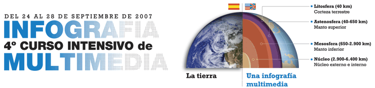
We have some more new lecturers names for the World Press Design Summit of Estepona. The list published on this blog days ago have new particants, as Paco Oca said on his blog Maquetadores.es. Names of great professional of high level, as Jordi Catalá, graphics editor of El Periódico de Catalunya, one of the most "risky" newspapers in Spain at the moment; Chico Amaral, from teh Barcelona office of Cases i Associats; Michel Gaffre of News Media; Lucie Lacava, who redesigned papers as La Presse, Toronto Star, Chicago Tribune or the last change of El País; and Mario tascón, General Director of Contents of PRISA digital mediaand one of the pioneers of infographics in Spain from El Mundo.We have to add to these names Manuela Mariño, infographics artists of La Voz de Galicia and an habitual of the Malofiej list of awarded thanks to her originalty and her clean style
With all that, this is the list at the moment:
- Rodrigo Fino, of García Media, Argentina
- Juan Durán, of Diario de Hoy, El Salvador
- Claudio Rodríguez, de la UNAM de México
- Orlando Romero, of Gramma Internacional, Cuba
- Miguel Ángel Gómez, of Gulf News, Dubai
- Miguel J. Buckenmeyer, one of the fathers of the awarded El Economista
- Marco Gatica, of El Mercurio, Chile
- Jaume Serra, of OUSinfografia.com
- Norberto Baruch, El Norbi, of VisualMente
- Javier Sicilia, freelance
- Chico Amaral, of Cases i Associats
- Michel Gaffre, of News Media, France
- Mario Tascón, of Prisacom
- Jordi Catalá, of El Periodico de Catalunya
- Lucie Lacava, of Lacava Design
- Manuela Mariño, of La Voz de Galicia
- Chiqui Esteban, myself
Tags:
Summits
03/07/2007
Megan Jaegerman, the triumph of the simple

Infographics guru Edward Tufte uploaded on his web a ver interesting article with graphics examples by Megan Jaegerman, infographics artists of The New York Times between 1990-1998, the time when the first Gulf war made infographics the star section of the newspaper.
Jaegerman's graphics are a great example on how to do great graphics on a very simple way. On how color can be used as a reading guide and calling atention on what's really important. On how the hardest idea can be easily explained. I hope God will fogive me for what I'll say, but just cutting a little text on some of them we would be talking of the prefect graphics.Even more if we remeber the graphics how they were done then.
Visiting the article is a must.
01/07/2007
Do it yourself at home
My former Art Director at La Voz de Galicia, Jesús Gil, used to tell me that people loves the kind of graphics which include things to "do it yourself at home". We made several graphcis that way, as one in which we told the readers to press a foam ball to show how the earth fklattened at the poles.
But truth is that that kind of graphics, a sort of "experiment", works very well. Always I always try to include these kind of details on mygrphics, when it's possible: drawing the shape of Michael Phelps' foot, the way readers can comper their feet to Phelps', drawing trimable bookmarkers to get ot included beside a Book Fair distribution graphic, comper things to the actual size of the newspaper... Searching interactivity also in print.
Now, Michael Gee, makes the double gamein the The San Jose Mercury News web. From internet, creates interactivity using the print. And he does it with this graphic about Transformers (remembrances of my chilhood stained now by the worst looking film of all times). On it, calls readers to print bluepritns as the showed below to build up your own Transformer (bad or good guy), and uses the online to show a video tutorial.
Media synergy.
Tags:
Online graphics,
Trends
Subscribe to:
Posts (Atom)


