31/01/2010

What would you send to Malofiej? (XII): La Voz del Interior (Argentina)


Juan Colombato is the head of the infographics department at the argentinian newspaper La Voz del Interior, from Santiago del Estero (Córdoba). We all know the quality of the argentinian infographics. And you could see watching this graphics how high the level is. This is not a national newspaper, but these infographics could be published on any national newspaper in the world. Even in an argentinian one.

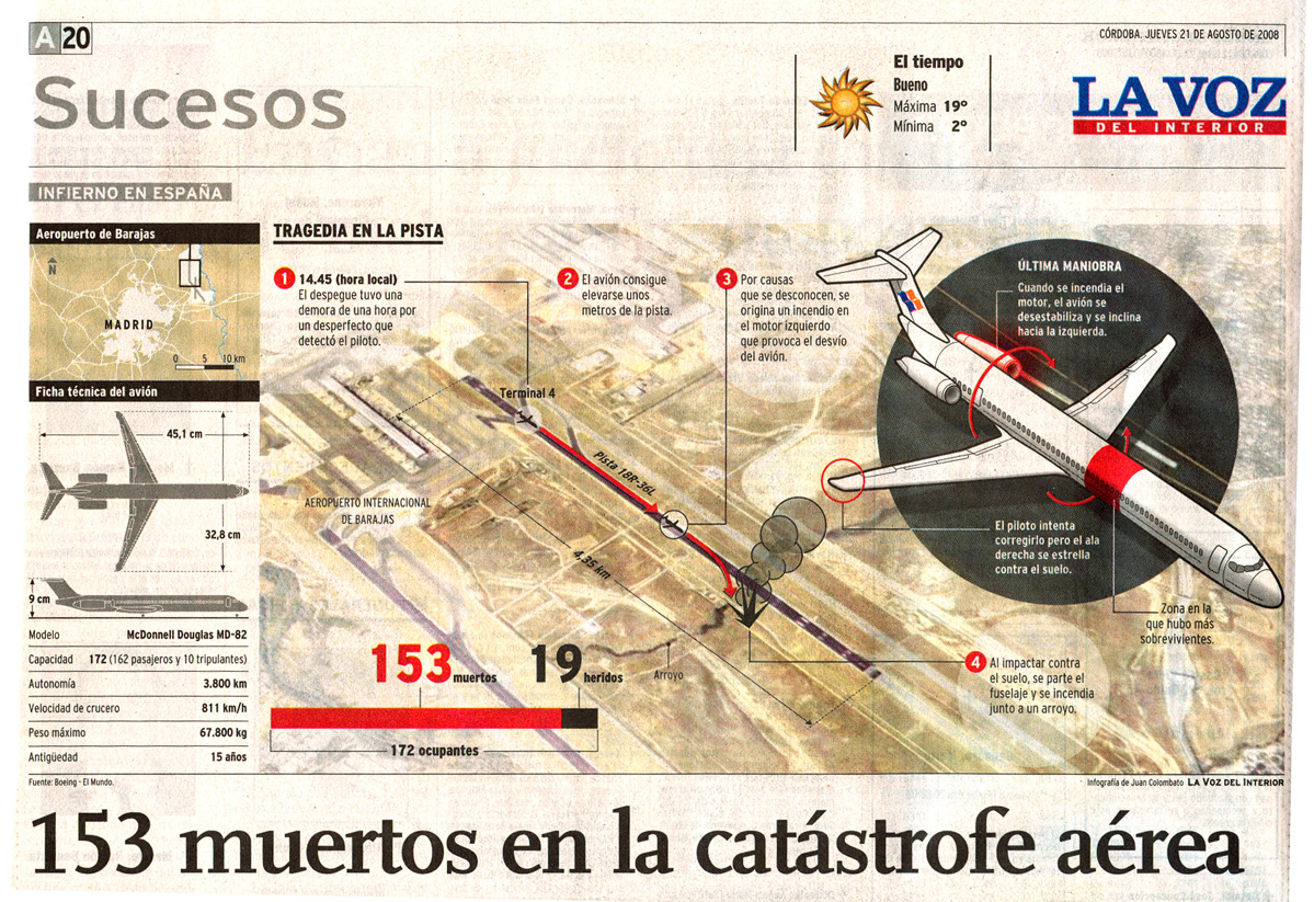
Juan uses to collaborate with this blog (which I thank him a lot). Last year he sent an example of what they did on teh Barajas plane crash.

I also have to tahnk him the article he wrote about Fernando Rubio's death (in spanish), one of the big ones of infographics who passed this week. By the way, I seize the opportunity to let you know that this edition of Malofiej is showing some graphics by Fernando on an exhibition at the World Summit. Also, Juantxo Cruz, director of infographics at El Mundo has published some early works by Fernando Rubio on his blog.


And tomorrow Superdeporte (Spain)


Share

What would you send to Malofiej? (XI): New Scientist


New Scientist is an international magazine about... science, obviously. Its infographics editor, Nigel Hawtin, sends some examples of what they are going to send to this edition of Malofiej.


As you could see, in this magazine the imoportant thing is not the spectacularity, but the information in the graphics. With a smart style, the communication is very effective. No tons of data, but little 'pearls'.
And tomorrow, La Voz del Interior (Argentina)


Share

29/01/2010

What would you send to Malofiej? (X): La Prensa Gráfica, El Salvador


La Prensa Gráfica, from El Salvador, is a newspaper which have appeared in this blog several times. Óscar Corvera is the one who has chosen the graphics he is going to send this year to Malofiej 18. He also made his picks last year.

And now I let him talk: "These graphics were published in 2009. Between the chosen ones there's multimedia telling the story of the murder of a child ten years ago, but people form El Salvador still remember it.


The other ones were for the print version, made individually or by the three infographics journalists of the team tohgether".

An tomorrow, New Scientist (UK)


Share

28/01/2010

Fernando Rubio


When Fernando Rubio began making infographics in Spain, I was starting school. Maradona, argentinian as him, haven't succeded at the Soccer World Cup of Mexico yet. Just with that data you can explain how important Fernando has been for spanish infographics. He was one of the ioneers, he started walking the firsts steps. He has been also a very kind person, somebody you could talk to and learn. I met him first when I was studying at the University of Navarre, as staff in Malofiej. By them Fernando had been 14 years working as chief of infographics at ABC. He was a myth. He looke dlike a hero for me. He and others like Tomás Ondarra, Mario Tascón, Rafa Höhr, Rafa Estrada, Juantxo Cruz, Pablo Ramírez, José Juan Gámez... That was many years ago. But every Malofiej, or almost all of them, from then, I could chat with Fernando at the bar of the Jumping Jester (or the 'official' pub on each Malofiej), where we really learnt.
The last time I saw him was this november in Córdoba. There I wa, with him and som of those 'heros': Tomás Ondarra, Javier Sicilia, Ulises Culebro, Jaume Serra... I didn't have much contact with them before. Some fast chats at Malofiej. Not much more. And when I went to the train station to go to Córdoba, I met Fernando there. She was with his wife, Adriana. We started talking while we were waiting. We have seats on different coaches. But he offered me a seat by his side, along with Ulises. And then I remembered the Malofiej days when I knew Mr. Fernando Rubio, the big chief of ABC. And those days he talked to me and treated me as I was a friend from all his life, not just someone you know. When I came back from Córdoba I could consider him a friend. So today, when I knew he has passed, I felt that I was losing a friend. And one of my heros in this thing called infographics.

Others remembering Fernando:

- Michael Agar (english)
- ABC

What would you send to Malofiej? (IX): Pedro Jiménez, El Mundo (Valencia)


El Mundo is one of the newspapers which cares the most about infographics. So you can explain that Pedro Jiménez is working for its Valencia edition. Meanwhile other national newspapers don't have infographic journalists on their editions, El Mundo has this 'deluxe' worker for one of them.


He send me this three graphics as the best of his year.

And tomorrow, La Prensa Gráfica, from El Salvador

27/01/2010

Infographics journalists have future


According to indeed.com. Via @joegraphics


Share

What would you send to Malofiej? (VIII): El Universal (Venezuela)


Mnay of you know Nicolás Ramallo for his work at El Universal (Caracas, Venezuela) and for his blog, Haga clic para continuar. He has sent a great selection of graphics they are sending this your to Malofiej.


El Universal uses to win some awards every year, almost in the last ones. And they deserve it, as you could see.


They are sending this year 20 features, 1 promotional and 3 one-column infographics to Malofiej. And also a portfolio with some works they did for an special issue fro their 100 anniversary. Those graphics will also be separtae entries on their own categories.


There's not much more to say. Show, don't tell...


This one was published on yje frontpage the day of the elections in Venezuela...


And these two were published in vertical...


An tomorrow, El Mundo (Spain, Valencia edition)


Share

26/01/2010

Visual Curriculum


Some days ago Leif Steen sent me this visual CV made by himself. As you could notice, it's inspired by the graphic winner of the last Peter Sullivan award, The Ebb and Flow of Movies, by The New York Times, very similar to its print version.

This remind me some graphic curricula I saw some weeks ago. One of them was at ColourLovers, this one by Greg Dizzia.


This curriculum is also available at Jumping Jester infographics, Aníbal Maiz's blog. There you can also find this opther example, by Jonathan Kaczynski:


Aníbal, found it at another blog, Isopixel, which writes about 30 creative curricula. One of them, this one by Michael Anderson.

But, who really summarized this 30 CVs was webdesignerdepot.com. And here they are. This one is one of them.

What would you send to Malofiej? (VII): The Globe and Mail (Toronto, Canada)


Ninian Carter is sDeputy Graphics Editor ar the canadian newspaper The Globe and Mail. He is the one who has sent this graphics made in 2009.


The style of this graphics is the style I grew with. The style I learnt and I always tried to imatate when I was starting in this world. Vectorial, isometric, the red arrow... Classic, but not old.


There's a very clear spanish referral: Rafa Estrada.


Anyway, don't wait for this graphics in the Malofiej books. Ninian won't send them to the awards. And this is one of the main points why I started this section. To be able to watch and show these infographics.

And tomorrow, El Universal, from Caracas, Venezuela.


Share

25/01/2010

National Geographic is much more than megagraphics

We all know that the infographics department of National Geographic is one of the best infographics departments of the world. We all know their spectacular graphics, very ellaborated, posters or with magnificent illustrations. But National Geographic is much more than jus that. Her you are two examples. The first one won a silver award at Malofiej last year. Who studies where?.


The second one, sent by José Marín, is called The Cost of Care.


Charts rather than infographics. Great ones.


Share

What would you send to Malofiej? (VI): El Heraldo (Barranquilla, Colombia)


Johan Romero, head of infographics at El Heraldo, from Barranquilla (Colombia), send this graphic as an example of what they are going to send to this edition of Malofiej. A clear example of the southamerican style: paper texture background, illustrations, schemes and photographic details. El Heraldo won a bronze last year, so this should be its year of confirmation. Good luck!

And tomorrow, The Globe and Mail (Canada)


Share

24/01/2010

What would you send to Malofiej? (V): Universidad de Santa Catarina (Brazil)


Malofiej is not just for professional media. The academic world is also a great place to look at when we talk about infographics. The students from Chapel Hill have already been awarded several times on infographics competitions. This time, Tattiana Teixieira, professor and researcher at the Universidade de Santa Catarina in Brazil, sends some infographics produced in the academic activity of her university. The graphic opening this post was made by the journalism student Rogério Moreira Júnior, with the orientation of professors Sandro Galarça and Tattiana Teixieira.


This second graphic was made by Diego Kerber (Journalism) and Grégorio Bacelar Lameira (Graphic Design), under the orientation of Galarça and Teixeira. Was published in the magazine Zero, a publication of the Universidade de Santa Catarina.

Many thanks to professor Teixeira for sending this graphics, adn remember that you don't need to publish on media to send something to this section.

And tomorrow, El Heraldo, from Barranquilla (Colombia)

23/01/2010

What are you sending to Malofiej? (IV): Grupo Apoyo, Peru


Robinson Choquetaype is Chief of Graphic Development and Infographics of the peruvian Grupo Apoyo. This group publishes Perú Económico and Semana Económica, the magazines where the graphics shown on this post were published (the next one, in english!)


This graphic is part of a section called Cholonomics, Robinson expains the name:

In this section of Perú Económico we try to show visually the different ways of working of men and women who do a living inventing and reinventing their jobs. THe information used come 100% from face to face researching, no theories, no elucubrations with data. Then comes the visual part. Representing this reality respecting its color and shape, showing the native way, the 'cholo' and the 'chicha', the way we call something very typical from Peru, but keeping the infographic sense: organization, data analysis and use of color. The idea behind Cholonomics% is to tell stories about business or microbusiness and their own starrings. CHOLO + NOMICS%


Peru is a very intersting place for infographics. Not just for Robinson Choquetaype, take a look also to El Comercio or Xabi Díaz de Cerio's business, Fábrica de Ideas (Ideas factory).

Teh explanations of the nexts graphics, also by Choquetaype


The beauty of Amazonas is not just a synonym of wild life and undiscovered vegetation, is also an important transportation way btween the countries besides its shore, keeping together both Atlantic and Pacific side of America. Hundreds of people navigate everyday on this highway on huge ships, for business or for meeting their families. On the peruvian amazonia there is no direct roads to Lima. Iquitos, the main city of the jungle is almost an island, you just can reach it by plane or ship (which is cheaper), so the river has a big social and strategic importance for trade. This infographic tries to make the reader understand that business, that way of transportation and another potentiality of the inmense Amazonas. To get all the information and direct sources for the graphic, I flied to Iquitos ant the next day I was on the biggest peruvian amazonian ship, with space for 250 passengers and able to transpor 2200 TN of cargo.


Water is a high value resource… also on the economic kind, and more for those who live on the tops of the hills around Lima. And they are not just a few.With 28 million people in Peru, just the 20% of them have potabe water service.
We look through this socioeconomic problem to know better the business behind the sale of water in tank trucks (2 'soles' for a 200l. cylinder), the daily work of the 'aguateros' (people who work in this job), and all the workflow, but also behind the starrings: the population affected by the lack of water and all the risks (with no other choice) paying for water, not always well purified.
Cholonomics also made a comparison between Lima and other big Latin American cities, such as Rio de Janeiro and Santiago. The result: Lima is a desert.

And tomorrow, the journalism studentd of the Universidade Federal de Santa Catarina (Brazil). We have to think also in the young values, the infographics journalist of a close future.


Share

Share

22/01/2010

What are you sending to Malofiej? (III): The Daily Telegraph, United Kingdom


Ciaran Hughes, infographics journalist of Telegraph Media Group, sends his five choices of infographics made in 2009 on his newspaper that he would (or will) send to this edition of Malofiej.


All of them are works for the London based newspaper The Daily Telegraph, one of the largest and most important newspapers of United Kingdom.


The 'capo' of the infographics zone is Michael Agar, you might have heard about him in this blog. About him and his own blog iGraphics Explained.


Personally, I love the direct style of these graphics and all of the infographic works of the Telegraph. No fireworks, great use of colors, they tell exactly what they want to tell... Great. One piece of that new english-style we can also see at The Guardian or The Independent (and its Sunday edition IoS).


Good luck for Ciaran, Michael and all the team of the Telegraph!

P.D. Ciaran uses to delight his Facebook contacts with a new musical video each day. I finsh this post with one of them, from one of my favourites bands...


And tomorrow... Peru Economico


Share