

El Correo (Bilbao, Spain), was famous all around the worl by it hand drawing style. They used the illustrations on graphic like no one, and on breaking news too. The example shown is about a spanish militar plane that crashed i Turkey.
The southamerican infographic style has much of illustration on it. One of the big exponents of it was, anyway, the spanish Jaume Serra, who created an era on his time at Clarín.

The graphic of the whale is still chasing Jaume...
But we have the opposite way. Fernando Rubio, head of the infographics department at the spanish newspaper ABC, came from Argentina with his great illustration skills. You can take a glance of it on his blog.
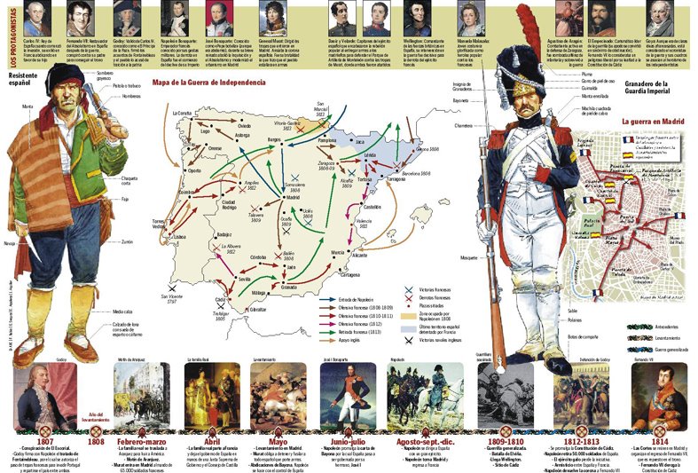
The spanish independence war as Fernando Rubio drew it.
From the same place arrived to our peninsula also Fernando Robato, now working at the sports newspaper As.
Robato is the paradigm is that southamerican style: textured background, central illustration and many explanations with small details.
But we also have our own product in Spain. Many of our infographics journalist are also great at illustrations. Tomás Ondarra, the ruling hand of El País infographics department, is also the hand that draw the illustrations for the opinion pages on teh main spanish newspaper. Emilio Amade, from El Mundo, also uses the pencil many times to illustrate his graphics with great examples. As Julián de Velasco did at Marca and now keep doing for Focus Ediciones. Julian has two blogs with his examples: Illustrations infographics and El mundo bélico.
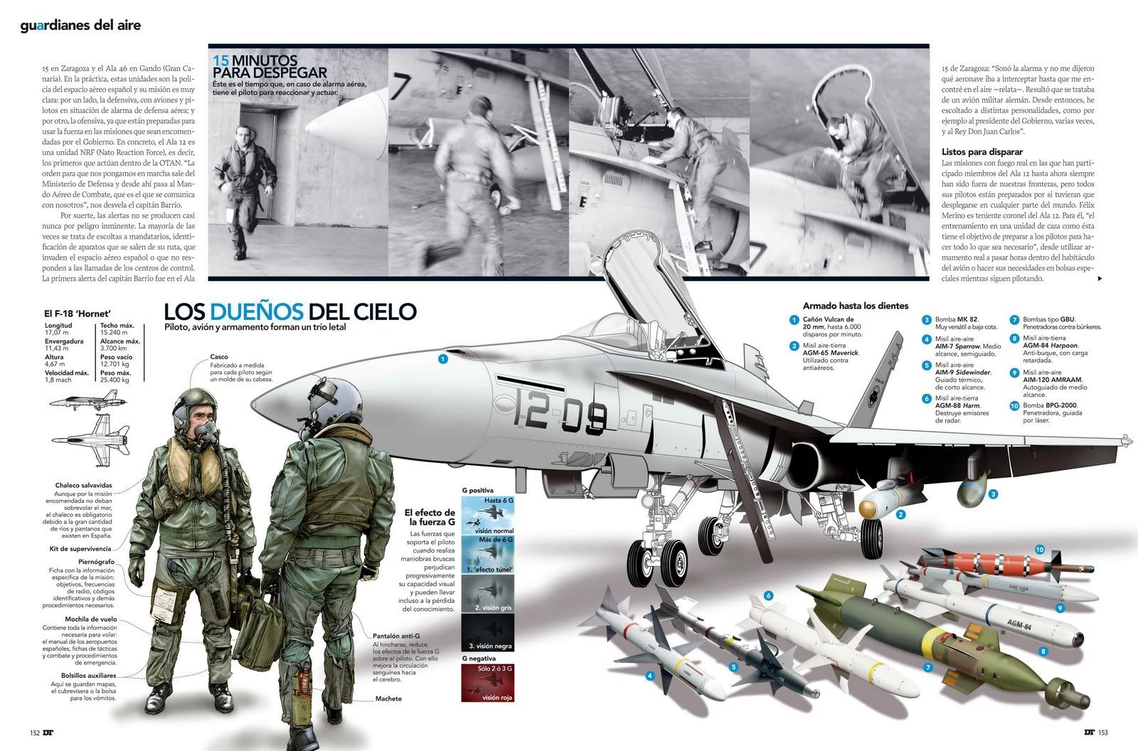
El F18 y sus pilotos, para la revista DT. Julián de Velasco.
But I must confess that one of my favourite illustrator-infographics journalists is Gabi Campanario, who works for The Seattle Times and blogs on Seattle sketcher. And this part of his jobs is which I like the most: the fast drawings on Moleskine, which are a kind of graphics by themselves, with all the explanations of his daily life.
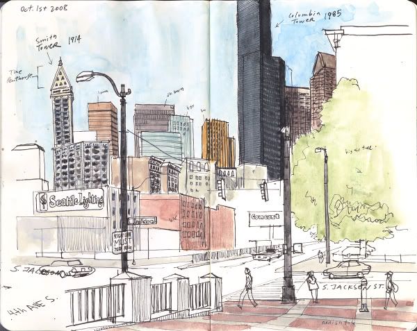
One of his jobs, with some facts on it.
And we also have my colleague at Público Álvaro Valiño, whose illustartion style is more conceptual, but who also havs a good hand for drawing when we wants to use it. He's a great illustrator and a fantastic infographics journalist, but he don't mix these two things usually. The other people of the department, Mónica and Miriam, have also great skills for hand drawing, so I'm the fool of the department...


Some 'Valiñadas', as we called them onour former newspaper La Voz de Galicia. These are some of the most hand-drawed. More examples on alvarovalino.com.
But this happens too on online infographics. Just take a look to some of health graphics that Xocas produced on elmundo.es, with some high quality heirs as Artur Galocha.

Click on image to access the online graphic
And others illustartors-infographics artists that come to my mind at the moment...
- ABerrocal
- Lizzeth Huerta
And so many more...
2 comments:
thanks for your article
(and the entire blog BTW)
France is where I work, and it's more like the opposite : use a photography in an infographic could cost you comments as "if it's an infographic it has to be drawn !". Not exactly the best way to think simple.
At the other hand, many graphists concider it's not useful to know how to draw ; somes are even afraid someone would ask to hold a pencil !
In production, draws could get the greatest illustrations , like the samples you shown — these are the best it can get.
But for daily work, it's essential, basical ! Very often a student ask me if it's important to draw to do my job, I answer it's not necessary to know how to write to create a poem — but damn it's useful.
Great posting. I've seen lots of drawing heavy infographics on SND and am pretty amazed at the talents in Spain.
The feel of using drawings in infographics really depends on what the graphic is trying to bring across.
Thanks for posting the links to the artists' websites. It's a great resource!
Post a Comment