Share
I was hired by lainformacion.com two years and a half ago, a just-online young information site in Spain. I came from Publico, a print national newspapers. My task at lainformacion.com was leading the New Narratives Department. I could call it the infographics department, but the concept it's wider than that.
By then, I always had thought than infographics were very useful for readers, give very good image to the media and helped to build that scarcity that made people buy one newspaper and not another. What I didn't knew and was about to discover, is that infographics could become so important for media, not just in terms of quality, journalism and image, but also in visits and time in page.

Showing posts with label Infographics departments. Show all posts
Showing posts with label Infographics departments. Show all posts


11/06/2011
iGraphics, an independent greek infographics agency
Tweet Share

Dimitris Kabitis, Galatsidis Achileas (both former Eleftheros Typos) and some other journalists and designers have released iGraphics, the first independent greek infographic agency according to themselves.
They create print and online information graphics, and they have even translated some of them to english. From here, good luck!

Dimitris Kabitis, Galatsidis Achileas (both former Eleftheros Typos) and some other journalists and designers have released iGraphics, the first independent greek infographic agency according to themselves.
They create print and online information graphics, and they have even translated some of them to english. From here, good luck!
06/06/2011
Do you want to work in Dubai?
Share

Al Bayan and Emirates 24/7 are two Dubai newspapers with a very good infographics department. The peruvian Luis Chumpitaz leads a great and heterogeneus team, showing every day the quality of their works, winning international awards on each contest they participate.
Now, SND jobs announces two information graphic designers positions in their team. They ask for someone who can talk in english or arabic, with journalistic background. They are also looking for two online developers (AS3-HTML5) and one digital illustrator.
So, if you feel attracted by working in Emirates, with am award-winning team in two quality newspapers, this is your chance.

Al Bayan and Emirates 24/7 are two Dubai newspapers with a very good infographics department. The peruvian Luis Chumpitaz leads a great and heterogeneus team, showing every day the quality of their works, winning international awards on each contest they participate.
Now, SND jobs announces two information graphic designers positions in their team. They ask for someone who can talk in english or arabic, with journalistic background. They are also looking for two online developers (AS3-HTML5) and one digital illustrator.
So, if you feel attracted by working in Emirates, with am award-winning team in two quality newspapers, this is your chance.
04/04/2011
Infographics at La Vanguardia
Tweet Share
I've talked about the infographics department of La Vanguardia before on this blog, about this catalonian newspaper hired Jaime Serra as head of infographics. I've talked about the blog of the department, Jaime's blog, some awards they got in Malofiej, its redesign, some historic infographic...
Here's just some examples of the kind of things they're doing at the moment as I've done with other infographics departments.
The head of graphics, as I was telling before, is Jaime Serra, who became famous leading the infographics department of the argentinian newspaper Clarín doing some famous stuff as the whale graphic or the one of the bread. Always tryning to innovate and give more tha news to the readers, Jaime publish now a visual column in the newspaper
(Clic on images)

Along with Jaime works as deputy graphics director Josep Ramos, and the rest of the departemnt are Raúl Camañas, Alan Jürgens, Rosa Mª Anechina, Jordi Bagué, Anna Monell, and very usual collaborations by the illustrator Oriol Malet And, as a team, they produce works like this one of the Sagrada Familia, something important for a newspaper from Barcelona.

And talking about Barcelona... What a soccer team! Here you have a comparison of its stars with the Real Madrid ones.


And one extra, this magazine double spread. Infoat a glance: How big is that ship? Place it on Paseo de la Castellana, one of the most famous streets of Madrid and you'll know...

I've talked about the infographics department of La Vanguardia before on this blog, about this catalonian newspaper hired Jaime Serra as head of infographics. I've talked about the blog of the department, Jaime's blog, some awards they got in Malofiej, its redesign, some historic infographic...
Here's just some examples of the kind of things they're doing at the moment as I've done with other infographics departments.
The head of graphics, as I was telling before, is Jaime Serra, who became famous leading the infographics department of the argentinian newspaper Clarín doing some famous stuff as the whale graphic or the one of the bread. Always tryning to innovate and give more tha news to the readers, Jaime publish now a visual column in the newspaper
(Clic on images)

Along with Jaime works as deputy graphics director Josep Ramos, and the rest of the departemnt are Raúl Camañas, Alan Jürgens, Rosa Mª Anechina, Jordi Bagué, Anna Monell, and very usual collaborations by the illustrator Oriol Malet And, as a team, they produce works like this one of the Sagrada Familia, something important for a newspaper from Barcelona.

And talking about Barcelona... What a soccer team! Here you have a comparison of its stars with the Real Madrid ones.

In this time full of data visualizationss, La Vanguardia keeps doing a terrific job with illustrated classic infographics. With such quality as these ones of the Solomon Temple or How volcanoes work.


Sometimes with an schematic style, like this one about the path of suitcases in El Prat airport.

And the difference sometimes comes by the topic. This one, about the Rubik cube.

And one extra, this magazine double spread. Infoat a glance: How big is that ship? Place it on Paseo de la Castellana, one of the most famous streets of Madrid and you'll know...

06/02/2011
World Map of Infographics journalists. Second round.
Tweet Share
Some time ago I started a map showing infographics journalist and departments around the world. It was an open collaborative map, and somebody deleted the data and add oil companies in the south of Spain. I guess it was a mistake, but I lost all the information.
Well, let's try again. Unfortunately, this time it won't be a open map. It's closed and I'm the only one who can update it (although I can give collaborator invitations to those interested). So, if you want to be on the map, just send me an email or write a comment in this post. I will add you to the map. Once it will have enough content, I will publish it on a static place in this web. It's Google Maps, so you can take it to your web too.
The map will show professionals related with infograhics on five different categories:
- Print infographics departments (blue)
- Interactive infographics departments (red)
- Integrated infographics departments (green)
- Freelancers or business (yellow)
- Teachers (purple)
At the moment, I just have some spanish departments and professionals, as a test. I will update it daily, but please be patient. I'm waiting for your maisl and comments. And if you want to be collaborator, just ask me.
Ver Infografistas/Infographic journalists en un mapa más grande
Some time ago I started a map showing infographics journalist and departments around the world. It was an open collaborative map, and somebody deleted the data and add oil companies in the south of Spain. I guess it was a mistake, but I lost all the information.
Well, let's try again. Unfortunately, this time it won't be a open map. It's closed and I'm the only one who can update it (although I can give collaborator invitations to those interested). So, if you want to be on the map, just send me an email or write a comment in this post. I will add you to the map. Once it will have enough content, I will publish it on a static place in this web. It's Google Maps, so you can take it to your web too.
The map will show professionals related with infograhics on five different categories:
- Print infographics departments (blue)
- Interactive infographics departments (red)
- Integrated infographics departments (green)
- Freelancers or business (yellow)
- Teachers (purple)
At the moment, I just have some spanish departments and professionals, as a test. I will update it daily, but please be patient. I'm waiting for your maisl and comments. And if you want to be collaborator, just ask me.
Ver Infografistas/Infographic journalists en un mapa más grande
23/01/2011
A spaniard making infographics in China
Tweet Share
Xan Sabarís was until last year the head (and only member) at the infographics department of Diario de Pontevedra, a local newspaper in the northwest of Spain. He had worked previously for another newspapers of the Vocento group (which owns ABC, El Correo and others) and La Voz de Galicia. He was publishing really good stuff in Pontevedra. But in 2010 he was hired by a chinese neswspaper, China Daily , based in Beijing and where Bill Gaspard, former SND president, was the Art Director. These are some of his works there.


"Apart from me, there are three chinese guys in the department. Thay make graphics, but also layouts pf the pages.
Maybe the best word to explain how is working here is 'rough'.
I don't speak or read chinese (but in the newspaper people speak english), and the rythm of work here is very different form the spanish one, at least where I've worked before. We can say China is quiet..."


Xan Sabarís was until last year the head (and only member) at the infographics department of Diario de Pontevedra, a local newspaper in the northwest of Spain. He had worked previously for another newspapers of the Vocento group (which owns ABC, El Correo and others) and La Voz de Galicia. He was publishing really good stuff in Pontevedra. But in 2010 he was hired by a chinese neswspaper, China Daily , based in Beijing and where Bill Gaspard, former SND president, was the Art Director. These are some of his works there.

I asked him a little text explaining is work in a chinese newspaper, how is working in such a different culture and way of working. And these are his words:

"Apart from me, there are three chinese guys in the department. Thay make graphics, but also layouts pf the pages.
Maybe the best word to explain how is working here is 'rough'.
I don't speak or read chinese (but in the newspaper people speak english), and the rythm of work here is very different form the spanish one, at least where I've worked before. We can say China is quiet..."

"The biggest problem is the lack of information. When you need to go further you need speak, most times, with sources abroad.
An advantage is that people is open to new ideas and they take risks. Few newspapers in Spain (maybe none) would risk, not being a special event, to use one of the firsts pages of the newspaper for a big infographic (the one about the skyscrapers)."
An advantage is that people is open to new ideas and they take risks. Few newspapers in Spain (maybe none) would risk, not being a special event, to use one of the firsts pages of the newspaper for a big infographic (the one about the skyscrapers)."


"Following the sentences you published some posts ago, here's a chinese one:
I don't remember what was the information about. It was an evolution, year by year, of something. But in all years the values were around 50, and then, one year, it grows to 100, and then the next year comes back to 50.
Me: "What happened here?"
Writer: "Ummm… Dont' know. Doesn't matter, that's not the story".


Here you have some works by Xan and his team. Congratulations to him and all his team.


12/01/2011
Nine sentences I've heard being working in newspapers
Tweet Share
Some days ago Clases de Periodismo interviewed me and used one of my sentences for the headline:
“Infographics journalist are often more rigorous than writers".
Some of my writers colleagues have shared with me their disapproval, something I, sincerely, knew that would happen. Of course, this is said ina certain context and is not always true, it's just a generalization. What I wanted to explain is that most of infographics is not treated like information bu writers in many newspapers, meanwhile infographics journalists try to do a journalistic job.
To 'justify' someway this sentence, here you are some examples of sentences I've herad in my short career (here are the sins, but not the sinners):
- "If we would have to check the data there would be no newspapers"
- We have to explain how the bathyscaphe is
- And how it is?
- I don't know, just draw a bathyscaphe
- Infographics journalist: "I need one more year of data"
- Writer: "Just put a little more than the previous year"
- We've got to do a graphic about "...", but we have no data at all.
- Writer (after a detailed explanation): "And that is the way the attack happened"
- Infografista: "¿And who is the source"
- Redactor: "Don´t put a source, I'm guessing, but don't worry, I'm pretty sure it was that way"
- "I know that's the real data, but it's not very spectacular... Can't we exaggerate a little?"
- Writer: "If we use the actual data... it's very far from ..."
- Infographics journalist: "But they are very far, that's the information indeed"
- Redactor: "I know, but I think it's better if they're closer"
Some days ago Clases de Periodismo interviewed me and used one of my sentences for the headline:
“Infographics journalist are often more rigorous than writers".
Some of my writers colleagues have shared with me their disapproval, something I, sincerely, knew that would happen. Of course, this is said ina certain context and is not always true, it's just a generalization. What I wanted to explain is that most of infographics is not treated like information bu writers in many newspapers, meanwhile infographics journalists try to do a journalistic job.
To 'justify' someway this sentence, here you are some examples of sentences I've herad in my short career (here are the sins, but not the sinners):
- "If we would have to check the data there would be no newspapers"
- We have to explain how the bathyscaphe is
- And how it is?
- I don't know, just draw a bathyscaphe
- Infographics journalist: "I need one more year of data"
- Writer: "Just put a little more than the previous year"
- We've got to do a graphic about "...", but we have no data at all.
- Infographics journalist: "So, in order to explain the accident, I need to know where was the car, where the truck, how they crashed..."
- Writrer: "Do we need to know all that? No, no, just draw a crash"
- Writer (after a detailed explanation): "And that is the way the attack happened"
- Infografista: "¿And who is the source"
- Redactor: "Don´t put a source, I'm guessing, but don't worry, I'm pretty sure it was that way"
- "I know that's the real data, but it's not very spectacular... Can't we exaggerate a little?"
- Writer: "If we use the actual data... it's very far from ..."
- Infographics journalist: "But they are very far, that's the information indeed"
- Redactor: "I know, but I think it's better if they're closer"
And the best one...
- "I don't mind the data, but I said just the opposite in my article, so change the graphic or jus delete that data"
Don't worry, all of this problems were solved (not without big fights).
All of these are things are own experiences or I've been hearing by myself.
UPDATE
Some suggestions:
@albertocairo: "Our reader is idiot"
@ikimartinez: "Do the graphic with balls. It's the fashion now"
UPDATE
Some suggestions:
@albertocairo: "Our reader is idiot"
@ikimartinez: "Do the graphic with balls. It's the fashion now"
29/05/2009
i from infographics


Some weeks ago was released in Portugal a new print newspaper (yes, print!), called just i. It's a new InnovAtion project with Sojormedia, where I had a little participation.
But let take a glance to some infographics...


There are two visual journalists in the department: Carlos Monteiro and Ricardo Santos, both form the portuguese newspaper '24 Horas'. The style of infographics follow the general design created by Javier Errea: no fireworks, modern, compact, with cromatic impact but smart. And the Innovation spirit: "newspapers must be daily magazines", as Juan Antonio Giner says.


19/05/2009
National Geographic draws in spanish

I wrote yesterday my first article for 233 grados,the communication blog of Diximedia, editor of lainformacion.com, where I work now. I write about the spanish spekaers of the National Geographic infographics department, that are 4 out of 6 (Juan Velasco, Alejandro Tumas, Fernando G. Baptista and Hiram Enríquez).
The article is wrote in spanish, but here you are some words translated. Anyway, you always can read the complete article
"(The infographic boom of the 90s) created (in Spain) a legion of infographics artists, some of them really good. That was unusual in other places, Spain took advantage of that situation created in the newspapers and got an accumulated empiric knowledge before than the rest of the world"
Alejandro Tumas
About the process to create a graphic for the magazine:
"We have continuous meetings all along the process, with opinions of a lot of people. At the end, we make color tests and refine the design to the most imperceptible detail".
Fernando G. Baptista
07/10/2008
Infographics departments around the world: RCS Quotidiani, Italia (Corriere della Sera, La Gazzetta dello Sport)
Working on an infographics department in Italy is hard. Not just because you would prefer being on the streets, staring the monuments or eating pasta with Lasmbrusco. The proble is that the people that work on these departments are not considered journalists, and writers and editor take decissions about the way the graphic is done. We complain a lot about this kind of things in Spain, but we must recognize that the problem is much bigger in Italy.
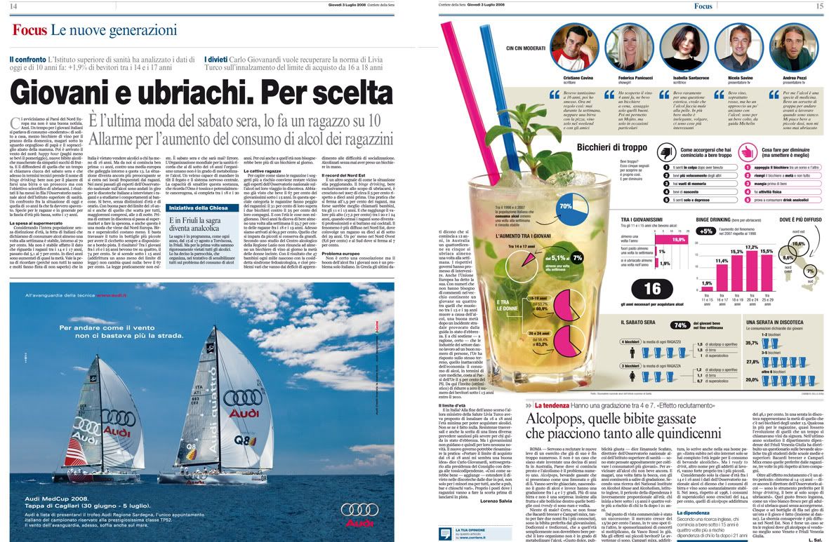
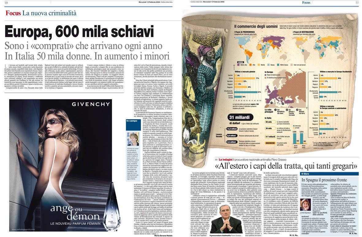
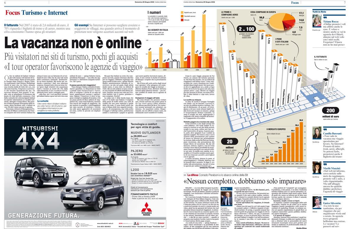
Anyway, some people manage to do some good things despite all these problems. Even winning some international awards. This happens on RCS, the most important journalistic enterprise of Italy. The departed, commanded by Marcello Valoncini, is on charge of the infographics for Corriere della Sera (the biggest political newspaper of the country) and La Gazzetta dello Sport (the biggest sports newspaper too). Marcello has, on his own words, a young and motivated team. And now, I let him speak:


Our department has 15 people on the infographics staff, fr both newspapers. We work on different shifts to cover form 14.00 to 01.30. We have three great illustrators and the rest of the department has a good creatve capacity. We don't work for the web, so our works can't be watched online.
As you could understand, this is going one step behind the spanish or american newspapers.


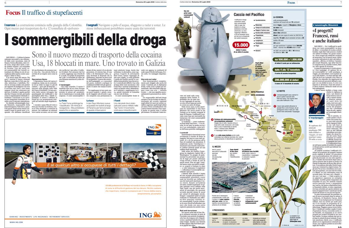
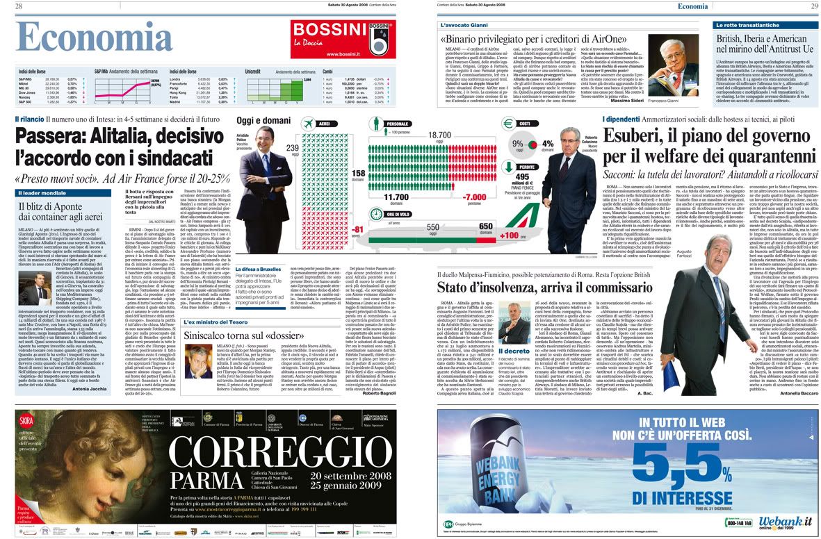
From 2005, Corriere della Sera (founded at 1876) arrives to the newsagents with a full color edition, which have meant big changes on our traditional newspaper, which is more than 130 years old: we changed the page format, the fonts and the text size. A new font has been created, the Solferino, exclusive for us. The pagination has been also absolutely changed. We've created a new section, with in-deep features, called 'Focus', where graphics have a big importance. Readers have liked it very much.


La Gazzetta dello Sport (founded at 1896) has also suffered a big transformation this march: new format, smaller, new pagination and new fonts too. I personally creatd a style handbook for the sports newspaper. It could help to keep the same style on different graphics.


And, as signature of the graphics here shown, here you are all the people that works on RCS infographics department:
- Marcello Valoncini (Chief of infographics)
- Pierluigi Serena (Deputy chief)
- Andrea Venier (Deputy chief)
- Sabina Castagnaviz (illustrator)
- Nicolas Vargas (illustrator)
- Dario Arcidiacono (illustrator)
- Marco Maggiori
- Ade Rana
- Cristina Pirola
- Sara Caffulli
- Franco Sturino
- Franco Amici
- Massimiliano Aliberti
- Roberto Sotera
- Gianfranco Giudici

Anyway, some people manage to do some good things despite all these problems. Even winning some international awards. This happens on RCS, the most important journalistic enterprise of Italy. The departed, commanded by Marcello Valoncini, is on charge of the infographics for Corriere della Sera (the biggest political newspaper of the country) and La Gazzetta dello Sport (the biggest sports newspaper too). Marcello has, on his own words, a young and motivated team. And now, I let him speak:
Our department has 15 people on the infographics staff, fr both newspapers. We work on different shifts to cover form 14.00 to 01.30. We have three great illustrators and the rest of the department has a good creatve capacity. We don't work for the web, so our works can't be watched online.
As you could understand, this is going one step behind the spanish or american newspapers.
From 2005, Corriere della Sera (founded at 1876) arrives to the newsagents with a full color edition, which have meant big changes on our traditional newspaper, which is more than 130 years old: we changed the page format, the fonts and the text size. A new font has been created, the Solferino, exclusive for us. The pagination has been also absolutely changed. We've created a new section, with in-deep features, called 'Focus', where graphics have a big importance. Readers have liked it very much.
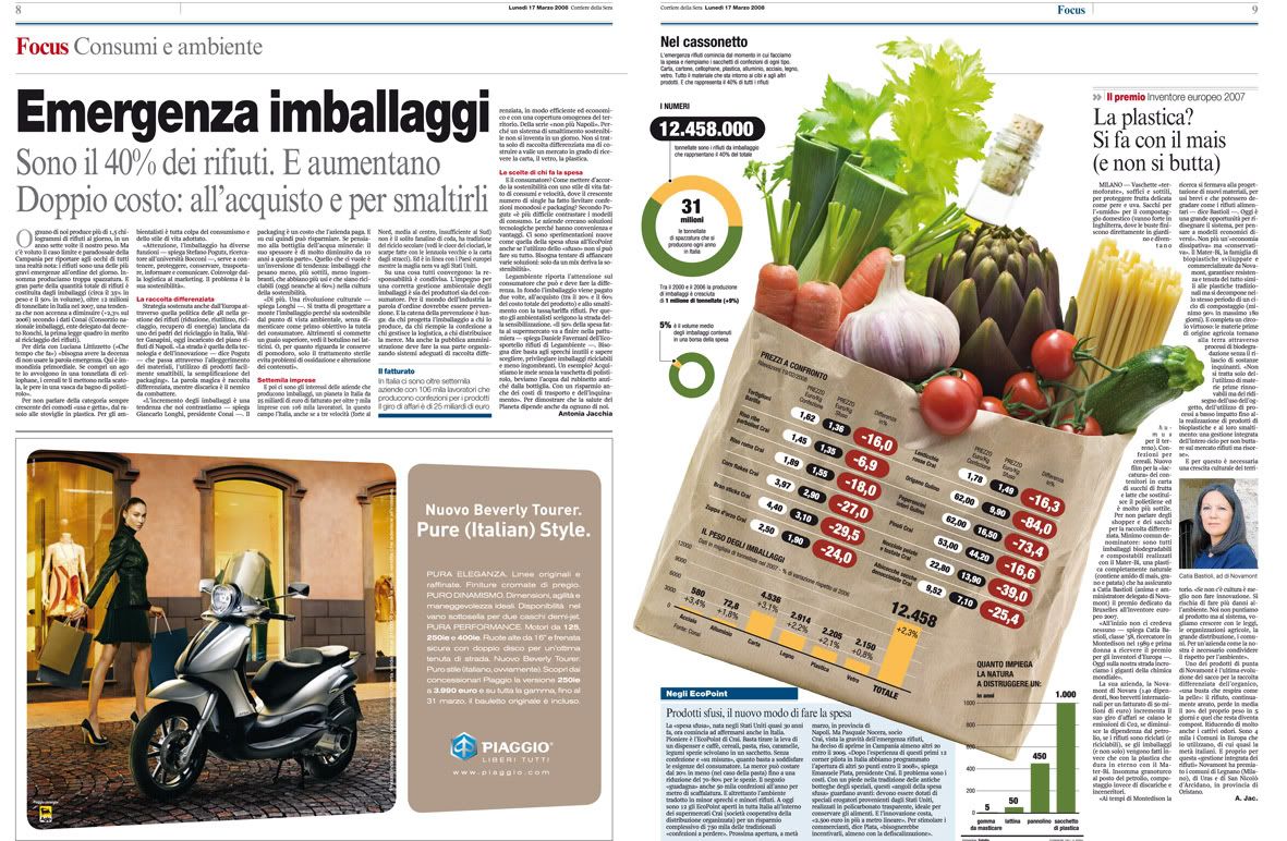
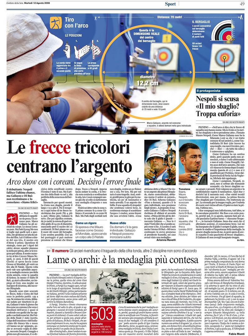
La Gazzetta dello Sport (founded at 1896) has also suffered a big transformation this march: new format, smaller, new pagination and new fonts too. I personally creatd a style handbook for the sports newspaper. It could help to keep the same style on different graphics.
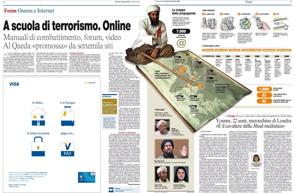
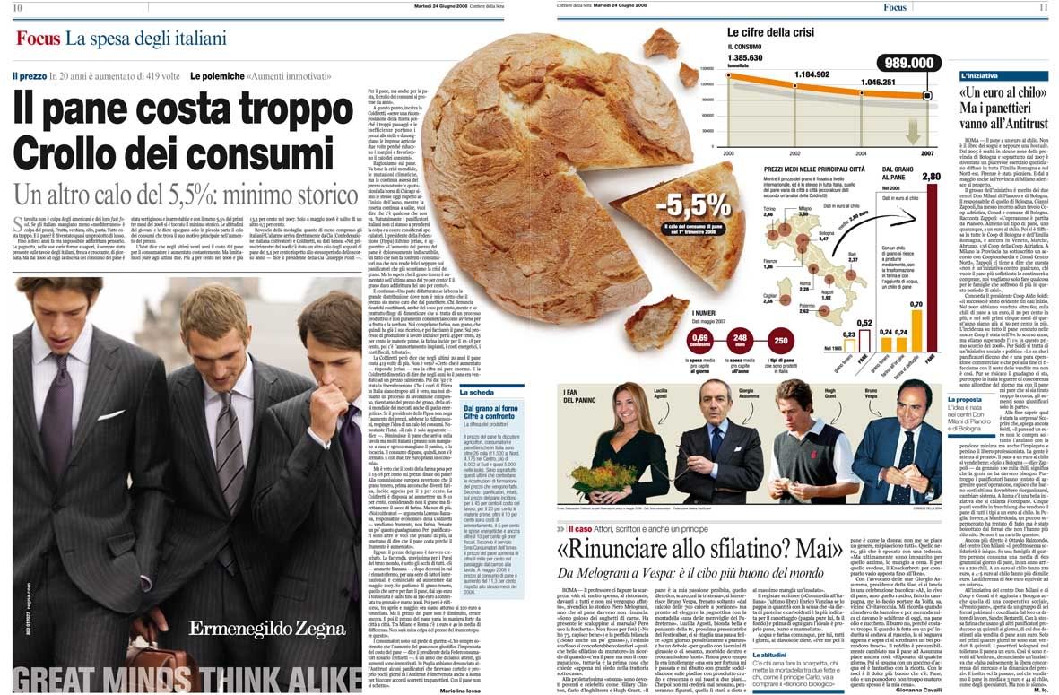
And, as signature of the graphics here shown, here you are all the people that works on RCS infographics department:
- Marcello Valoncini (Chief of infographics)
- Pierluigi Serena (Deputy chief)
- Andrea Venier (Deputy chief)
- Sabina Castagnaviz (illustrator)
- Nicolas Vargas (illustrator)
- Dario Arcidiacono (illustrator)
- Marco Maggiori
- Ade Rana
- Cristina Pirola
- Sara Caffulli
- Franco Sturino
- Franco Amici
- Massimiliano Aliberti
- Roberto Sotera
- Gianfranco Giudici
02/10/2008
Infographics departments of the world: Hufvudstadsbladet (Helsinki, Finland)
Hbl is a daily newspaper with a circulation of approximately 55000 and a geographical spread over the Swedish speaking areas in Finland, primarly along the coastline in the south and west. Since the transition to the tabloid format four years ago, Hufvudstadsbladet design has been awarded several times. The infographics department was during the last year granted awards by the European Newspaper Awards, the Finnish Newspapers Association and in the SND/S competition.
Overall the newspaper has been awarded Europe's best designed newspaper in the category 'local paper' by European Newspaper Awards and Best Redesign by SND International.
Here you are som examples of the infographics made by its team, formed by three members: Björn Heselius, Mikael Bobacka and Maija Hurme. And explained by one of them, Björn Heselius.

In this single page we wanted to open the eyes of the readers and inform them of what really happened to people that celebrated New Year's Eve exactly one year ago. Instead of doing it in a short article that most likely would have been read and forgotten just as fast, we made this gingerbread man, broke it's leg and neck, burned the hand and eye. Next to each injury we presented the numer of people that last New Years Eve lost their vision after being hit in the face by fireworks, broke their leg, were killed, suffered severe burns, reported domestic violence, were raped and (as we are in Finland) of course, how many liters of alcohol that was bought for the holidays. This visualisation was awarded by SND Scandinavia this year and for me personally it was also a way of saying that the infograpics artist not always need to draw, it's just as effective to bake the story.

We found out that among all employees of the Finnish parliament only one out of three is male, but among the members of the highest executive staff in the same organisation the men are in strong majority. The symbols indicate the number of men/women in the different offices, starting from the highest superintendents, continuing via supervisors all the way down to floor personnel. At the bottom of the graphics section we also compared different kinds of duty, salary and education for both men and women employed by the parliament.

Last summer we had an extraordinary intense period of thunderstorms. This spread originated in an idea of finding out where the lightning is most intensive in Finland. After getting all the information needed we started out by splitting the entire country into a grid of about 100 square kilometer per section. We calculated the exact number of lightning strikes for each section and it resulted in a map showing that the most lightning-intensive area was in the inland. In order to get a personal touch to the story we started looking for thunderstorm-chasers in the most intensive area and luckily found one! As a bonus we also explained the origin of thunder and lightning. This infographic was presented with an Award of Excellence in the European Newspaper Awards last year.

Instead of praising the growing business of biodynamic fuel we here show that the green alternative isn't really as world-saving as we might have believed. In order to produce one single car tank of biofuel you need the same amount of crops (corn and other grains) that would feed 365 people for a day. More than 850 million people suffer from malnutrition in the world. If 1,64 million people wouldn't fuel their car with biofuel once every week there could be enough food for the starving people.

Once a week we publish a home-section in the newspaper. This issue is on how to make the perfect home entertainment room and still being able to use the room for socialising. After consulting a interior designer and an architect we came up with this idea of taking a normal sized apartment and according to the experts' ideas redecorate the living room into a more suitable homecinema/living room. We also created two technical alternatives; one for the connoisseur that is willing to pay for the ultimate experience and one budget alternative.

In the greater Helsinki area there are two competing businesses who provide food to the elderly people who still live at home. We found out that those living in the city of Helsinki paid 34 percent more than those living in the suburbs for the same amout of food. Here showed by the number of meatballs elderly people get for 50 cents depending on what food service provider they have.
Overall the newspaper has been awarded Europe's best designed newspaper in the category 'local paper' by European Newspaper Awards and Best Redesign by SND International.
Here you are som examples of the infographics made by its team, formed by three members: Björn Heselius, Mikael Bobacka and Maija Hurme. And explained by one of them, Björn Heselius.
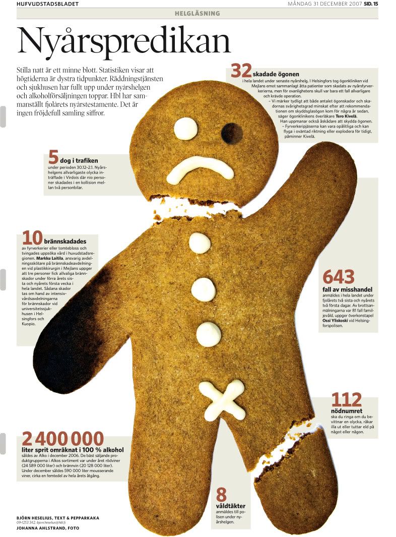
In this single page we wanted to open the eyes of the readers and inform them of what really happened to people that celebrated New Year's Eve exactly one year ago. Instead of doing it in a short article that most likely would have been read and forgotten just as fast, we made this gingerbread man, broke it's leg and neck, burned the hand and eye. Next to each injury we presented the numer of people that last New Years Eve lost their vision after being hit in the face by fireworks, broke their leg, were killed, suffered severe burns, reported domestic violence, were raped and (as we are in Finland) of course, how many liters of alcohol that was bought for the holidays. This visualisation was awarded by SND Scandinavia this year and for me personally it was also a way of saying that the infograpics artist not always need to draw, it's just as effective to bake the story.
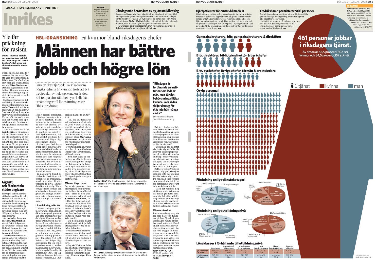
We found out that among all employees of the Finnish parliament only one out of three is male, but among the members of the highest executive staff in the same organisation the men are in strong majority. The symbols indicate the number of men/women in the different offices, starting from the highest superintendents, continuing via supervisors all the way down to floor personnel. At the bottom of the graphics section we also compared different kinds of duty, salary and education for both men and women employed by the parliament.
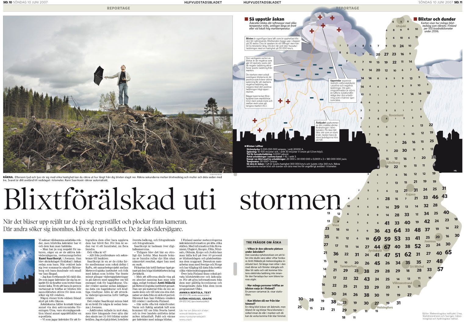
Last summer we had an extraordinary intense period of thunderstorms. This spread originated in an idea of finding out where the lightning is most intensive in Finland. After getting all the information needed we started out by splitting the entire country into a grid of about 100 square kilometer per section. We calculated the exact number of lightning strikes for each section and it resulted in a map showing that the most lightning-intensive area was in the inland. In order to get a personal touch to the story we started looking for thunderstorm-chasers in the most intensive area and luckily found one! As a bonus we also explained the origin of thunder and lightning. This infographic was presented with an Award of Excellence in the European Newspaper Awards last year.
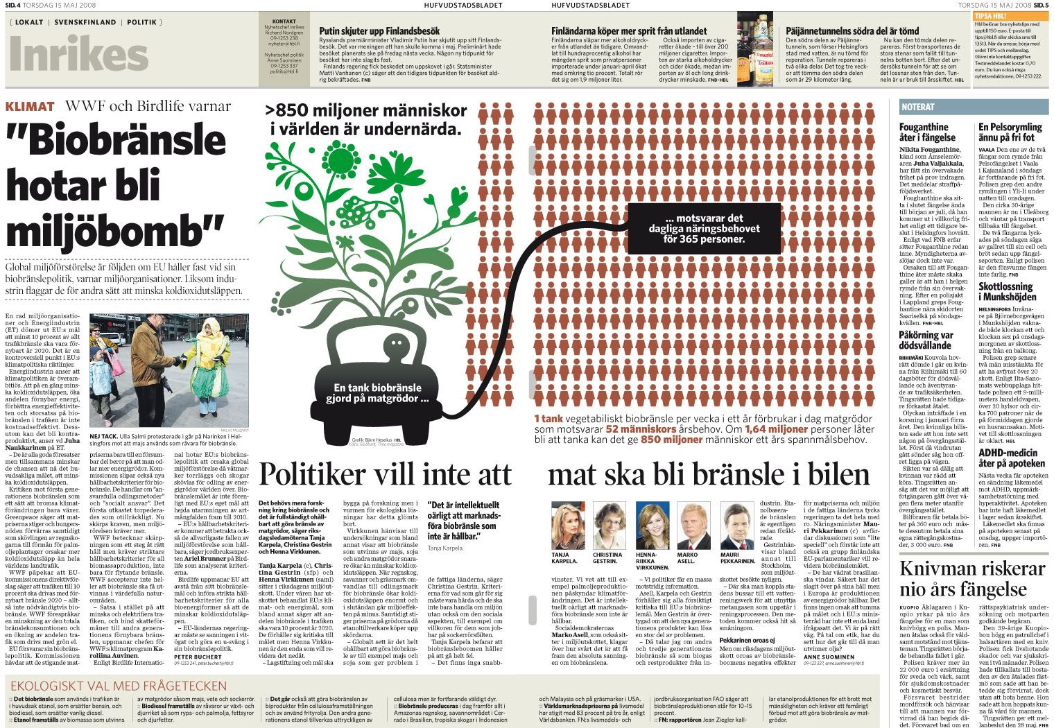
Instead of praising the growing business of biodynamic fuel we here show that the green alternative isn't really as world-saving as we might have believed. In order to produce one single car tank of biofuel you need the same amount of crops (corn and other grains) that would feed 365 people for a day. More than 850 million people suffer from malnutrition in the world. If 1,64 million people wouldn't fuel their car with biofuel once every week there could be enough food for the starving people.
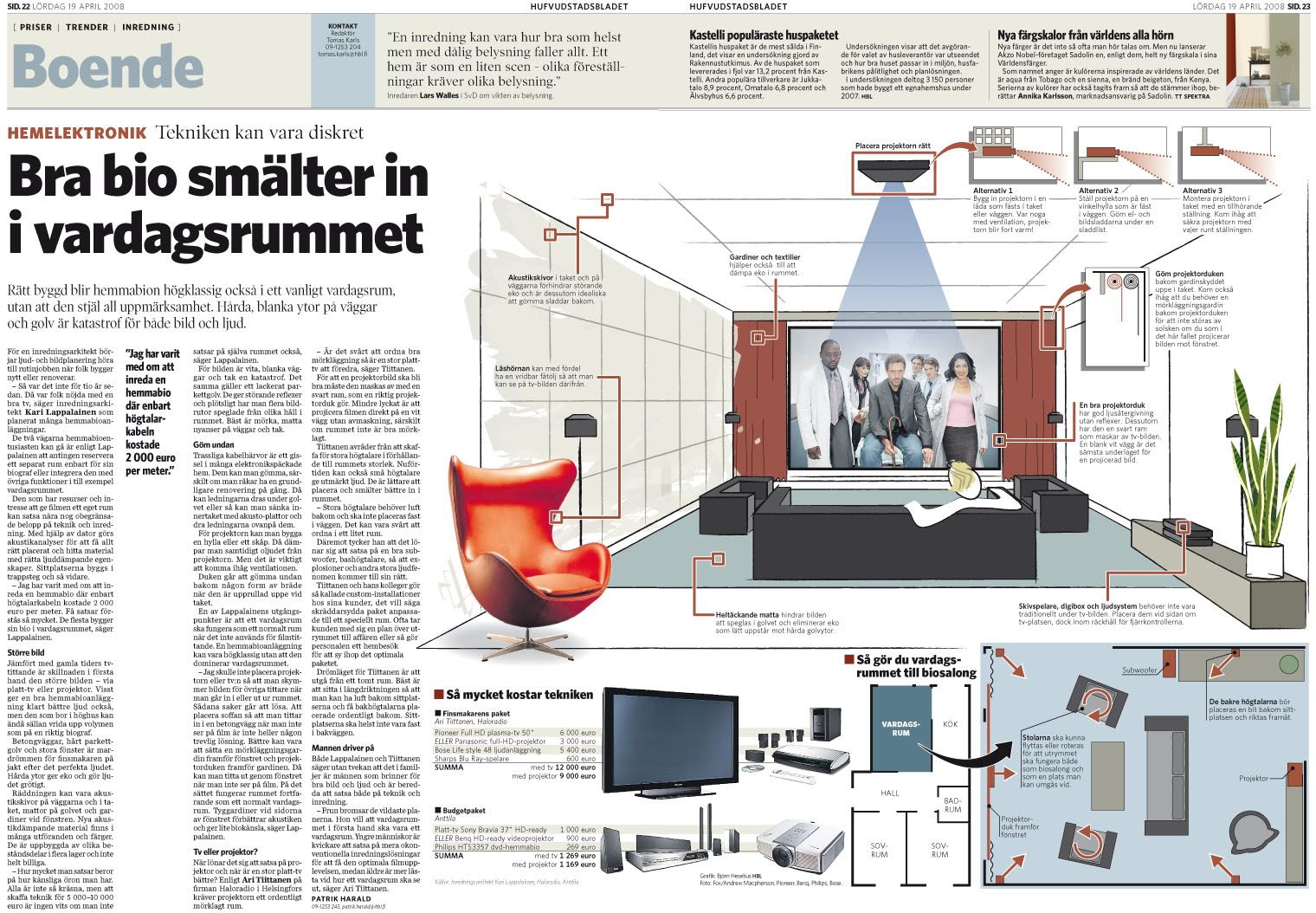
Once a week we publish a home-section in the newspaper. This issue is on how to make the perfect home entertainment room and still being able to use the room for socialising. After consulting a interior designer and an architect we came up with this idea of taking a normal sized apartment and according to the experts' ideas redecorate the living room into a more suitable homecinema/living room. We also created two technical alternatives; one for the connoisseur that is willing to pay for the ultimate experience and one budget alternative.
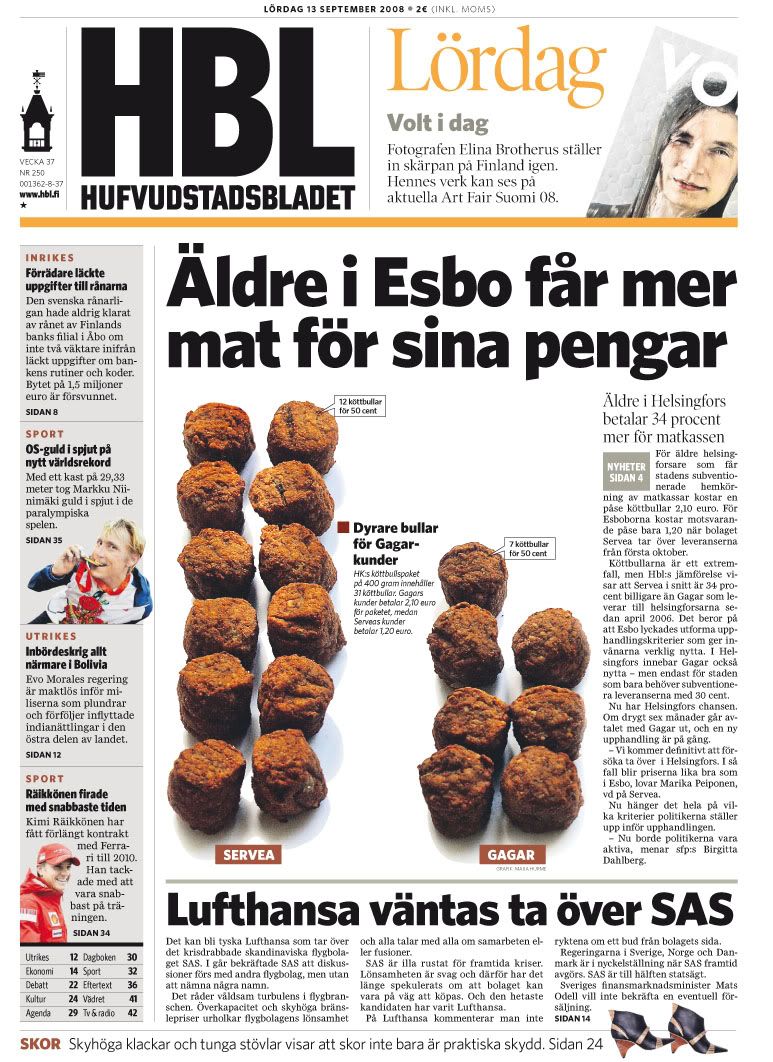
In the greater Helsinki area there are two competing businesses who provide food to the elderly people who still live at home. We found out that those living in the city of Helsinki paid 34 percent more than those living in the suburbs for the same amout of food. Here showed by the number of meatballs elderly people get for 50 cents depending on what food service provider they have.
03/09/2008
Infographics departments around the world: Big changes on El Heraldo, Barranquilla (Colombia)
This summer I had the luck of contributing on two InnovAtion projects. One of them has been the redesign of the brazilian newspaper Correio, from Salvador da Bahía, from which I'm still receiving stuff to write a post focused on infographics, although I strongly recommen you Juan Antonio Giner's posts (1, 2, 3, 4, 5, 6 y 7) in order to see the great changes on this newspaper.
Th other has been El Heraldo, from Barranquilla. The press leader on Shakira's hometown, a city where newspaper are growing and growing.

This project had a design by Javier Errea and the work of Marta Botero, Eduardo Tessler, Gabriel Sama, Pablo Errea and myself, adding of course Juan Antonio Giner and Carlos Soria. If you're interested on the design and editorial sides of the re-birth, the best is to visit Innovations in newspapers blog, which will be uploading stuff about this these days.
El Heraldo had no infographic journalists. Two designers made graphics when they were needed, They will keep helping on graphics, but, with the changes, El Heraldo hired Johan Romero Montes, who previously worked for El Tiempo (Bogotá). His arriving has been a very helpful hand to get the dramatic changes we wanted for the newspaper.
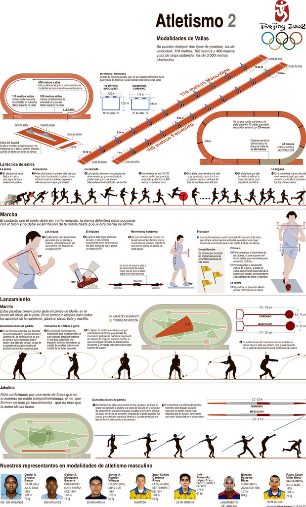
A good example of the new graphics are these from the Olympics Games, the big test for this new changes.


The guidelines for this project were those you're used to be on this blog: be clear and clean, the main thing on a graphic is the information, avoid decoration, use color as guide... With all these ideas and the people of El Heraldo (Johan, Jan, Eduard, Fabián...) they've got an Art Department which will be responsible of very nice visual surprises this year.
The first issue was released this monday, and this was the firs graphic:

Not an spectacular example, but with very good and useful information. I hope to keep showing some examples these days. Anyway, congratulions to Johan and all the team.
Th other has been El Heraldo, from Barranquilla. The press leader on Shakira's hometown, a city where newspaper are growing and growing.

This project had a design by Javier Errea and the work of Marta Botero, Eduardo Tessler, Gabriel Sama, Pablo Errea and myself, adding of course Juan Antonio Giner and Carlos Soria. If you're interested on the design and editorial sides of the re-birth, the best is to visit Innovations in newspapers blog, which will be uploading stuff about this these days.
El Heraldo had no infographic journalists. Two designers made graphics when they were needed, They will keep helping on graphics, but, with the changes, El Heraldo hired Johan Romero Montes, who previously worked for El Tiempo (Bogotá). His arriving has been a very helpful hand to get the dramatic changes we wanted for the newspaper.
A good example of the new graphics are these from the Olympics Games, the big test for this new changes.
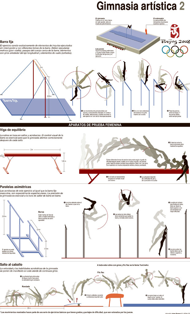
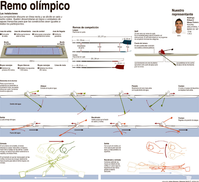
The guidelines for this project were those you're used to be on this blog: be clear and clean, the main thing on a graphic is the information, avoid decoration, use color as guide... With all these ideas and the people of El Heraldo (Johan, Jan, Eduard, Fabián...) they've got an Art Department which will be responsible of very nice visual surprises this year.
The first issue was released this monday, and this was the firs graphic:
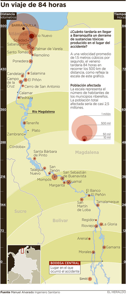
Not an spectacular example, but with very good and useful information. I hope to keep showing some examples these days. Anyway, congratulions to Johan and all the team.
09/07/2008
Infographics departments around the world: La Prensa Gráfica (El Salvador)
The infographics department of this newspaper was born on 1999, with three artists, but it was this year when the style rules and the infographics genres were finally established.

At the moment, the infographics editor Óscar Corvera, who has has been a great ally for this blog before, assists daily to the editorial meetings every morning to settle the agenda of the graphics for the day or for some graphic projects, as told us Enrique Contreras, Visual Concepts chief at Grupo Dutriz (which is the owner of La Prensa Gráfica). Adding to this, the department make its proposals, research, and execute its own topics. Many of them takes the editorial wing interest grow and build a feature to go along with the story.

The main graphic genres, as they told us, are the judicial infographics (crimes, crashes, assaults), sports, ecologic topics, technology, economics, politics, archeology, history health and reseach (which means, almost all).
The area has now five people working on infographics, two of them with journalism degree and with the close target of merging the online graphics department (and God bless this kind or merges!).

They are also with the firsts steps on the commercial infographics, with the Bussiness Head of the group.
If we talk about awards, two SIP awards and four SND decorate their walls. Well deserved.


At the moment, the infographics editor Óscar Corvera, who has has been a great ally for this blog before, assists daily to the editorial meetings every morning to settle the agenda of the graphics for the day or for some graphic projects, as told us Enrique Contreras, Visual Concepts chief at Grupo Dutriz (which is the owner of La Prensa Gráfica). Adding to this, the department make its proposals, research, and execute its own topics. Many of them takes the editorial wing interest grow and build a feature to go along with the story.
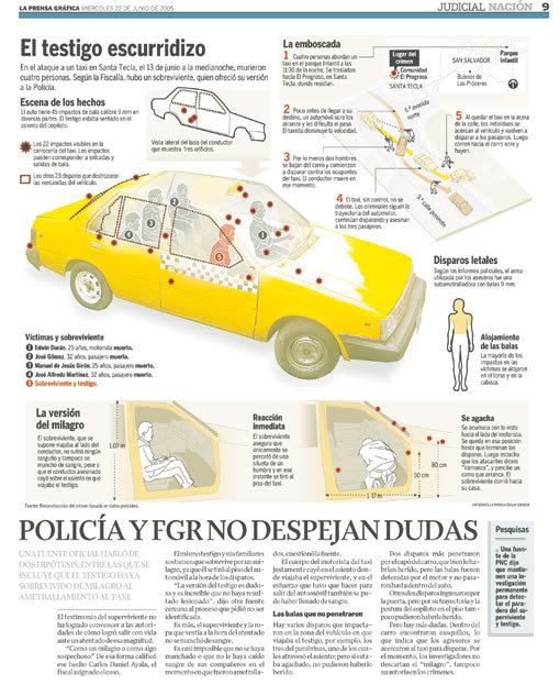
The main graphic genres, as they told us, are the judicial infographics (crimes, crashes, assaults), sports, ecologic topics, technology, economics, politics, archeology, history health and reseach (which means, almost all).
The area has now five people working on infographics, two of them with journalism degree and with the close target of merging the online graphics department (and God bless this kind or merges!).

They are also with the firsts steps on the commercial infographics, with the Bussiness Head of the group.
If we talk about awards, two SIP awards and four SND decorate their walls. Well deserved.

Subscribe to:
Posts (Atom)