Showing posts with label Bests of 2008. Show all posts

26/01/2009

Best of 2008: Mario Chumpitazi picks

Mario Chumpitazi, peruvian infographics journalist, also chooses his favourite graphic for the past year.

1. Preview of the american elections. Reforma (Mexico)

"I like the graphics with a lot of details, clean and easy to read."


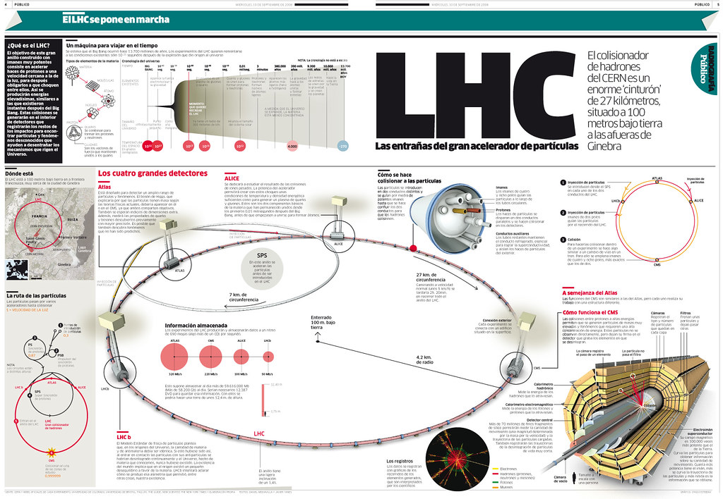
2 y 3. LHC. Clarín (Argentina) and Público (Spain)

"I've chosen two graphics of the hadron collider because I think the topic is amazing, like something from a film by Steven Spielberg. In both cases, the explanations of how it works is excellent."


And also shows his best own works.

1. The Diaper
"Infographic made for Kimberly-Clark Peru. There was a new diaper plant in Lima, one of the modernests of the world. (Fábrica de Ideas)"


2. XV centuries of history
"Graphic made for the Bienvenida Group. At the end of the year, this magazine edits a book about the history of Peru. (Fábrica de Ideas)"


3. The war of the Malvines
"One of the lasts grahics I made for La Industria de Trujillo. Puer nostalgy. It was the anniversary of the war."

21/01/2009

Best of 2008: Xan Sabaris picks

Xan Sabarís works for Diario de Pontevedra, although he is a nomad of the spanish infographics. And he sends his picks as the bests of 2008:

1. Passes of the Spain-Russia soccer match. Público (Spain)
Chiqui Esteban


"Is one of those graphics that always come once and again to your head once you've seen it. I choose it because of the information it shows, because it show a message (Xavi is the key) and allow to have a clear view at a glance but you can also stay watching for 30 minutes"

2. Can a President tame the bussiness cycle?. NYTimes.com
Kevin Quealy, Guilbert Gates


"Despite the big amount of information it offers, it's clear and easy to understand."

3. Slavery and vote for Obama. Allen Gathman


"Idea and information. It's brilliant. It' one of those that make you say: Holy Shit!"

And a little special mention...

The most expensive liquids in the world. Público (Spain)


"Not for the graphic, but for the information."


And his own favorites:

1. Bullfighting


2. Wine


3. Volvo Ocean Race

14/01/2009

Best of 2008: Óscar Corvera picks

Óscar Corvera (La Prensa Gráfica, El Salvador) has been named on this blog already, and more than once. Now, he's back to pick the bests graphics of the last year.

"There are many impressing works by the way the graphic designers made them. An example are thee three graphics that fascintnated me when I saw them, because they show something different and encourage me being different."


1. Magallanes Penguin (Clarín)


2. Beijing 2008 medals analysis (Público, Spain)
Chiqui Esteban


3. 50 years of spacial exploration. (5W, National Geographic)


And the best graphics made by OScar and the rest of the team (Jorge Contreras, René Rivas and Douglas Jarquín).

1. Oil crisis
"The oil crisis punished all sectors during 2008. The graphic shows the chain of impacts on citizens and how the rise of oil affects his economy and stability."


2. Electoral power
"Some months before the elections at El Salvador, the journal wanted to show a statistical summary with the presidential results over the last 20 years. We compared the amount of votes obtained by the main political parties."


3. LPG presses
"The aniversary of La Prensa Gráfica was the perfect excuse to make a complete infographic with the presses."

12/01/2009

Best of 2008: Kabitis Dimitris picks

Kabitis studies Communication and Mass Media in the University of Athens (Greece). But also works at the Eleftheros Tipos’ infographics department since 2007.

These are criteria he followed in his own words:

"First of all, the information that is the main subject of the infographic has to be interesting and exciting. So as you can tell, my fisrt criteria is subjective.

Then, I think is basic the information to be visualized in a clear way for the readers to understand it or not. Also I would like to point out that usually this means that I prefer infographics that are of minimal aesthetic and not heavy.

The last of my criteria is that the infographic has to be innovative. Although if the infographic doesn’t fit the criteria above, innovation alone is not enough."

And here they are:

1. USA and Iraq. The New York Times


Kabitis says: "Using only two flags in three rows the graphic manages to tell the story of a war"

I must say that in my opinion this is an illustration and not an infographic, but if someones consider it a graphic, it enters in the show.


2. The first walk on the Moon . NASA


There's also another version on an baseball diamond


3. Costanera Center . El Mercurio (Chile)
Juan Pablo Bravo


And also, his three own best graphics of the year.

1.Four ways to deal with the overwarming of Earth
made with Kali Labrou and Achilleas Galatsidas

"This infographic includes four futuristic ways proposed by novelists against climate change. This project was an idea of our infographics department, all the information was gathered by our team."


2.Taipei 101
Made with Kali Labrou

"The triumph of man on nature. Tower’s mechanics enable it to stand in an environment with typhoons and many earthquakes. (I like mega structures)"


3.Kovalainen’s accident and new measures of security
Made with Spiros Kanakaris

10/01/2009

Best of 2008: Max Gadney picks

Max Gadney is a classic of the BBC online graphics department, althought he's now working on the TV area.

Although he offers a larger explanation on his blog, these are his picks as the best grahics of the last year:

1. TV US elections (BBC)


Click on the image to watch the video

2. Stamen data visualization


Click on image to access MySociety.

3. Spanish 2008 budget (Público, Spain)


It was published in 2007, but we have done exceptions before, and being one graphic published on the newspapers where I work... I can do another.

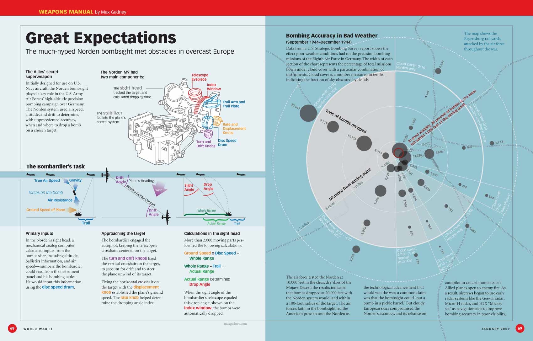
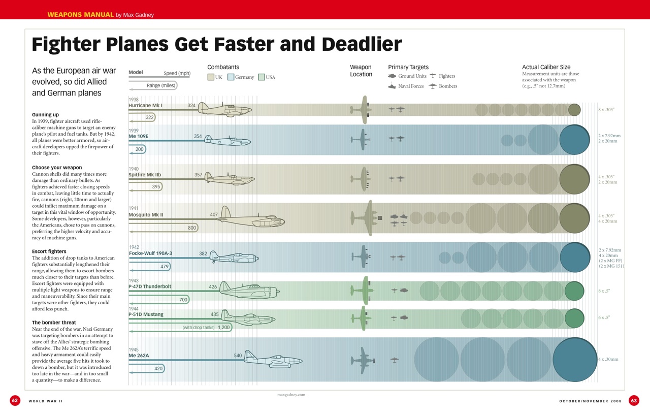
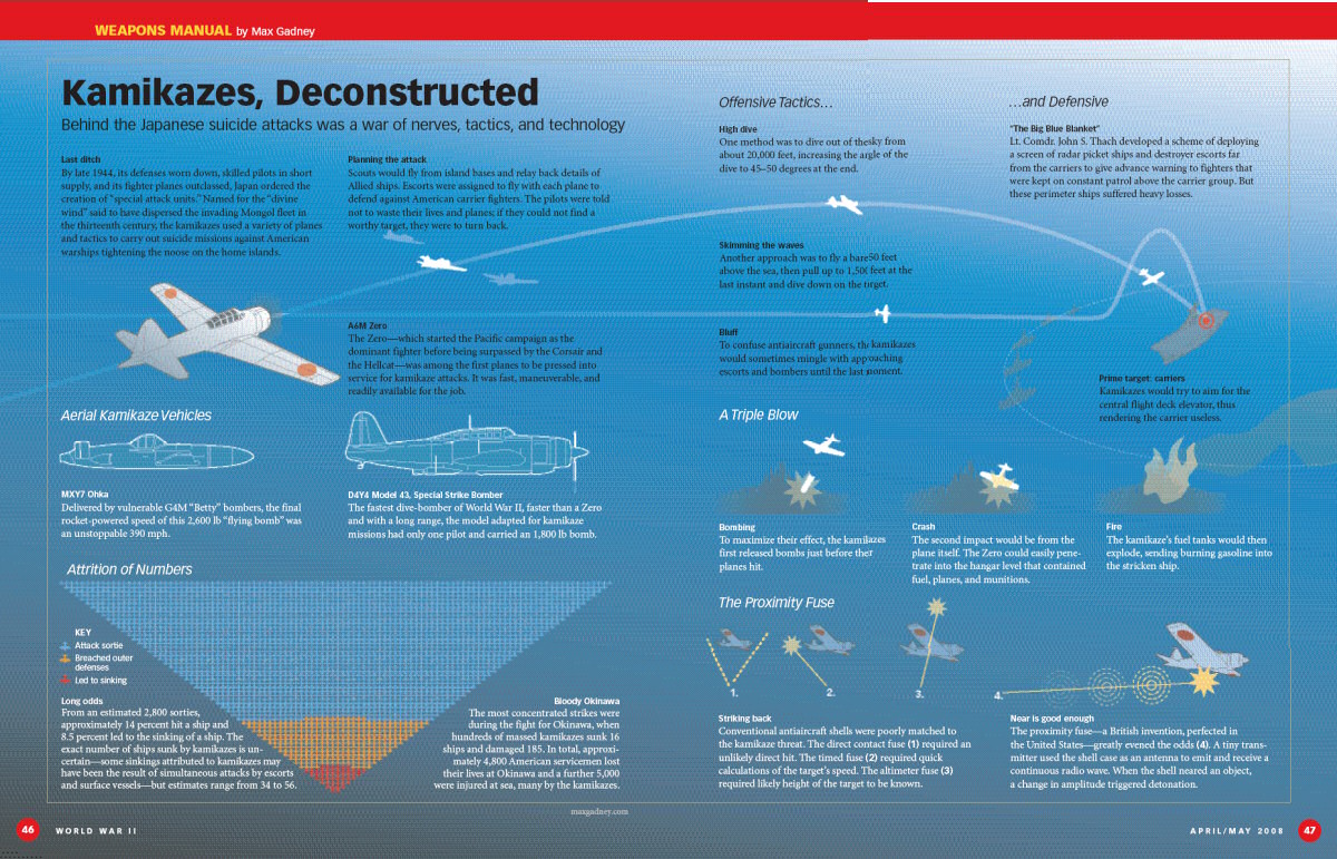
And these are his own favourites, all of them published at Historynet.com:

1. Nordern Bombsight


2. Fighter Planes


3. Kamikaze

08/01/2009

Best of 2008: Johan Romero picks

Johan Romero, infographics journalist at El Heraldo de Barranquilla picks the three best graphics published on his newspaper in the last year.

1. Wright Brothers plane


2. Melting ice


3. Popularity of south american presidents

Best of 2008: Juan Miguel Tomalá picks

Juan Miguel Tomalá, from the ecuatorian daily El Telégrafo picks the best graphics of 2008, as before did his colleague of department Freddy Fiallos Calderón.
They agree on their first pick:


1. Noah's Arc of the 21st century. elmundo.es
Emilio Amade

Access the online graphic


2. South of here
Chapel Hill students

Access the online graphic


3. Magallanes penguin (Clarín)


And his favorites among his own works...

1. Cyborg 2.0


2. Anatomy of the new buses


3. Guayaquil Municipal Museum

Access the online graphic

06/01/2009

Bests of 2008: Juanjo Cholbi picks

Please forgive me for these days of inactive blog... but life in holiydays is that way...

Juanjo Cholbi is infographics journalist (and much more things) at the regional spanish newspaper Levante-EMV. He has chosen these as his favourite graphics of the year:

1. Mandioca Wichi


Perfect example of the latinamerican infographic style. I thinks this one is from 2007, but enters in the contest anyway.

2. Democratic primaries

Race for the democratic primaries. As the last example, I don't know where was it published, so I'll thank any clue.

3.Iraq war victims. The New Yok Times


This graphic was already commented on this blog and was published on the opinion pags of the Grey Lady just on year ago.

And these are the graphics Cholbi chooses as the best of his job the last year.

1. Potato year


2. El Pateller. From myth to reality


3. Aircraft carrier Juan Carlos I

31/12/2008

Bests of 2008: Pedro Jiménez picks

Pedro Jiménez, infogrgraphic journalist at El Mundo on its Valencia edition make his picks for the bet graphics of the year:


1. Berlin Water System. Infografik KircherBurkhardt


2. LHC. Clarín
Vanina Sánchez, Hugo Vasiliev, Pablo Loscri y Guillermo Milla


3. Magallanes pengüin (Clarín)


And these are his three choices as his own three bests graphics of the year:


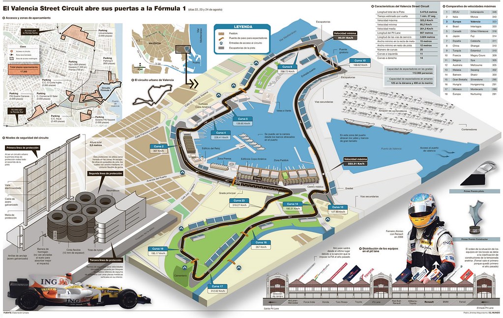
1. F-1 circuit of Valencia


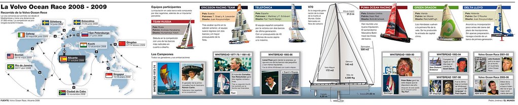
2. Volvo Ocean Race


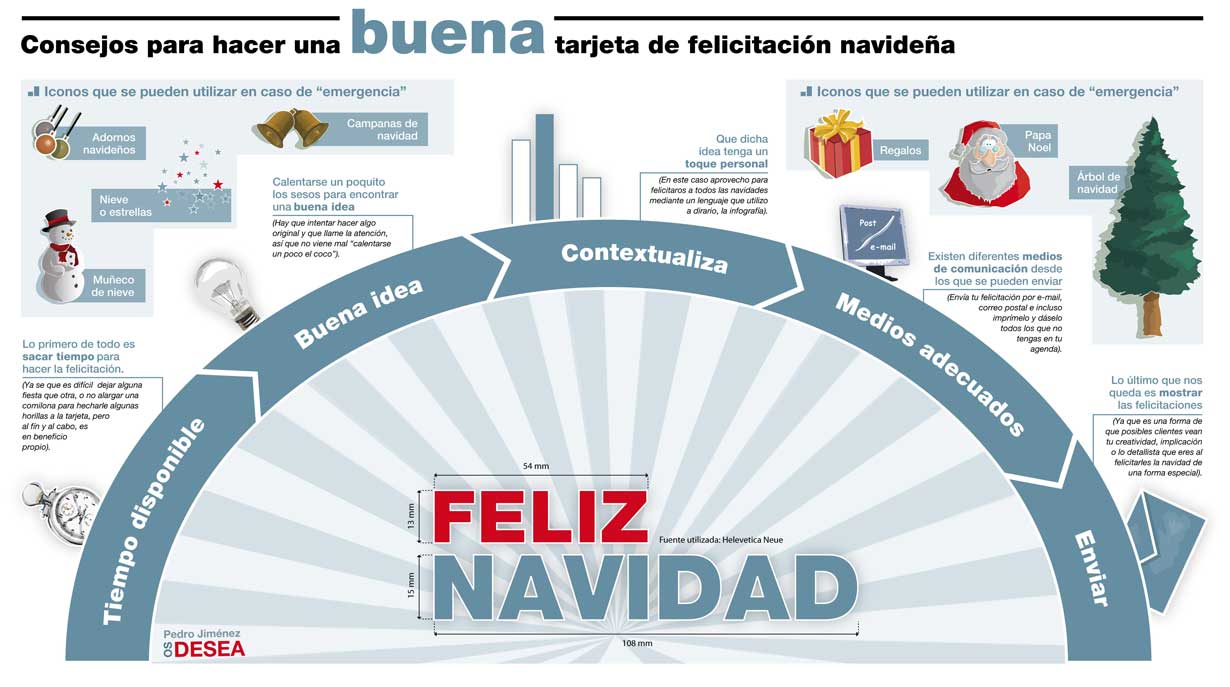
3. How to make a Christmas greeting


If you want to participate, read this.