Share
Ok, nothing new for infographics professionals. And maybe not the best way. But useful anyway to have a fast preview...
Via 1001medios

Showing posts with label Resources. Show all posts
Showing posts with label Resources. Show all posts


24/10/2010
Antidecalogue for infographics departments
I've read today at the great blog Lola como mola by Silvia Cobo an antidecalogue for digital media (in spanish) written by David Domingo. I'm not reproducing it here visit her blog with Google Translate and pay her a visit. But I noticed that it's not very far from what could be an antidecalogue for infographics departments. I mean, ten things media should do if they want to destroy their own graphics departments:
1. Place someone with no journalistic ambition directing the department. He or she just need to know how to draw or how to design. They're not doing journalism, just making the news prettier.
2. Any writer or department chief decides about the infographics. Articles and what goes inside them belongs to the writers. If they don't like the colors, or using a pie instead bars, they decide.
3. If the people of the infographics department want to go out for the coberture of any event, don't allow them. That's journalists matter, what infographics got to do with it? They just have to draw what they're told.
4. Writers and infographics people don't have to talk each other. Writers take a sheet with the data to infographics, infographics do the drawing, and that's all, that's how things work. Infographics dudes don't have to understand the data. Copy the numbers, draw the bars, ctrl+p and the work's done.
5. Some news need a graphic, no matter if we have enough information. Maybe we don't know how the accident happened, but accidents informations go with infographics, so just guess what happened and don't forget to draw some flames, readers love them.
6. If another newspaper publish a good graphic, plagiarism is the best solution. Don't waste your time looking thinking on what's interesting for your own readers, don't look for the sources, don't look for better ways to tell the story. If a bigger newspaper did it that way, it has to be better than anything you could think.
7. Don't try to look for new narratives. Readers are not very smart people, they don't understand anything beyond bars and pies. And we don't have time to waste playing games...
8. An infographic that takes more than one day to be done doesn't worth it
9. The writer of the article that goes with the infographic don't have to read the graphic. Writers don't have time to read the data that goes in the graphic to check that article and graphic are saying the same. They're with the text, the important thing, not to go looking to drawings.
10. Never look what others are doing. Don't read other newspapers, don't look what are others doing. That's contamination, pollution, and you could loose your own very personal style.
1. Place someone with no journalistic ambition directing the department. He or she just need to know how to draw or how to design. They're not doing journalism, just making the news prettier.
2. Any writer or department chief decides about the infographics. Articles and what goes inside them belongs to the writers. If they don't like the colors, or using a pie instead bars, they decide.
3. If the people of the infographics department want to go out for the coberture of any event, don't allow them. That's journalists matter, what infographics got to do with it? They just have to draw what they're told.
4. Writers and infographics people don't have to talk each other. Writers take a sheet with the data to infographics, infographics do the drawing, and that's all, that's how things work. Infographics dudes don't have to understand the data. Copy the numbers, draw the bars, ctrl+p and the work's done.
5. Some news need a graphic, no matter if we have enough information. Maybe we don't know how the accident happened, but accidents informations go with infographics, so just guess what happened and don't forget to draw some flames, readers love them.
6. If another newspaper publish a good graphic, plagiarism is the best solution. Don't waste your time looking thinking on what's interesting for your own readers, don't look for the sources, don't look for better ways to tell the story. If a bigger newspaper did it that way, it has to be better than anything you could think.
7. Don't try to look for new narratives. Readers are not very smart people, they don't understand anything beyond bars and pies. And we don't have time to waste playing games...
8. An infographic that takes more than one day to be done doesn't worth it
9. The writer of the article that goes with the infographic don't have to read the graphic. Writers don't have time to read the data that goes in the graphic to check that article and graphic are saying the same. They're with the text, the important thing, not to go looking to drawings.
10. Never look what others are doing. Don't read other newspapers, don't look what are others doing. That's contamination, pollution, and you could loose your own very personal style.
21/07/2009
Three reasons journalists shouldn't use Flash
Great article in 10000 words. For online visual journalists, Flash is the one, big, necessary tool. There are many others, but Flash is the king. But sometimes Flash is not the right tool. The three reasons are better explained on the complete post, but here you are the headlines (comments are mine):
1. Flash projects take a long time to create
There are many ways to create graphics, so think twice before starting a Flash prohject that could be explained perfectly as a text or as a video... But, you really need to do it not just with Flash, do it also with print graphics.
2. Many projects don't need to be animated
That's true, many time it looks like we don't know that online graphic can be static. An image. If it doesn't need to be animated, don't do it. If you don't use it properly, animation is sometimes more a disturb than a help. Maybe sometimes we just don't need a Flash.
3. Most journalists are not designers
Want a professional product? Be professional. It not just the tool. You have to think visually. Let visual journalists work on visual news. It's not just the 'how to', is also the 'why'.
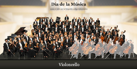
And I must thank the 10000words people. They give three examples on when flash infographics works: one about blue whales on National Geographic, other about construction deaths in Las Vegas and another about how a classic orchrestra works, done by Carlos Gámez at lainformacion.com, the web where I work as New Narratives Director.

1. Flash projects take a long time to create
There are many ways to create graphics, so think twice before starting a Flash prohject that could be explained perfectly as a text or as a video... But, you really need to do it not just with Flash, do it also with print graphics.
2. Many projects don't need to be animated
That's true, many time it looks like we don't know that online graphic can be static. An image. If it doesn't need to be animated, don't do it. If you don't use it properly, animation is sometimes more a disturb than a help. Maybe sometimes we just don't need a Flash.
3. Most journalists are not designers
Want a professional product? Be professional. It not just the tool. You have to think visually. Let visual journalists work on visual news. It's not just the 'how to', is also the 'why'.
And I must thank the 10000words people. They give three examples on when flash infographics works: one about blue whales on National Geographic, other about construction deaths in Las Vegas and another about how a classic orchrestra works, done by Carlos Gámez at lainformacion.com, the web where I work as New Narratives Director.
26/04/2009
Advices from my first teacher
My first job as professional, beyond internships, was at La Voz de Galicia, where I met a great team with Xoán González as the department coordinator. He gave me some advices that I still have in my head...
1. First of all: Rigor
During the Prestige disaster all the oil spots we placed on the maps had coordinates to set the right point. Those days, La Voz de Galicia became the reference for the information about the disaster for all the spanish media.
This is absolutely the opposite of ideas I've heard in other places: "If we just say what we really knew we couldn't fill the newspapers". What a scandal!

2. From six unities, people stop calculating
Comparing with 150 or 2000 soccer fields is nonsense. People just imagine a 'big extension', with no difference between both. Six unities is the maximum. And doing the comparison with something unitary is much better.
'As big as Spain' is a good comparison. '90 times the size of Cantabria' is not.
3. Be careful with the arrows
Don't use arrows to speak about things that are not placed anywhere. If a car is cheap, you can't draw it and place an arrow to it. This is an example of what we have to avoid.

4. Don't use too many colors if you don't need them
We have to style colors at La Voz. UA soft one (light ocre) and a other for highlights (red). What we could do just with those we do it just with those. Maybe it looks too extreme, but it created a clear code with the reader... and was also very easy to convert to B&W.
There were much more advices. But these ones stays on my mind every time I make a graphic.
1. First of all: Rigor
During the Prestige disaster all the oil spots we placed on the maps had coordinates to set the right point. Those days, La Voz de Galicia became the reference for the information about the disaster for all the spanish media.
This is absolutely the opposite of ideas I've heard in other places: "If we just say what we really knew we couldn't fill the newspapers". What a scandal!

2. From six unities, people stop calculating
Comparing with 150 or 2000 soccer fields is nonsense. People just imagine a 'big extension', with no difference between both. Six unities is the maximum. And doing the comparison with something unitary is much better.
'As big as Spain' is a good comparison. '90 times the size of Cantabria' is not.
3. Be careful with the arrows
Don't use arrows to speak about things that are not placed anywhere. If a car is cheap, you can't draw it and place an arrow to it. This is an example of what we have to avoid.

4. Don't use too many colors if you don't need them
We have to style colors at La Voz. UA soft one (light ocre) and a other for highlights (red). What we could do just with those we do it just with those. Maybe it looks too extreme, but it created a clear code with the reader... and was also very easy to convert to B&W.
There were much more advices. But these ones stays on my mind every time I make a graphic.
05/04/2009
Twitter for infographics journalists
 Twitter is the new fashion in online communication. The microblogging service allows a maximum of 140 characters for each message (as the SMS). Here you are a list of accounts owned by infographics journalists or people related with the infographics sphere. I just publish open profiles (not protected), because I think that they won't have a problem with it (Anyway, if someone doen't want his twitter account to appear here, just tell me and I'll erase it). You can also say yours on comments. Some of them are in spanish, and others not very active, but I'll put them here just in case... I begin with my own account...
@chiquiesteban (spanish)
New Narrativws Director at www.lainformacion.com (we'll release the site soon!) and blogger of Infographics News
@vizeds
Twitter of Visual Editors
@alpoma (spanish)
Alejandro Polanco. Writer, programmer and blogger of La Cartoteca, a very intersting cartography site.
@GINER
Juan Antonio Giner, president and founder of InnovAtion Media Consulting, editor of Innovations in newspapers and founder of the Malofiej Awards.
@patrisign (spanish)
Patricia Vicente, freelance infographics journalist. She has just been awarded with a Malofiej mdal for this graphic of the LHC.
@michaelagar
Michael Agar, Head of infographics at the Telegraph Media Group.
@majimeno (spanish)
Miguel Ángel Jimeno, journalism teacher at the University of Navarra and author of La Buena Prensa
@vectart (spanish)
Víctor Caballero, freelance infographics journalists.
@mtascon (spanish)
Mario Tascón, editor of www.lainformacion.com.
@juanvelasco
Juan Velasco, Art Director at National Geographic.
@drewvigal
Andrew DeVigal, Multimedia Editor of The New York Times.
@adrianaalves (portuguese)
Adriana Alves, journalist, student and blogger of Infografia en base de dados.
@karlgude
Karl Gude, former graphics director of Newsweek, now teacher at the Michigan State University.
@valenntinna (spanish)
Valentina Álvarez, graphic designer licensed on Social Communication.
@nunovargas (portuguese)
Nuno Vargas. I don't know exactly his charge, but you surely know him from Malofiej.
@pilhofer
Aron Pilhofer, Interactive Technologies Newsroom Editor of The New York Times.
@JavierZarracina
Javier Zarracina, Infographics director at The Boston Globe.
@shancarter
Shan Carter, Interactive graphics editor at The New York Times.
@xocasgv (spanish)
Xaquín González, Interactive graphics editor at The New York Times and blogger of xocas.com.
@zoopzoop
Peter Ong, Media Consultant at Checkout Australia.
@davegray
Dave Gray, funder of XPlane.
@dorsey
Steve Dorsey, Deputy Presentation and Innovation Editor at Detroit Free Press and secretary of the SND.
@robbmontgomery
Robb Montgomery, CEO of Visual Editors.
@bburton
Bonita Burton, AME of Visuals at Sun Sentinel and vicepresident at the SND.
@seanmcnaughton
Sean McNaughton, infographics editor at National Geographic.
@charlesapple
Bonita Burton, blogger of Charles Apple
@charlesmblow
Charles M. Blow, columnist of The New York Times.
@sarahslo
Sarah Slobin, former graphics editor at The New York Times and Fortune.
@teeceeTO
Tonia Cowan, graphics editor at The Globe and Mail.
@skomives
Stephen Komives, design editor at Orlando Sentinel.
@skomives
Stephen Komives, editor de diseño del Orlando Sentinel.
And so many that I have forgotten...
03/03/2009
NewsPageDesigner is now under SND
The NPD case ends (by now) with the portfolio site under the SND (more information here). You can access the site at this link.
The big problem is that the whole archive is lost, so, if you want to have it there you'll have to upload it again. SND assures that this is not the definitive page, but that all the files will be easy to migrate when the change will come.
The site has been created on Ning, used by VIsual Editors at the moment. The Sun Journal, the newspaper that hosted the old NPD keeped the url newspagedesigner.com, but erasing all the content. From the old NewsPageDesigner just the anme and the idea remains.
The big problem is that the whole archive is lost, so, if you want to have it there you'll have to upload it again. SND assures that this is not the definitive page, but that all the files will be easy to migrate when the change will come.
The site has been created on Ning, used by VIsual Editors at the moment. The Sun Journal, the newspaper that hosted the old NPD keeped the url newspagedesigner.com, but erasing all the content. From the old NewsPageDesigner just the anme and the idea remains.
26/01/2009
Those kind of things that infographics journalist use to like
Some days ago a friend sent me this map developed by the European Union showing the accesibility of the different points of the world. It shows the time that takes to reach from anywhere to a city with a population bigger than 50,000.

DMultimedia, the new blog created by the responsible of the online graphics at ELPAIS.com, Carlos Gámez, I saw this 'Multiwidget' that explains what happens in the world right now. Click on the image to watch it!

And if you want to know more things on what's happening right now on Earth, you can check Breathing Earth (thanks to Mario Tascón for the link). It simulates the CO2 emissions, births and deaths by country on real time.


DMultimedia, the new blog created by the responsible of the online graphics at ELPAIS.com, Carlos Gámez, I saw this 'Multiwidget' that explains what happens in the world right now. Click on the image to watch it!
And if you want to know more things on what's happening right now on Earth, you can check Breathing Earth (thanks to Mario Tascón for the link). It simulates the CO2 emissions, births and deaths by country on real time.
18/10/2008
nytimes.com: the messenger and the source
This new technological era gives new tools and new sources for journalists and any other people. Google Maps is one of the best examples. But in these days of presidential debates in USA, the best tool adn source for us in Publico has been nytimes.com. As we ourselves declared as source of our graphics.
On the spanish presidential debates we made the graphics while we were watching at them.


But for the USA debates the time was not the right one. It was very late in the night (or very early in the morning) in Spain when McCain and Obama discussed about Joe the plumber. We had to made a decission: sleeping and working the day after or stay awake and watch the debate and go to do the graphics the next day as zombies.
But nytimes.com arrived to save us with its incredibles interactive features.
On them we could watch all the debate the morning after, read the transcription, look for the words that had been said by each candidate (with number of times being said by each one and with the context), see the topics and the time dedicated to each one... And with every debate easy to access.

With them we could contextualize the photos, access the 'screenplay' of the debate, make a tagcloud... And read all the transcription to count the people refered, as sometimes they were named by name, somo by charge and some by surname.
Thanks to nytimes.com cause thanks to it we could sleep these days. These were teh results:


On the spanish presidential debates we made the graphics while we were watching at them.

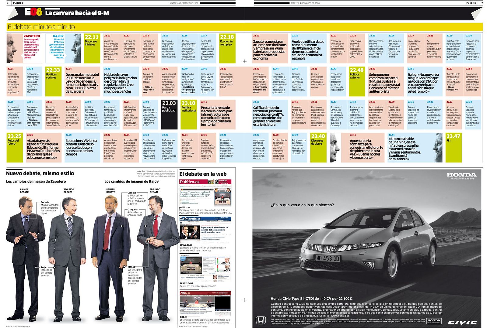
But for the USA debates the time was not the right one. It was very late in the night (or very early in the morning) in Spain when McCain and Obama discussed about Joe the plumber. We had to made a decission: sleeping and working the day after or stay awake and watch the debate and go to do the graphics the next day as zombies.
But nytimes.com arrived to save us with its incredibles interactive features.
On them we could watch all the debate the morning after, read the transcription, look for the words that had been said by each candidate (with number of times being said by each one and with the context), see the topics and the time dedicated to each one... And with every debate easy to access.

With them we could contextualize the photos, access the 'screenplay' of the debate, make a tagcloud... And read all the transcription to count the people refered, as sometimes they were named by name, somo by charge and some by surname.
Thanks to nytimes.com cause thanks to it we could sleep these days. These were teh results:


06/09/2008
Ten advices for editors and writers when they ask for an infographic
Infographics journalists complaint by their own nature. And I will go against nature if I'd say that this characterists has no reasons. At the newspaper I work for, Publico, as it was born less than a year ago we started from nothing, and with people coming form many different places. So we made a little 'Handbook' for writers and editors with some advices or rules for when they come to ask for a graphic. With these conclusions, and those that I got on my works as Innovation's consultant, I dare to offer this ten advices. Many of them are extensible to the general journalism, but sometimes we must make visible that infographics are journalistic products. At least, those on newspapers.
1. Infographics are information, not decoration
The mother of all rules. Graphics are not to make pages more beautiful. One may ask for a graphic when we need a visual explanation better than a text one. If you don't know if the information would be wll explained visually, ask the infographic journalist.
2. Information in the graphic gives the size of it
We must not make the layout and then ask for the graphic. Oversizing graphic because we don't have more to say on the text is not the solution. It just mean that the information didn't need such a big space. Anyway, is always easier to have more space for text than for graphic, where size is so important. And the same with the very small ones.
3. If you wouldn't do it with the text, you can't do it with the graphic
Data on graphics can't be less rigourous than in the text. The newspaper is the same, the reader is the same, the afcts are the same. Graphics are not a minor genre, is a different language. And use the orgiginal sources, don't take information from other media. And if you dio it, it must be said on the sources.
4.Graphics are not made for those who don't want to read
If someone buy a newspaper it means that he (or she) likes to read and get informed. Graphci are not explanations for fools, and must not understimate our reader's intelligence. We don't have smart readers who read the texts and fools who looks at the graphics. The same reader look texts and graphics, and we use these two kinds of language because teh things we want to say are better said on the chosen language. Graphics and texts are complements, not exclusive.
5. Do not repeat the data on graphic and text
Graphic is not for summarizing the text. If you have nothing to tell apart form the data on the graphic maybe you don't need a text. What's the problem? So, we also must avoid sentences like "Don't put this on teh graphic or I would have nothing to say on the text". Give the information in teh best way for the reader, not in teh best way for you.
6. Quality of the infographics depends on information and time
Information for graphics is like the screenplay for a film. Maybe we can make a bad graphic with good information, but it's almost impossible to make a good graphic with bad information.
7. Say no to the big reports culture
It's not unusual to have big mountains of papers with reports of some enterprise or institution. and they are usually full of little graphics. The solution is not to think "How many of this one I need to fullfill the expectad space for a graphic'". maybe none of these graphic are relevant. Or maybe you have to 'cook' (on the best meaning) them to obtain new answers.
8. Graphics must be visual
Graphics are not not texts + photos. Texts and photos are texts and photos. Tables, lists, commented photos, key facts... all those could be better explained with layout solutions. Having them made by the infographics department won0't make them more attractive, the information si attractive by itself.And if you have doubts, ask the infographic journalist.
9. Go for the good ones
Infographics departments, as all departments, has it resources limited. But, in our case, we cannot ask for people from other departments on teh bad days, we can't use wire graphics on many small papers, we don't have a catalog of pre-designed graphics we can use as pre-designed pages. And, when the big things happens, infographics use to be always there: with sports in the Olympics, with Policts on teh elections, with Local when there's an accident or a disaster, with World when there's a war... there's no rest for graphics. So, many times, we can't go for ALL the graphic and we have to bet for have less graphics (but good ones) instead of a lot of poor graphics. And, the graphic we must have is not always that of the big topic of the day, but that one that really needs a graphic to be explained. Maybe the big topic of the day doesn't need a graphic.
10. Trust the infographic journalist
On most of the cases I know, infographic journalist are very enthusiastic with their job (Ok, tehre are exceptions). Usualley, when an infographic journalist tell you to have the infographic smaller or even not making a graphic is not because he doesn't want to work. It's because he really think that this is the best for the information. On the same way, you must hear the infographic journalist when they advice you to have a graphic with your information. The fact of asking for a graphic must be a billateral task.
And a final advice for both writers and infographic journalists... we must avoid all those graphics that, when we want to describe them we say "the typical graphic showing...". Avoid the typical. rethink all from the beggining each time, and so you can have original ways to explain things. That way you can erally know if the 'common places' of the infographics are so because it's the best way to explain things or because no one has think it well.
All kind of suggestions are accepted!
1. Infographics are information, not decoration
The mother of all rules. Graphics are not to make pages more beautiful. One may ask for a graphic when we need a visual explanation better than a text one. If you don't know if the information would be wll explained visually, ask the infographic journalist.
2. Information in the graphic gives the size of it
We must not make the layout and then ask for the graphic. Oversizing graphic because we don't have more to say on the text is not the solution. It just mean that the information didn't need such a big space. Anyway, is always easier to have more space for text than for graphic, where size is so important. And the same with the very small ones.
3. If you wouldn't do it with the text, you can't do it with the graphic
Data on graphics can't be less rigourous than in the text. The newspaper is the same, the reader is the same, the afcts are the same. Graphics are not a minor genre, is a different language. And use the orgiginal sources, don't take information from other media. And if you dio it, it must be said on the sources.
4.Graphics are not made for those who don't want to read
If someone buy a newspaper it means that he (or she) likes to read and get informed. Graphci are not explanations for fools, and must not understimate our reader's intelligence. We don't have smart readers who read the texts and fools who looks at the graphics. The same reader look texts and graphics, and we use these two kinds of language because teh things we want to say are better said on the chosen language. Graphics and texts are complements, not exclusive.
5. Do not repeat the data on graphic and text
Graphic is not for summarizing the text. If you have nothing to tell apart form the data on the graphic maybe you don't need a text. What's the problem? So, we also must avoid sentences like "Don't put this on teh graphic or I would have nothing to say on the text". Give the information in teh best way for the reader, not in teh best way for you.
6. Quality of the infographics depends on information and time
Information for graphics is like the screenplay for a film. Maybe we can make a bad graphic with good information, but it's almost impossible to make a good graphic with bad information.
7. Say no to the big reports culture
It's not unusual to have big mountains of papers with reports of some enterprise or institution. and they are usually full of little graphics. The solution is not to think "How many of this one I need to fullfill the expectad space for a graphic'". maybe none of these graphic are relevant. Or maybe you have to 'cook' (on the best meaning) them to obtain new answers.
8. Graphics must be visual
Graphics are not not texts + photos. Texts and photos are texts and photos. Tables, lists, commented photos, key facts... all those could be better explained with layout solutions. Having them made by the infographics department won0't make them more attractive, the information si attractive by itself.And if you have doubts, ask the infographic journalist.
9. Go for the good ones
Infographics departments, as all departments, has it resources limited. But, in our case, we cannot ask for people from other departments on teh bad days, we can't use wire graphics on many small papers, we don't have a catalog of pre-designed graphics we can use as pre-designed pages. And, when the big things happens, infographics use to be always there: with sports in the Olympics, with Policts on teh elections, with Local when there's an accident or a disaster, with World when there's a war... there's no rest for graphics. So, many times, we can't go for ALL the graphic and we have to bet for have less graphics (but good ones) instead of a lot of poor graphics. And, the graphic we must have is not always that of the big topic of the day, but that one that really needs a graphic to be explained. Maybe the big topic of the day doesn't need a graphic.
10. Trust the infographic journalist
On most of the cases I know, infographic journalist are very enthusiastic with their job (Ok, tehre are exceptions). Usualley, when an infographic journalist tell you to have the infographic smaller or even not making a graphic is not because he doesn't want to work. It's because he really think that this is the best for the information. On the same way, you must hear the infographic journalist when they advice you to have a graphic with your information. The fact of asking for a graphic must be a billateral task.
And a final advice for both writers and infographic journalists... we must avoid all those graphics that, when we want to describe them we say "the typical graphic showing...". Avoid the typical. rethink all from the beggining each time, and so you can have original ways to explain things. That way you can erally know if the 'common places' of the infographics are so because it's the best way to explain things or because no one has think it well.
All kind of suggestions are accepted!
30/08/2008
This blog is about...
The site Wordle allows you to create tagclouds from a text or a web, somegthing very useful for some infographics (I remeber some graphics about the contendants for the spanish presidency...). This is the result of entering Infographis News on this site:

'Graphics' and 'newsapers' are two of the biggest words, so I think everything's going as expected...
Via Phurious

'Graphics' and 'newsapers' are two of the biggest words, so I think everything's going as expected...
Via Phurious
17/06/2008
A world map of infographics artists
Ver mapa más grande
I had some free days (some of the readers of this blog would think that I don't work very much) and I've seized these days to explore the possibilities of Google Maps, one of this porgrams which makes our work easier. Researching about the Points of Interest (API) on a map, I started placing infographics departments on a map (oh, yes, I'm such a freak...). And then I thought, why don't share it and start creating a big database of all the infographics artists?
The map has just a few points that I'll go updating. Google Maps also allow to introduce photos, links and all that kind of information, so we can create a huge database, very useful for us all. You can add your information by yourselves, or all the departments you know. You just have to send me a mail and I'll send you an invitation to collaborate in the map. Anyway, if someone prefer not to appear on the map, just tell me and I'll erase him.
Here you are the link to the map
I'm using a color code:
Blue: Print newspapers
Red: Online departments
Green: Magazines
Yellow: Wires, freelances and others
Purple: Professors
I hope it will become an useful tool for us all.
Any suggestions, here I am.
29/04/2008
Ten tips to become an infographics artist
Some days ago, Armando Sotoca,blogger of the great graphic design site Criterion (in spanish), ask me to ellaborate a decalogue about journalistic infographics. You can access the article directly clicking here. But, in case you don't speak spanish, here is a translation
1. INFORMATION
In journalistic infographics, information goes first. The goal of the graphic is to give information. Design in this discipline is a tool, not a goal. Rigor and make information accessible and understandable are above stethics. Spectacle just for spectacle doesn't hel the reader.
2. ORGANIZING INFORMATION
Graphics are fast reading elements. The content must be organized to guide the reader and don't waste his time.
3. COLOR
To guide the reader, color could be our best tool. And it doesn´t matter if we print on B/W. Clear tones for the less important, dark for those elements on which we want to focus teh attention. John Grimwade and his 'red line' became famous for his good use of color on inforaphics

(Click to enlarge on John Grimwade's portfolio)
4. CLEAN AND CLEAR
If we want color to focus the attention, the rest of the elements should be clean and clear. Not just on their tones. Avoid horror vacui. Baroque graphics usually doesn't work on newspapers.
5. SHOW DON’T TELL
Always think on this sentence. Newspapers are full of text. Use graphics to explain things on a visual way.
6. COMPARE AND MEASURE
In journalism, context is very important. Infographics help a lot on this field. Comparations, measurementa and actual scales make information easy to understand in many cases.
An example, about the steps of Buzz and Aldrin on the moon:

(Click to enlarge on StrangeMaps)
7. DON'T BREAK SCALES (IF IT'S NOT ABSOLUTELY NECCESARY)
Many tiemes, on economics issues above others, we use to break teh scale to show a trend. But we're changing the real trend doing this. If we have to do it, include a locator of the actual scale.
8. DOCUMENTATION
To develop good graphics, many times we need great amounts of data. A graphics needs mre information than a text. A text could say 'in Somalia'. When you do a graphic, you need to place the spot on a exact place.
9. WRITERS ARE ALLIES
On every job, team is basic. On this one, when we don't know what does the client (reaers) exactly wants and the perception of it is subjective.
10. KEEP LEARNING
Keep attention on new trends, and not just on infographics: design, rests of journalism, infovis... Never think that what you know is enough. That is a mistake on any professional field, but more on this one, where the product lasts one day maximum.
Of course, comments with additions, rectifications or any different ideas are absoluteley welcome. Thanks in advance.
1. INFORMATION
In journalistic infographics, information goes first. The goal of the graphic is to give information. Design in this discipline is a tool, not a goal. Rigor and make information accessible and understandable are above stethics. Spectacle just for spectacle doesn't hel the reader.
2. ORGANIZING INFORMATION
Graphics are fast reading elements. The content must be organized to guide the reader and don't waste his time.
3. COLOR
To guide the reader, color could be our best tool. And it doesn´t matter if we print on B/W. Clear tones for the less important, dark for those elements on which we want to focus teh attention. John Grimwade and his 'red line' became famous for his good use of color on inforaphics

(Click to enlarge on John Grimwade's portfolio)
4. CLEAN AND CLEAR
If we want color to focus the attention, the rest of the elements should be clean and clear. Not just on their tones. Avoid horror vacui. Baroque graphics usually doesn't work on newspapers.
5. SHOW DON’T TELL
Always think on this sentence. Newspapers are full of text. Use graphics to explain things on a visual way.
6. COMPARE AND MEASURE
In journalism, context is very important. Infographics help a lot on this field. Comparations, measurementa and actual scales make information easy to understand in many cases.
An example, about the steps of Buzz and Aldrin on the moon:

(Click to enlarge on StrangeMaps)
7. DON'T BREAK SCALES (IF IT'S NOT ABSOLUTELY NECCESARY)
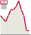
Many tiemes, on economics issues above others, we use to break teh scale to show a trend. But we're changing the real trend doing this. If we have to do it, include a locator of the actual scale.
8. DOCUMENTATION
To develop good graphics, many times we need great amounts of data. A graphics needs mre information than a text. A text could say 'in Somalia'. When you do a graphic, you need to place the spot on a exact place.
9. WRITERS ARE ALLIES
On every job, team is basic. On this one, when we don't know what does the client (reaers) exactly wants and the perception of it is subjective.
10. KEEP LEARNING
Keep attention on new trends, and not just on infographics: design, rests of journalism, infovis... Never think that what you know is enough. That is a mistake on any professional field, but more on this one, where the product lasts one day maximum.
Of course, comments with additions, rectifications or any different ideas are absoluteley welcome. Thanks in advance.
24/10/2007
As in Boston

I didn't go. But taking a little from here and other little from there, is possible to have a "little reconstruction" of what happened in Boston.
In the Summit web we have avalaible some PDFs and videos (coming soon) about some of the conferences. DAnyway, we'll put the focus upon those about graphics.
JAVIER ZARRACINA
Paco Oca uploaded on his blog some days ago three videos with Javier's conference. And Javier hmself uploaded on his personal web a link with a PDF of it..
TIPS AND TRICKS
Most of the are very basic, but there's always a little detail we haven't notices and could be very useful. I think the real workshops were better than this, but at least we have something
- Illustrator
- Photoshop
- Flash
ONLINE
We had two conferences about online, one focused on designm but also useful for graphics, with Jean Crandall (Washington Post) and Kelli Sulivan (LA Times). Kelli Sullivan's conferences about the project Altered Oceans is avalaible in PDF.
The other one, focused in graphics, had Len de Groot and Rafa Höhr talking about graphics form print to mutimedia. Both are uploaded.
- Len de Groot
- Rafa Höhr
GRAPHICS BRAINSTORMING
Archie Tse (NY Times) and Javier Zarracina took this section. Archie's PDF with some statistical works from NYT is amazing.
12/07/2007
Learn to draw El Correo style

Javier Zarracina, Graphics Director of The Boston Globe, former The San José Mercury News and El Correo, and Fernando G. Baptista, created a personal style in the basque newspaper based on fantastic handdrawings, which gave international recognition to the spanish publication. Now Javier, on his web javierzarracina.com, offers a tutorial with tricks and tips on how they draw.
Obviously, follow the eight steps of the tutorial is not enough to get graphics as the one above...
24/05/2007
Measuring the world

Nikon offers this interesting and useful web, Universcale, showing size comparisons between objects from protons to the whole universe. Very useful for those graphics trying to explain actual sizes using more than football fields..
Thanks to Carlos Gámez for the link!
PS. I announced I would post somo graphics of the new ET, but I fcouldn't do it yesterday. I will upload some as soon as possible. Mi apologies. Meanwhile, you can have a look to some of the new pages
28/03/2007
Color Palette Generator
¿Do you want to use the color pallete used on The New York TImes? ¿Want to know the CMYK of the water on this graphic you liked so much? Want to copy the gold used on Chris Morris' illustrations?
So, it looks like somebody got you on his thoughts and created this web where you can look at the web color range of an image uploaded in the web.
To access to ot, click here

Via Design Notes
So, it looks like somebody got you on his thoughts and created this web where you can look at the web color range of an image uploaded in the web.
To access to ot, click here

Via Design Notes
25/02/2007
Visual Journalism Bibliography
Poynter Institute published on the design/graphics section of its web a complete guide of online resources and visual journalism bibliography.
To get to it, here is the link
To get to it, here is the link
14/12/2006
Graphics about everything
 One of my fauvorites blogs is Information Aesthetics, about original ways for visual representation of data, statistichs or every little thing. Should be an obbligatory visit for every infographics artist, as the online version of divulgative books about practice and theory of graphics, these ones that always show the famous diagram of Napoleon's russian campaign. At this web you can find all sort of graphics, as some showing the connections between USA postal codes or Underground maps based on time better than distances. A recopilation of original and refreshing ideas. A must see!
06/11/2006
Celestia, much more than "Google Space"

Celestia is an incredible web. Above all, I recommend the program with the same name offered for downloading. It's a kind of "3d Google Space" in which you can take a look in real time, follow orbits, travel, look for objects... incredible. But Celestia offers much more. In the principal web you can get 3d hi-res images of all kind of objects related to astronomy,a nd you can also upload yours. Worths to take a look!
02/11/2006
How to use a wire graphic

When a wire graphics arrives (Reuters, AP, Graphic News...) you always have the temptation of fixing styles and publish it, but this example from Fernando Róbato (As), show how we should use wire graphics (obviously, when we have the time). Some days ago, Christian Iton, from Reuters Asia upload in Newspagedesigner this graphic. Some days later, As published the graphic shown above. Is a very simmilar information, and I suppose that Fernando based on it, but, the result is amazing. He uses the information, but not the illustration and get an unique graphic. Usually, we don't have the time to do it, but is an example we should take
Subscribe to:
Posts (Atom)