
As I told you on the last post, I spent this weekend in London. The former 'Helvetica and Gill Sans empire' is now being invaded by Slab fonts in general, and by Guardian Egyptian look-alikes in particular. London is my favourite city and one of the most important cities for infographics. If not the most important. When one thinks in infographics and London there are two obvious references.

This one is the map of Soho done by John Snow. Thanks to this map marking the cases of cholera, the doctor could guess that a particular pump on Broad Street was the source of the infection.

The other is the tube map, a method used later on all undergrounds all around the world. An example on how abstraction can be best used on graphics. This particular example is the map of 1933, the first one really schematic, made by Harry Beck.
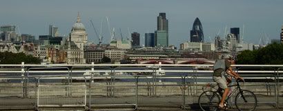
But London is nowadays a kind of capital of the graphic design of Europe. And anywhere you go there you can see why.
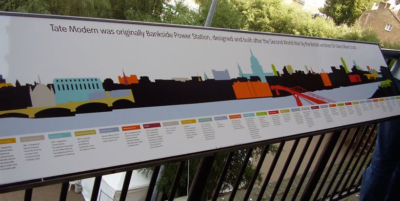
This is the Tate Modern. You can see in the terrace a guide of what you see with a color guide. Simple, yes, but smart and clear. OK, this is Tate Modern, but you can see this kind of examples everywhere in the city.
And just look on the changes that newspapers are doing: the Sunday Times redesign, the new bet for graphics of Telegraph Media group hiring Michael Agar, the international admiration for The Guardian...
Even ducks of Hyde Park are influenced by infographics
And sorry for this geek joke...
No comments:
Post a Comment