31/10/2008

ETA tries a massacre at the University of Navarre, home of the Malofiej Awards

The University of Navarre, home of the Malofiej Awards and of the Spanish Chapter of the SND, has suffered a terrorist attack that has been very close to become a tragedy. In a place where many of us will be on a few month and have been so many times.


I studied there, and on my last year I lived another car bomb just 100 meters from the same place where a car exploded today (yesterday for some of you).
But today, it has a harder blast. An at 11.00 am, with no possibilities of evacuation. In the heart of the University. As Pablo Ramirez tells on a comment at the spanish version of this blog, Alvaro Gil, one of the organizers of Malofiej and known by many of you, took his car from the parking where the blast occurred just one hour before the explosion.


From here, I just to to condemn the attack and send a big hug to all our colleagues of the University.

29/10/2008

Ask Charles Blow

Charles M. Blow, visual op-ed columnist of The New York Times and former infographics Director at this same place and at National Geogrpahic, is this week answering readers questions at the section Talk to the Times.
To ask him, just send a mail to askthetimes@nytimes.com

Here you are a little apperitive of his answers:

"When I was in the graphics director job in the newsroom, I urged the staff to experiment with exotic charting form and complex data sets. In this job, I do my best to make the charts as simple as possible. My thinking is (and the response has been) that my readers are not impressed by visual tricks. They want strong points that are easy to grasp."

27/10/2008

Copies and plagiarism. They are not the same thing

Many people come to Público's infographics department to say that we're being very orginal with our graphics. I use to answer that we're not. We're just very good copying ideas. We have selected the existing styles that we think that fits with our style and our ideas on how to explain thing. The graphics with balls, used by almost everyone nowadays, the caudal graphics and many other things have been seen before at The New York Times or The Guardian. And they had seen them before on Fortune and Minard... And, as Zarracina says, "we're all copying Playfair". And I also would say Leonardo da Vinci.


One of William Playfair's graphic, creator of charts.

On graphics, as on every kind of culture, almost everything has been invented yet. Many of the biggests advances are just reinterpretations and rescues of things done before.

For example, I love this Nigel Holmes' graphic.


So I was very surprised when I discovered a collection of look alikes on BibliOdyssey.


And not just those. Gonzalo Peltzer sent me this pair of new examples.


MAybe many of you would know them before. But I didn't. And this is not a problem for me. Holmes had to explain this data. And this was a very good way of doing. It was done before, yes, but the reader deserves the best explanations, not just the newest one. If we can give a new one that improves the others, that a great great plus.
But those who work on newspapers know that many times some articles are forgotten just because other newspaper publish them before. So we punish our owen readers.
On my opinion, this have no sense. Being original must not be a problem, but an advantage.
OK, we should not copy, don't tell where we found something, sign in and sell that as our own. But that's a different story.

Soemtimes we're asked for something original. And some proposals are using analog illustrations for the bars. As we can see on these examples of Spain at 30's. When letterset was high-tech.


Image from Malofiej 14 book, frome Fermín Vílchez's article 'Origin and evolution of graphics in Spain, 1856-1936

So, now George Rorick could come to claim his copyright for the weather maps made on 80's at USA Today.

24/10/2008

Another pair of infographics blogs

If you are here reading this blog I suppose you like news graphics.
So here you are another pair of infographics blog you would like to take a glance

Maxgadney.com


Those who are used to vst Pamplona on Malofiej would know personally Max Gadney, the former head of the online BBC department.Los que sois habituales de Malofiej seguro que conoceréis a Max Gadney. He and his tema had showed how graphics are mainly good idea on how to represent information visually. Max is now on the TV division, but also on his personal blog and on WWII Magazine.


Parka Blogs


Parka (Teoh Yi Chie), infographics journalist in Singapur, is the creator and webmaster of this blog. He talks of much more things that infographics. One of his great contributions has beento classify thousands of graphics of NPD.

nytimes.com... again

YEs, I know I'm being a little monothematic lately (and not very fast). Please forgive me. But the american elections graphics have a name (although this one is more about the crisis): nytimes.com. And this example is not just a big database (Which it is also). Is a great example on how communicate visually on a very easy and clear way. Just click on the image to play a little with it.


Thanks to Guillermo Nagore for the advice

20/10/2008

nytimes.com: the messenger and the source II: API

One more step on this way for the new york newspaper. What soitu made in Spain is now made for the world by nytimes.com: open source data for graphics. And in this case, like for Soitu.es, the elections has been the trigger. Nytimes.com offers API for the financial data of the candidates. You cann access all the information here.
And it won't be the one and only ocassion. They're preparing much more open source data.


I still have to keep studying online graphics, but this kind of initiatives encourage me a lot...

18/10/2008

nytimes.com: the messenger and the source

This new technological era gives new tools and new sources for journalists and any other people. Google Maps is one of the best examples. But in these days of presidential debates in USA, the best tool adn source for us in Publico has been nytimes.com. As we ourselves declared as source of our graphics.

On the spanish presidential debates we made the graphics while we were watching at them.


But for the USA debates the time was not the right one. It was very late in the night (or very early in the morning) in Spain when McCain and Obama discussed about Joe the plumber. We had to made a decission: sleeping and working the day after or stay awake and watch the debate and go to do the graphics the next day as zombies.

But nytimes.com arrived to save us with its incredibles interactive features.

On them we could watch all the debate the morning after, read the transcription, look for the words that had been said by each candidate (with number of times being said by each one and with the context), see the topics and the time dedicated to each one... And with every debate easy to access.


With them we could contextualize the photos, access the 'screenplay' of the debate, make a tagcloud... And read all the transcription to count the people refered, as sometimes they were named by name, somo by charge and some by surname.

Thanks to nytimes.com cause thanks to it we could sleep these days. These were teh results:


15/10/2008

I like checking out charts

I write on my browser Xocas.com and I find this video on Xaquin's web.


I'm not going to comment it. It's not necessary. Just 50-50% surrealist and wonderful!

13/10/2008

Serra's bread

Gonzalo Peltzer has been commenting on the spanish version on this blog how some of the graphics shown here on some posts (1 y 2) regarded him the berad graphic made by Jaume Serra at Clarin some years ago. This graphic is more an opinion column than a graphic. With a very strong intention. It shows which percentage of the population preceive teh different scales of wages in Argentina. From left to right, from the biigests to the smallets. A 42,6% earns less than 500 pesos per month (155 $ on today's change).

12/10/2008

Behind the scenes: How did Pizarro die?

South(and center)America is a great talent factory on the infographics field. One of the most productive plants is Peru, and teh most important newspaper of the conutry is El Comercio (Lima). One of its infographcis journalists, Raúl Rodriguez, explains the process tehy followed on one of their last great graphics.

"Some weeks ago was released an exhibition at the Lima Cathedral about the conqueror of Peru Francisco Pizarro, whose corpse rests there. The exhibition focused on teh investigation by the Peruvian Anthropolgy Forensic Team, who has identified and examinated the body of this historic character. The team is well known on the country and Bosnia for different investigations.

Months before this, the press department of the Lima Archbishopric contacted our department in order to know if there was a possibility of developing a graphic with the stuff they have over this matter . When we knew it, we all put faces of 'Are you kidding? Of course!'

When we watched the stuff and the way they worked we knew we must do a forensic graphic, as they started forkm the very beggining the examination of the corpse. First of all, they confirmed that it was a man, and then determined the age of the bodyparts.

Once they knew the gender, age and aproxiamted year of the death they tried to find the causes. The chronists of that age sorrounded this fact with many legends and many historians 'recreated' the circunstances of the death. I remeber a book talking about the sentences said by Pizarro when he was fighting for his life:
Imagination FC:5 – Real Facts Utd.: 0."


What called my attention the most was the skull. It shows many wounds that are coherent with the most difunded versions about Pizarro's death. They talk about a conspiration whose head was Diego de Almagro's son, his partner of the conquest, and who was betrayed by Pizarro on the ground deal. The skull shows many wound on the cervical vertebres, which denotes the great skills of the swordmen (many of them, as show the great amount of wounds) and the intention of cutting the head to put it on a spear."

When we had all the stuff I asked for the space we had for the infographic. We had a B&W page with an interview to Hernando de Orellana Pizarro, one of Pizarro's descendant and president of Obra Pía de los Pizarro Foundation, placed in Trujillo, Spain.

We had to deal with that circunstances and the main thing we had to explain was the known reasons of the death. So we used for that the small pieces that open the graphic. This helping pieces are very important on infographics,as in forensic sciences, because is good to start from teh very beggining- We have to assume that the reader is new to this data, and so we can reach everybody.


The structure (an inverted L) suggested by the page, conditioned how we had to tell the story (watch sketch). We started with a drawing of the head adn neck where we place the photos or teh damaged vertebres and then we analyze the skull and the wounds on it. The long piece of the L is used to fit the shape of the complete skeleton where other wounds and problems are placed."


Finally we explained where is Pizarro buried and used a photograph os his descendant, whose DNA will be studied. Past, present and future.

07/10/2008

Infographics departments around the world: RCS Quotidiani, Italia (Corriere della Sera, La Gazzetta dello Sport)

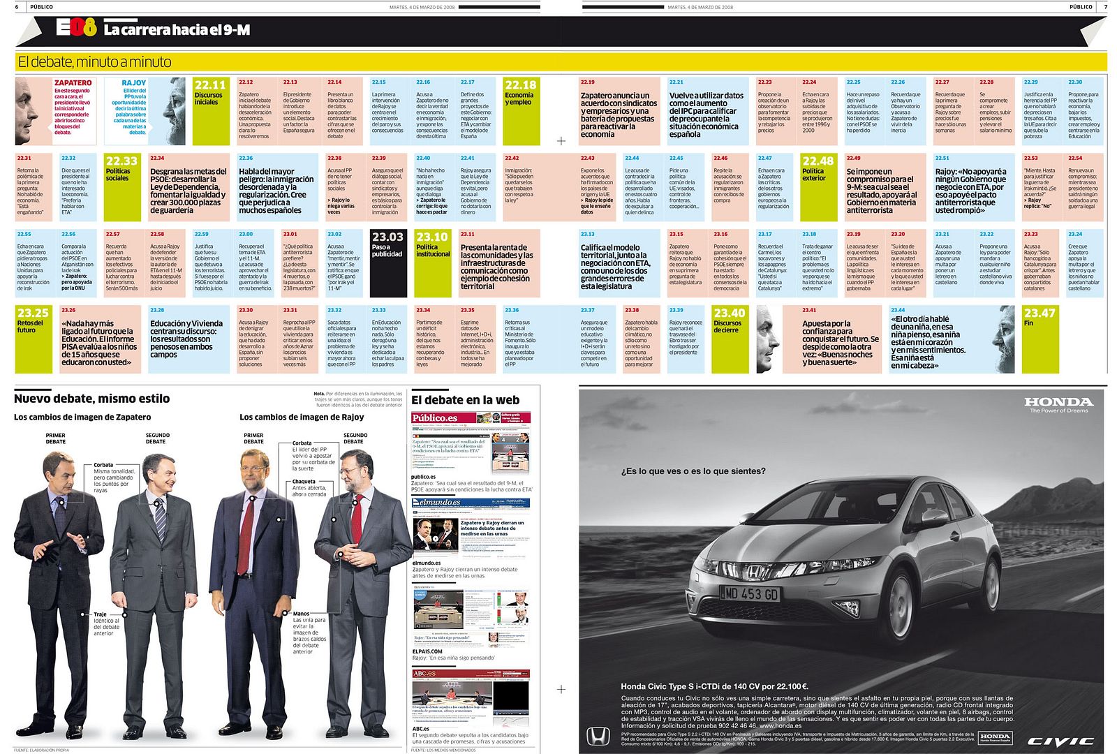
Working on an infographics department in Italy is hard. Not just because you would prefer being on the streets, staring the monuments or eating pasta with Lasmbrusco. The proble is that the people that work on these departments are not considered journalists, and writers and editor take decissions about the way the graphic is done. We complain a lot about this kind of things in Spain, but we must recognize that the problem is much bigger in Italy.
Anyway, some people manage to do some good things despite all these problems. Even winning some international awards. This happens on RCS, the most important journalistic enterprise of Italy. The departed, commanded by Marcello Valoncini, is on charge of the infographics for Corriere della Sera (the biggest political newspaper of the country) and La Gazzetta dello Sport (the biggest sports newspaper too). Marcello has, on his own words, a young and motivated team. And now, I let him speak:


Our department has 15 people on the infographics staff, fr both newspapers. We work on different shifts to cover form 14.00 to 01.30. We have three great illustrators and the rest of the department has a good creatve capacity. We don't work for the web, so our works can't be watched online.
As you could understand, this is going one step behind the spanish or american newspapers.


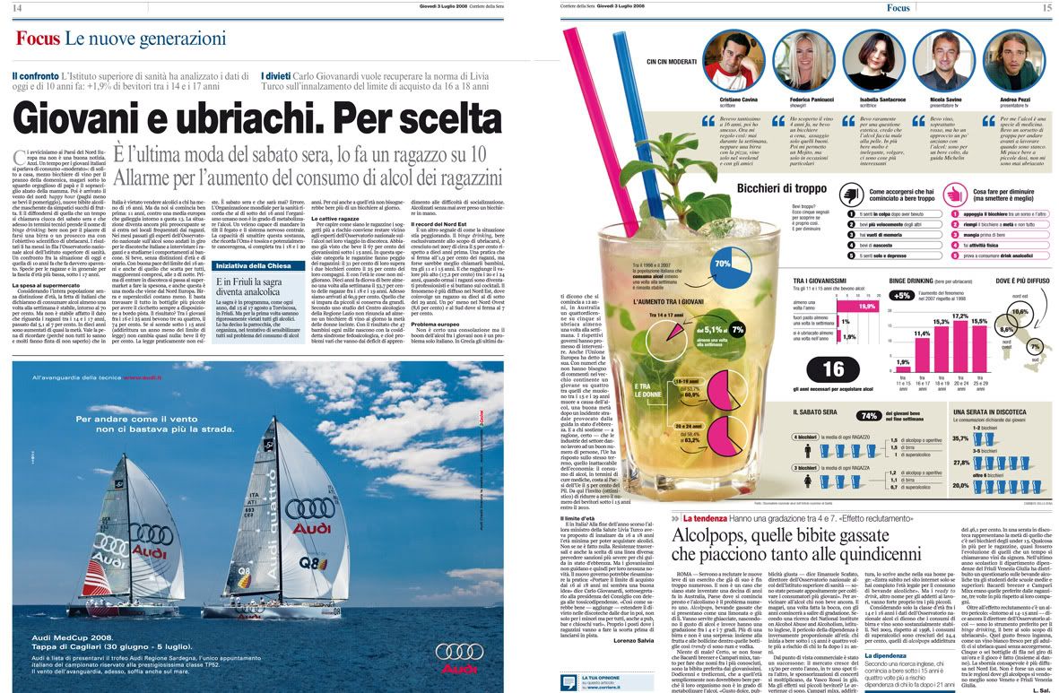
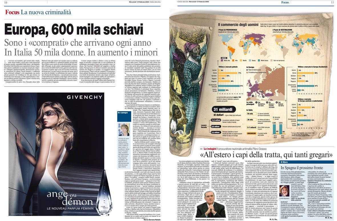
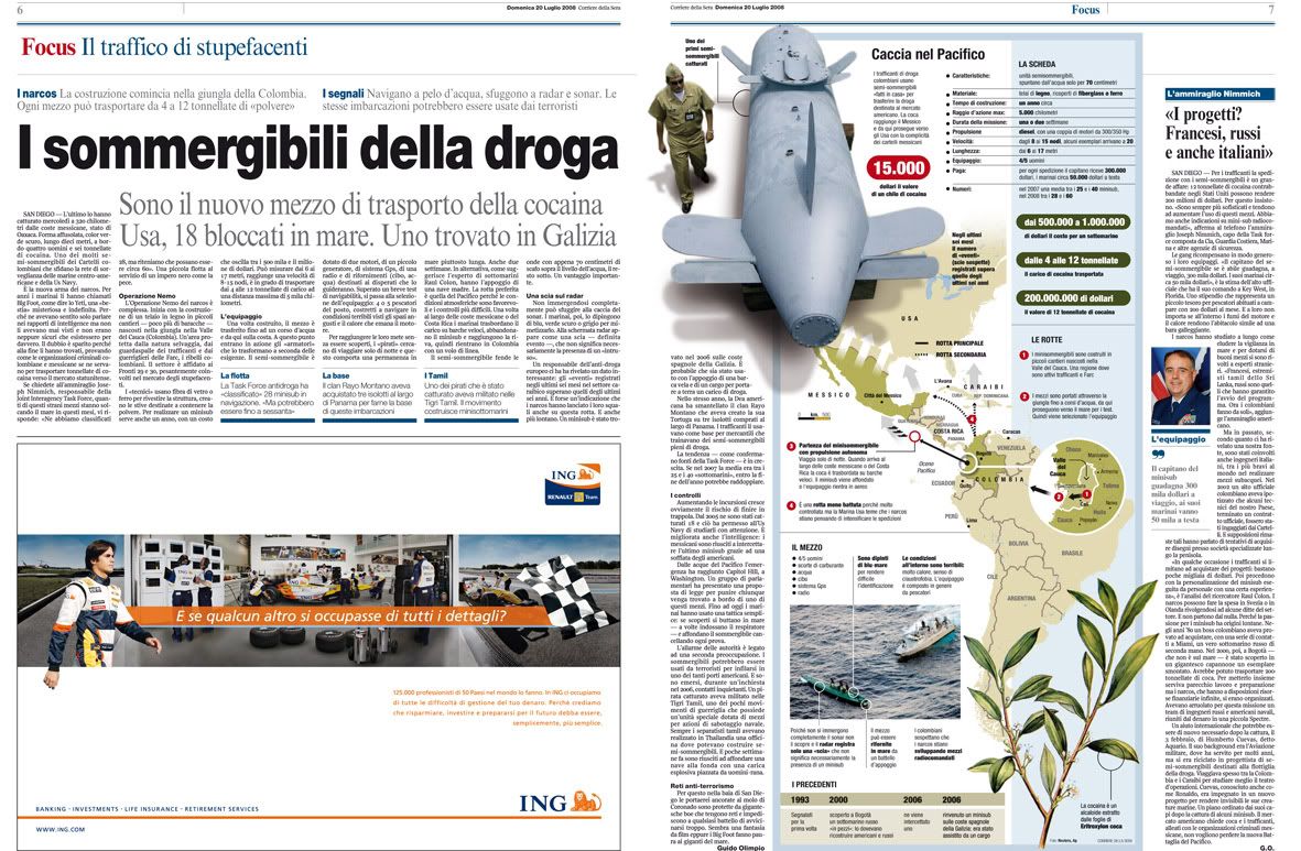
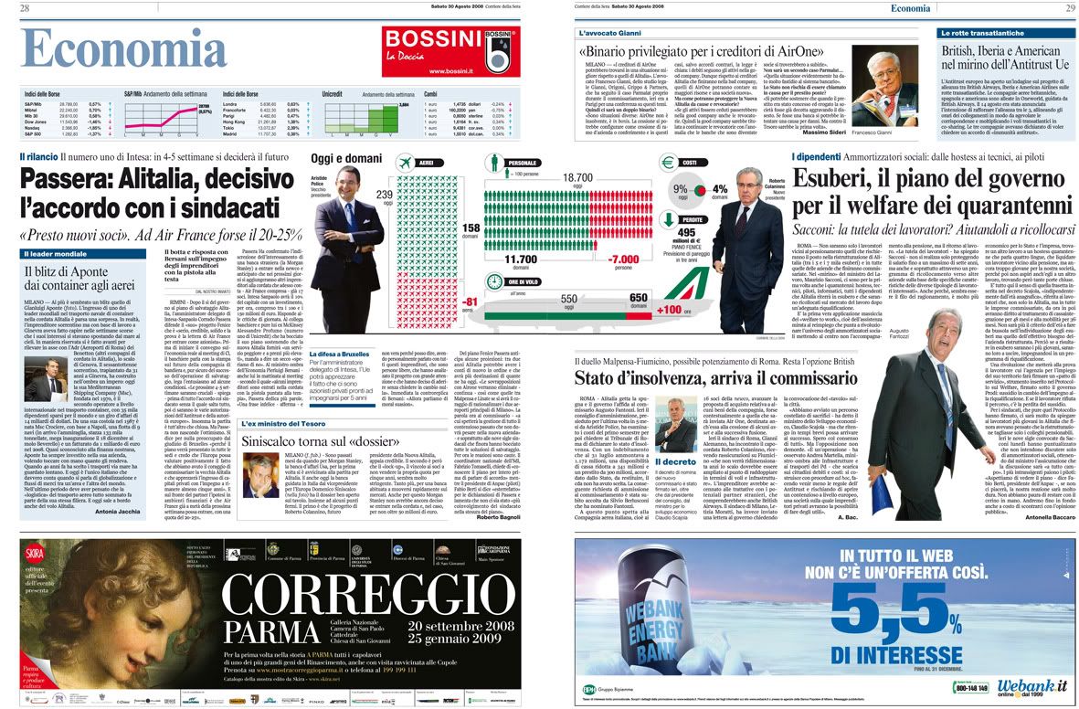
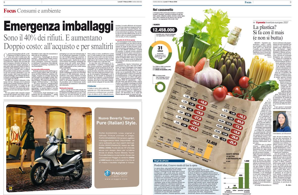
From 2005, Corriere della Sera (founded at 1876) arrives to the newsagents with a full color edition, which have meant big changes on our traditional newspaper, which is more than 130 years old: we changed the page format, the fonts and the text size. A new font has been created, the Solferino, exclusive for us. The pagination has been also absolutely changed. We've created a new section, with in-deep features, called 'Focus', where graphics have a big importance. Readers have liked it very much.


La Gazzetta dello Sport (founded at 1896) has also suffered a big transformation this march: new format, smaller, new pagination and new fonts too. I personally creatd a style handbook for the sports newspaper. It could help to keep the same style on different graphics.


And, as signature of the graphics here shown, here you are all the people that works on RCS infographics department:
- Marcello Valoncini (Chief of infographics)
- Pierluigi Serena (Deputy chief)
- Andrea Venier (Deputy chief)
- Sabina Castagnaviz (illustrator)
- Nicolas Vargas (illustrator)
- Dario Arcidiacono (illustrator)
- Marco Maggiori
- Ade Rana
- Cristina Pirola
- Sara Caffulli
- Franco Sturino
- Franco Amici
- Massimiliano Aliberti
- Roberto Sotera
- Gianfranco Giudici

06/10/2008

Hand drawing and infographics: when hands are used for more than moving the mouse

Many peope say that they won't become infographics journalists just because they down't drw well. I always sy them than drawing is not absolutely necessary. I am not very good at drawing, well, I was good at the school, but not enough for a newspaper. And I don't do any hand drawing for my job. But, truth is, than having a good hand never comes for bad. Just ask Baptista and Zarracina.


El Correo (Bilbao, Spain), was famous all around the worl by it hand drawing style. They used the illustrations on graphic like no one, and on breaking news too. The example shown is about a spanish militar plane that crashed i Turkey.

The southamerican infographic style has much of illustration on it. One of the big exponents of it was, anyway, the spanish Jaume Serra, who created an era on his time at Clarín.


The graphic of the whale is still chasing Jaume...

But we have the opposite way. Fernando Rubio, head of the infographics department at the spanish newspaper ABC, came from Argentina with his great illustration skills. You can take a glance of it on his blog.


The spanish independence war as Fernando Rubio drew it.

From the same place arrived to our peninsula also Fernando Robato, now working at the sports newspaper As.

Robato is the paradigm is that southamerican style: textured background, central illustration and many explanations with small details.

But we also have our own product in Spain. Many of our infographics journalist are also great at illustrations. Tomás Ondarra, the ruling hand of El País infographics department, is also the hand that draw the illustrations for the opinion pages on teh main spanish newspaper. Emilio Amade, from El Mundo, also uses the pencil many times to illustrate his graphics with great examples. As Julián de Velasco did at Marca and now keep doing for Focus Ediciones. Julian has two blogs with his examples: Illustrations infographics and El mundo bélico.


El F18 y sus pilotos, para la revista DT. Julián de Velasco.

But I must confess that one of my favourite illustrator-infographics journalists is Gabi Campanario, who works for The Seattle Times and blogs on Seattle sketcher. And this part of his jobs is which I like the most: the fast drawings on Moleskine, which are a kind of graphics by themselves, with all the explanations of his daily life.


One of his jobs, with some facts on it.

And we also have my colleague at Público Álvaro Valiño, whose illustartion style is more conceptual, but who also havs a good hand for drawing when we wants to use it. He's a great illustrator and a fantastic infographics journalist, but he don't mix these two things usually. The other people of the department, Mónica and Miriam, have also great skills for hand drawing, so I'm the fool of the department...


Some 'Valiñadas', as we called them onour former newspaper La Voz de Galicia. These are some of the most hand-drawed. More examples on alvarovalino.com.

But this happens too on online infographics. Just take a look to some of health graphics that Xocas produced on elmundo.es, with some high quality heirs as Artur Galocha.

Click on image to access the online graphic

And others illustartors-infographics artists that come to my mind at the moment...
- ABerrocal
- Lizzeth Huerta
And so many more...

02/10/2008

Infographics departments of the world: Hufvudstadsbladet (Helsinki, Finland)

Hbl is a daily newspaper with a circulation of approximately 55000 and a geographical spread over the Swedish speaking areas in Finland, primarly along the coastline in the south and west. Since the transition to the tabloid format four years ago, Hufvudstadsbladet design has been awarded several times. The infographics department was during the last year granted awards by the European Newspaper Awards, the Finnish Newspapers Association and in the SND/S competition.
Overall the newspaper has been awarded Europe's best designed newspaper in the category 'local paper' by European Newspaper Awards and Best Redesign by SND International.

Here you are som examples of the infographics made by its team, formed by three members: Björn Heselius, Mikael Bobacka and Maija Hurme. And explained by one of them, Björn Heselius.


In this single page we wanted to open the eyes of the readers and inform them of what really happened to people that celebrated New Year's Eve exactly one year ago. Instead of doing it in a short article that most likely would have been read and forgotten just as fast, we made this gingerbread man, broke it's leg and neck, burned the hand and eye. Next to each injury we presented the numer of people that last New Years Eve lost their vision after being hit in the face by fireworks, broke their leg, were killed, suffered severe burns, reported domestic violence, were raped and (as we are in Finland) of course, how many liters of alcohol that was bought for the holidays. This visualisation was awarded by SND Scandinavia this year and for me personally it was also a way of saying that the infograpics artist not always need to draw, it's just as effective to bake the story.


We found out that among all employees of the Finnish parliament only one out of three is male, but among the members of the highest executive staff in the same organisation the men are in strong majority. The symbols indicate the number of men/women in the different offices, starting from the highest superintendents, continuing via supervisors all the way down to floor personnel. At the bottom of the graphics section we also compared different kinds of duty, salary and education for both men and women employed by the parliament.


Last summer we had an extraordinary intense period of thunderstorms. This spread originated in an idea of finding out where the lightning is most intensive in Finland. After getting all the information needed we started out by splitting the entire country into a grid of about 100 square kilometer per section. We calculated the exact number of lightning strikes for each section and it resulted in a map showing that the most lightning-intensive area was in the inland. In order to get a personal touch to the story we started looking for thunderstorm-chasers in the most intensive area and luckily found one! As a bonus we also explained the origin of thunder and lightning. This infographic was presented with an Award of Excellence in the European Newspaper Awards last year.


Instead of praising the growing business of biodynamic fuel we here show that the green alternative isn't really as world-saving as we might have believed. In order to produce one single car tank of biofuel you need the same amount of crops (corn and other grains) that would feed 365 people for a day. More than 850 million people suffer from malnutrition in the world. If 1,64 million people wouldn't fuel their car with biofuel once every week there could be enough food for the starving people.


Once a week we publish a home-section in the newspaper. This issue is on how to make the perfect home entertainment room and still being able to use the room for socialising. After consulting a interior designer and an architect we came up with this idea of taking a normal sized apartment and according to the experts' ideas redecorate the living room into a more suitable homecinema/living room. We also created two technical alternatives; one for the connoisseur that is willing to pay for the ultimate experience and one budget alternative.


In the greater Helsinki area there are two competing businesses who provide food to the elderly people who still live at home. We found out that those living in the city of Helsinki paid 34 percent more than those living in the suburbs for the same amout of food. Here showed by the number of meatballs elderly people get for 50 cents depending on what food service provider they have.