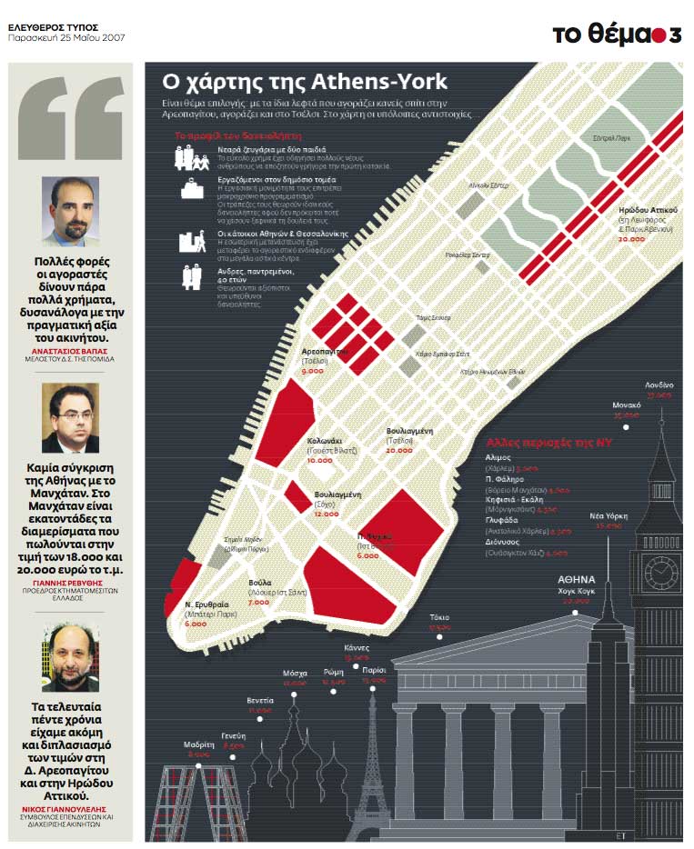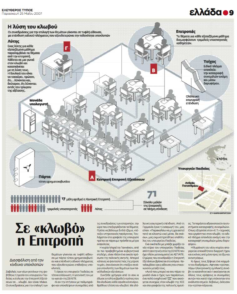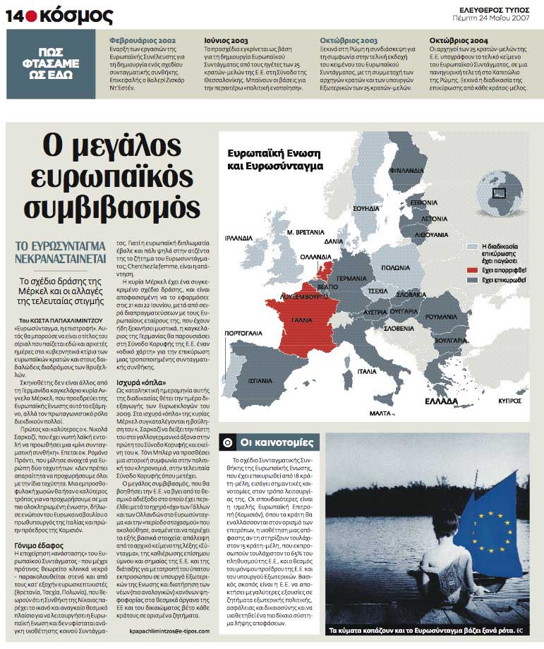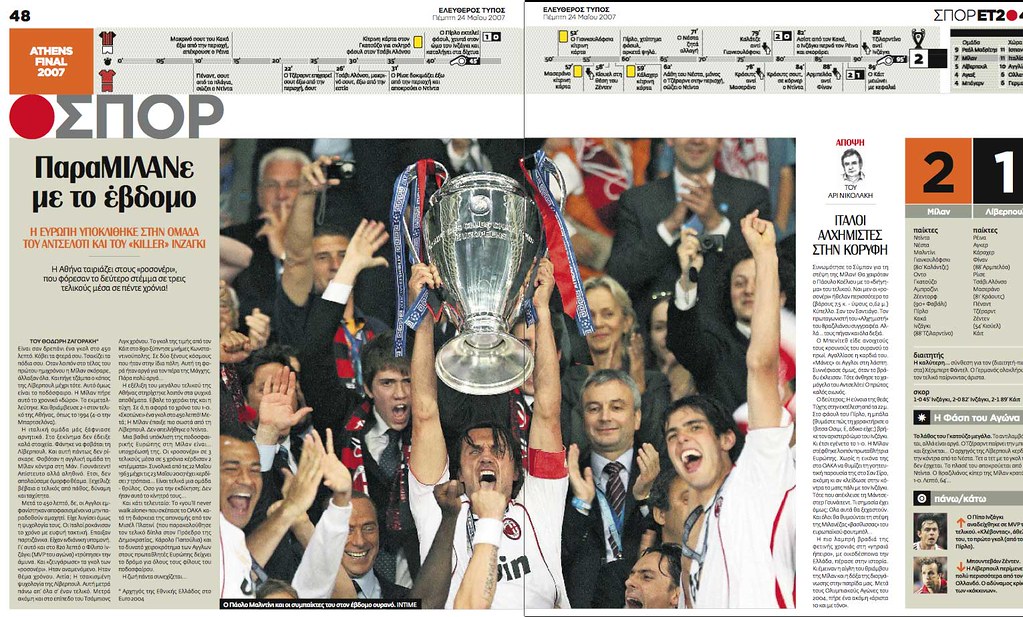


The paper has suffered a complete revolution, and graphics must have the same way. Old ET combined graphics and photos with tables and texts, using a lot of colors, creating a confusing and overcharged style (take a look on this old post). Bet for clear and clean graphics and color as a guide for information it easy to see on the new style, perfectly used for the ET infographics team.

No comments:
Post a Comment