
Megagraphic: El Mundo on the Gran Vía of Madrid
One in a million. An authentic encyclopedia. And it's obvous they did an enormous effort with it. Something to keep in your house.
More on La Iguana Ilustrada (Juantxo Cruz's blog, chief of infographics at El Mundo)

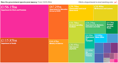
Cutting the budgets: do it yourself (The Guardian)
Easy and direct, with a lot of information and makes the reader walk in the 'cutters' shoes. YOu can find very interesting things palying with it.
Click on the image for the interactive infographic
Netflix rents (NYTimes)
The big thing of this graphic is that stereotypes are true. Being a topic aparently uninteresting with the raw data, the infographic converts the information into a kind of sociodemographics lessons of the US.
Click on the image for the interactive infographic

And now, hs own three picks...
Rythm of the city
Now it's me (Chiqui) talking: I chose this infographic as one of the best of 2010. So I don't have much more to say...

(On we're back with Xan)
This and the next infographic were published in Diario de Pontevedra, and they were the only ones with some (good) feedback from the readers. I'm specially glad with the second one, about saving banks merging in Spain, that, being risky for what readers of the newspaper are used to, was useful for them.
Saving banks mergings

Terracota warriors
I choose it because this was my first feature at China Daily and because of the difficulty of the fact-cheking. I had to use a source abroad, because after a very difficult burocratic process, the chinese sources (the museum where warriors are) didn't want to give any information at all.

No comments:
Post a Comment