Barack Obama and Mitt Romney will be face-to-face again on TV for their second debate. A debate, bi its nature, shouldn't be a subject easy to visualize, but day after the day, media gets to publish great graphics, in a record time, about what is said on these spaces. These are some examples of graphics on this topic, new and old.
The New York Times: the replay
No surprises. NYT uses to do spectacular (and effective graphics) with almost any topic. Debates are not an exception.
This interactive way to replay the vice-presidential debate may not be a graphic. I don't mind the name: graphic, design, layout... It's a different way to present the information, easy to navigate and with fact-checking embedded.
Boston Globe: the intensity
Daigo Fujiwara and Alvin Chang created this graphic visualizing the intensity of the Biden and Ryan answers at the VP debate.
Click in the image and, in less than 30 seconds, tell me the three most controversial topics of the debate: taxes, defense and medicare jump to your eyes. And you easily see how abortion was not something to discuss. And you can also have more detailed information with just a mouse-over. That's what graphics can do: give you a good summary at a glance and allow you to get deeper without problems.
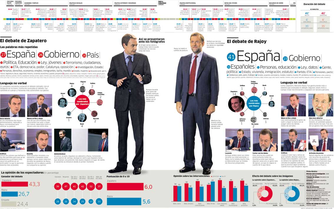
Publico: everything else
Four years ago, Rajoy and Zapatero had a TV debate, after many years without this kind of face-offs in Spain. So Publico, a very political newspaper where I was working with other very talented infographic journalist, wanted to cover it with a breaking news double spread explaining all the details around the candidates and their performing. The political analysis will have pages of text. This was something else.
This was the result.
The body language, the bets moments, the mentions, the timeline... we focused on the most visual details of the confrontation.
NPR: the details
This is not a debate graphic. Not even a graphic, maybe, but as I told before, I dont mind the names.
But they created the debate from speeches and presented it in a very different way, as an homage to the famous pop-up videos.
They focus on some details, fact checking and curiosities. What is behind the declarations.
UPDATE
Periscopic: the issues
Periscopic has also its own way to visualize the presidential debate words through
Politilines.com., 'Connecting the issues to the candidates' is the motto of this initiative. And so it is.
A direct way to know what the candidates are saying about certain topics... and who's talking about the topic chosen (and what are they saying).


.jpeg)


