Showing posts with label My worst graphic. Show all posts

05/02/2007

My worst graphic: Gonzalo Hernandez

You can "discover"Gonzalo Hernándezat his web. He works in Cancun (México) (place where woking is harder) deveoping the visual resources and infographics department ot the Periódico Quequi Quintana Roo and he's a collaborator of Economía and some publications f the USA. Maybe you also have seen some of his works on the Enciclopedia del Franquismo (Franquism Enciclopedy) published by El Mundo.
These are the good thing, now we're focusing in the bad ones (it's a joke). Gonzalo sends two graphics made for Prensa Libre (Guatemala) years ago.


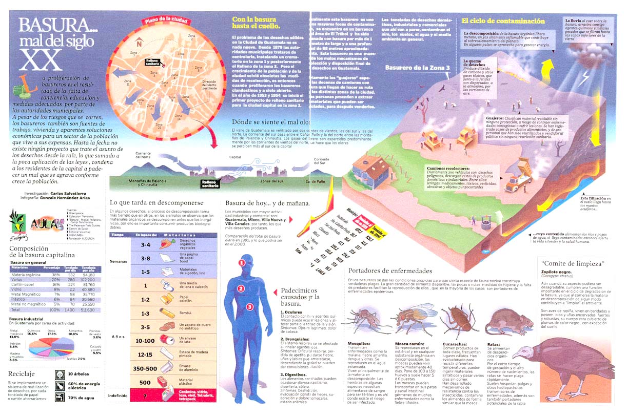
This first talks about problems caused by trash. Gonzalo talks himself about it: "it's a colorful carnival, editors didn't read the texts -and I didn't ask for it- head and introduction text is trapped in a color which does not allow a clear readinge.... I didn't know or I just didn't try to administrate well this information. I wanted to get all the information in the graphic and the final result... is terrorific to try reading it!"


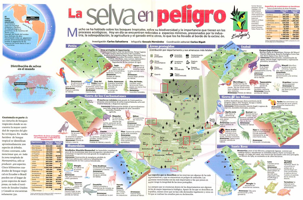
He talks also about the second one: "It's about natural diversity of Guatemala forests, threatenes by men...this one is worse..it's like a monument to disorder..main text is very far from head, the Guatemala map is literally into an information chaos, the visual navegation concept arrived here, and came back the same way"

In my opinion, these are the typical mistakes we have when we're full of information and we don't have the time or simply we don't really try to analyze what's the main thing, how do we want to explain it, what shoud be on a graphic and what's not and how are we going to make understable all the data. Problems grow when we have a double spread. But we can learn a lot from mistakes

26/01/2007

Mi worst graphic: Aberrocal

Antonio Berrocal (who's preparing his personal web, just thepreview is great) works as infographics artist and illustrator inMálaga Hoy. He sends this graphic from september, 2006, very recent, and explain its mistakes:

- The photo is bad. Left of it is out of focus and streets and rivers are not appreciable, althought they have their names on
- The map of Malaga should have some identificative points, as streets, dock, river... Just as shadow zones above the map. Neither I can be sure of the extension and situation of the zones I drew myself
- There are no cypher data about extensions to understand the magnitude of the zone

A mess, unclear and uninformative

My worst graphic: Jose Manuel Ferrer

José Manuel Ferrer es el infografista de Granada Hoy. If you take a look to his graphics you wouldn't imagine these ones are his, but he signed them: "with I made them, I was proud of them, I thought they were good, but time's put everything in it's right place, and I've payed for it". As always happens. He doesn't choose a graphic as his worst, he chooses four