Showing posts with label Front pages. Show all posts

06/08/2008

No sacred spaces

If I talked about the bet of NYT for the visuals on tha last post, we had a good example this morning.


And it has been also the main element on the web all the morning with an online graphic that you can use on the home itself, without opening a new window (although it has changed).

If you can explain better a story with a graphic, use a graphic. No fear. There's no sacred palces, not even the front page of the NYT. No sacred spaces. Which is sacred is the correct explaining of the story. Forget what we use to do and think on what we should do.

Via Innovations in Newspapers

22/01/2008

Does it make sense?


Does this front page make sense?, Is this graphic real? And if it is, does it make sense to publish it without cyphers?
Sometime we complaint that graphics are used just with an sthetic intention, instead of thinking on the information?. Well, this is not the case. No sthetic. No information. No sense.

04/01/2008

When size matters


This is today's front page of The Independent.

Aprt from if it's "beautiful" (there's no more subjective matter) or if we're interested on the topic or not, the red stroke showing the actual size of the cage gives this information a great strength and make information more understandable. Just a visual detail, but it worths the whole page

26/06/2007

The Independent: how to use graphics on front pages

I've talked several times on this blog about graphics as main illustration of the front page. Something I support, as an option, because of the possibilities of graphics for explaining the information at first sight. There's a "fear" about using big infographics on front pages, and sometimes editors use photos as if it was an obligation.
One of the newspapers which has the best use of infographics on A1 pages is The Independent (and its sunday edition The Independent on Sunday). They show their opinion and clear facts just taking a look to its cover.
And, as this is a visual journalism blog, Show, Don't Tell! Here you are a slideshow with the "infographic" front pages of the last 12 monthss.


If you want to take a look to all The Independent front pages since march 2006, click here

18/06/2007

Risky bussiness?


Big infographic A1s, betting for soemthing different than a typical elections victory photo (the safe? way) arrives to french traditional media. In Europe, just a few "dare" to publish this A1s (with the honourable exceptions The Independent and El Periódico). Anyway, when you see the papers in the morning... What cover would you choose? Le Figare ore these ones?


Via Innovations in Newspapers

09/05/2007

El Periodico, opening a path in Spain

Many times I've talked on this blog about the decission of opening the newspaper with a graphic, and most of the times was about papers from abroad (I'm talking from Spain) and for having a little complaint about the lack of these inniciatives in my country (some have tried, but still just a few).
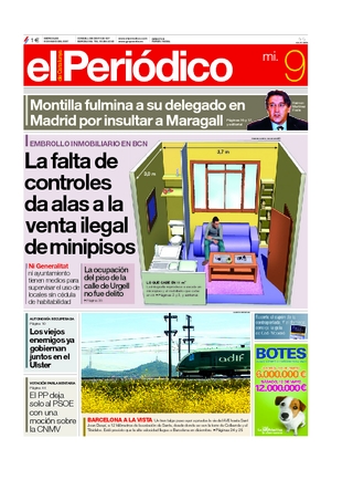
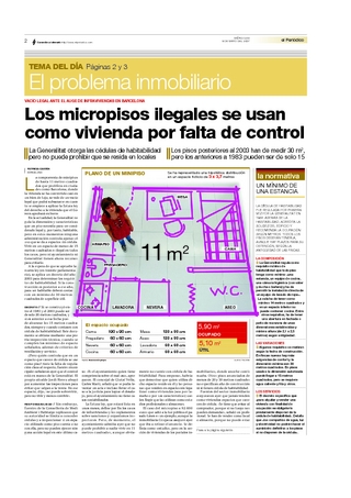
In this ocassion, El Periódico, in a continuous effort to innovate on its cover (sometimes winning, other not) today "dares" to publish a A1 Graphic, about the extremely small and illegal flats which are appearing in Barcelona. A visual explanation for a topic that really worries people (with our mutual friend James, from Poser)
On inside pages they explain again the same information, but on a different way, giving other way to distribute such tnuy flat.
They care about an affordable and visual explanation of the data. Well done.

But, Spain is not yet a place where this kind of innitatives are easy to find. These risks (are they considered) are not common beyond sports papers, meanwhile in USA (and not only there) they have its space, as we can see just taking a look to today covers on Newseum. Some use the graphic as main illustration, other don't, but the vocation to explain the data from the beggining do exist.
We don't have to use a graphic on A1, but we have to give to the information the resources they need.


Via Paco Oca, Maquetadores

22/04/2007

New trend?

Marca is the topselling sports newspaper in Spain, and far from the rest. In Spain, the kig of the sports is, no doubt, football (or soccer, if you're american!). And goals are the amin attraction of this sports. So, what better than explain that goal everybody will be speaking of in the morning for those who couldn't watch at at it? With its target this is nearly a public service

12/02/2007

Arizona Republic A1s

I've talked several times about A1s graphics, but this is a clear example about how to make them fit great.


Examples from Andrew Long's portfolio, Arizona Republic

05/02/2007

That's what a graphic should show

Innovations in newspapers showed this sunday a recopillation of The Independent A1s, which worths to have a look. Between this amount of atratctives covers, maybe professional thinking, but this one was which take my attention


A main idea to sell the paper: clear and visual. We've got a lot of pages talking about North Korea nuclear weapons, but here's where we can see directly the risks, whihc countries are affected and how much they are, teh range of their missiles... Information not able to show with just a big head and a photo. Yes, we've seen this graphic like a million times, little, acompaigning an information. But here, it's the starring and IS the information. A good image worths 1000 words, a graphic maybe more...

05/12/2006

Cover infographics


A good photo cover sells the paper, but it's also true that just a few dare to do it with an infographic. And never so big. High bet by Rocky Mountain News (Denver, USA). Peolpe could say if this is a mistake or not, but is brave, something we really need in journalism bussiness