Share
I'll be updating everything with links and images.
IMPRESOS / PRINT
Noticias de Actualidad Inmediata / Breaking News
1CB Bronce / Bronze
Público (España)
Radiografía de la posesión en el clásico
--------------------------------
1CC Bronce / Bronze
The New York Times (USA)
Districts Across the Country Shift to the Right
---------------
1CC Bronce / Bronze
Clarín (Argentina)
Radiografía Argentina-Corea del Sur
1DC Plata / Silver
The New York Times (USA)
Oil Spill: Disaster in the Gulf
1DC Bronce / Bronze
The New York Times (USA)
The 2010 Election
Reportajes / Features
2AA Bronce / Bronze
Al Shabiba (Oman)
Four Decades of Progress
---------------------------
2AB Plata / Silver
La Voz del Interior (Argentina)
Bicentenario Argentino
---------------------------
2AB Plata / Silver
Público (España)
------------------------------
2AB Bronce / Bronze
Público (España)
Los siete países implicados en el 'Plan Cóndor'
2AC Plata / Silver
The New York Times (USA)
As Floodwaters Recede, a Crisis Emerges
-------------------------------
2AC Bronce / Bronze
Folha de S.Paulo (Brasil)
Genealogía de los partidos politicos
2AC Bronce / Bronze
The New York Times (USA)
How the Oil Slick Grew and Dissipated
------------------------
2AD Oro / Gold
National Geographic Magazine (USA)
World of Rivers (Premio Miguel Urabayen Award Best Map)
-----------------------------
2AD Bronce / Bronze
Vanguardia Grandes Temas (España)
-----------------------------
2AD Bronce / Bronze
National Geographic Magazine (USA)
The Battered Gulf Coast
2AD Bronce / Bronze
National Geographic Magazine (USA)
Templo Mayor
2AD Bronce / Bronze
National Geographic Magazine (USA)
Cost of Living
---------------------------------
2AD Bronce / Bronze
Época Magazine (Brasil)
The Changes in Prison Population in Brazil
-------------------------------
2AE Bronce / Bronze
Golden Section Graphics
Wer Wird Präsident for Die Zeit (Germany)
-------------------------------
2BB Bronce / Bronze
Público (Portugal)
Bandeiras Azuis em 2010
2BC Oro / Gold
The Washington Post (USA)
One Shop, Over 2,500 Crime Guns
--------------------------
2BC Plata / Silver
The Washington Post (USA)
One Gun Store's 'Time to crime'
2BC Bronce / Bronze
El Mundo (España)
Gran Vía, Cien años de historia
-------------------------------
2BC Bronce / Bronze
The New York Times (USA)
Stop, Question and Frisk in New York Neighborhoods
2CC Bronce / Bronze
Die Zeit (Germany)
Seid verschlungen, Milliarden!
-------------------------------
2CD Bronce / Bronze
Large Scale Projects
--------------------------------
2DA Bronce / Bronze
Superdeporte (España)
33ª Copa del América
------------------------------
2DA Bronce / Bronze
i (Portugal)
Dicionário do Surf
------------------------------
2DA Bronce / Bronze
i (Portugal)
Formula 1, Championship review
-------------------------------------
2DB Oro / Gold
Público (España)
Los abuelos de Alonso
---------------------------
2DB Plata / Silver
Al Bayan Newspaper (UAE)
F1 Red Bull Car
2DC Plata / Silver
The New York Times (USA)
Strikeouts (and Questions) Are on the Rise
---------------------------------
2DD Bronce / Bronze
Climbing the 8000ers
-------------------------
2EC Plata / Silver
Clarín (Argentina)
El túnel de San Gotardo
------------------------------
2EC Bronce / Bronze
Folha de S.Paulo (Brasil)
La vida a bordo de una plataforma petrolera

2EC Bronce / Bronze
O Estado de S.Paulo (Brasil)
Baleia-jubarte
------------------------------
2EC Bronce / Bronze
O Estado de S.Paulo (Brasil)
Tapuiassauro
------------------------------
2EC Bronce / Bronze
The New York Times (USA)
A Bewildering Tangle of Options
------------------------------
2EC Bronce / Bronze
The New York Times (USA)
Orbital Mechanics
--------------------------
2ED Plata / Silver
National Geographic Magazine (USA)
Blue Holes of the Bahamas
2ED Bronce / Bronze
Galileu Magazine (Brasil)
As pedras do caminho
------------------------------
2ED Bronce / Bronze
National Geographic Magazine (USA)
Our Sprawling, Evolving Grid
2ED Bronce / Bronze
National Geographic Magazine (USA)
Japan's Swirling Seas
2EE Bronce / Bronze
KircherBurkhardt for Gas Winner Wertvolle Rohstoffe
2FD Oro / Gold
National Geographic Magazine (USA)
Gulf of Mexico (Premio Peter Sullivan Award Best of Show)
-------------------------
2FD Plata / Silver
National Geographic Magazine (USA)
Barcelona's Natural Wonder
------------------------------
2FD Bronce / Bronze
IL-Intelligence in lifestyle (Italy)
Materia Prima
---------------------------
2GB Plata / Silver
Público (España)
Cuadernos de viajes
------------------------------
2GB Bronce / Bronze
El Correo (España)
El encierro
-------------------------------------
2GC Bronce / Bronze
The New York Times (USA)
A Peek Into Netflix Queues
------------------------------
2GD Bronce / Bronze
Clarín (Argentina)
Teatro Colón: La trama secreta
2HB Plata / Silver
Al Bayan Newspaper (UAE)
F1, The Checkered Flag
------------------------------
2HB Bronce / Bronze
Público (España)
Juegos Olímpicos de invierno
2HC Bronce / Bronze
Clarín (Argentina)
La concentración argentina
------------------------------
2HC Bronce / Bronze
O Estado de S.Paulo (Brasil)
Geography of voting
--------------------------------
2HC Bronce / Bronze
Il Sole 24 Ore (Italy)
Dentro la Sagrada Familia
----------------------------------------
Una columna / One column
3C Bronce / Bronze
La Vanguardia (España)
Data81
Criterios / Criteria
5AB Bronce / Bronze
Expresso (Portugal)
Um exercicio de equilibrismo
5CD Oro / Gold
Transfer Calligraphy
---------------------------------
Portafolios / Portfolios
6BB Bronce / Bronze
Público (España)
Tramas y procesos
------------------------------
6BC Bronce / Bronze
Clarín (Argentina)
Mundial Sudáfrica 2010
6BD Plata / Silver
National Geographic Magazine (USA)
Features Portfolio
6BD Bronce / Bronze
IL-Intelligence in lifestyle (Italy)
Analisi Grafica
6BD Bronce / Bronze
IL-Intelligence in lifestyle (Italy)
Piccolo Lord
6BE Plata / Silver
Golden Section Graphics for Geo (Germany)
Geo Kosmos Weltspiel
-----------------------------
6BE Bronce / Bronze
Golden Section Graphics (Germany)
Features Portfolio Agencies
6CC Plata / Silver
The Washington Post (USA)
Todd Lindeman
6CC Bronce / Bronze
Clarín (Argentina)
Florencia Caramignoli
6CC Bronce / Bronze
The New York Times (USA)
Ford Fessenden
Promocionales / Promotional
7B Bronce / Bronze
Gulf News (UAE)
Burj Dubai, World's tallest skycrapper
7C Plata / Silver
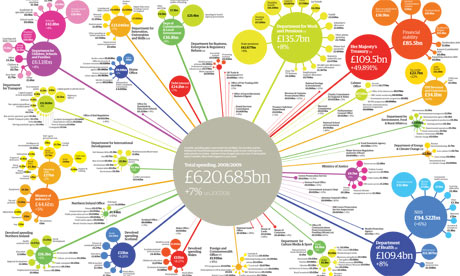
The Guardian (UK)
Fact File UK
----------------------
ONLINE
Noticias de Actualidad Inmediata / Breaking News
8AA Bronce / Bronze
The Sunday Times (UK)
8AB Bronce / Bronze
NYTimes.com (USA)
8CB Bronce / Bronze
NYTimes.com (USA)
8DA Bronce / Bronze
Associated Press (USA)
8DB Oro / Gold
NYTimes.com (USA)
-------------------------------
Reportajes / Features
9AA Bronce / Bronze
ultimosegundo.ig.com.br (Brasil)
9AB Bronce / Bronze
NYTimes.com (USA)
9AB Bronce / Bronze
NYTimes.com (USA)
9AB Bronce / Bronze
The Washington Post (USA)
9AB Bronce / Bronze
The Washington Post (USA)
9BA Bronce / Bronze
Népszabadság (Hungary)
9BB Plata / Silver
NYTimes.com (USA)
9BB Plata / Silver
NYTimes.com (USA)
9BB Bronce / Bronze
NYTimes.com (USA)
9CB Bronce / Bronze
The Washington Post (USA)
9DA Bronce / Bronze
Al Bayan (UAE)
9DA Bronce / Bronze
The Sunday Times (UK)
Skydiver (Coming down)
9DB Oro / Gold
NYTimes.com (USA)
(Premio Peter Sullivan Award Best of Show)
------------------------------
9DB Bronce / Bronze
NYTimes.com (USA)
9DB Plata / Silver
NYTimes.com (USA)
9DB Plata / Silver
NYTimes.com (USA)
9DB Bronce / Bronze
NYTimes.com (USA)
9DB Bronce / Bronze
NYTimes.com (USA)
9EB Oro / Gold
Estadao.com.br (Brasil)
-----------------------------
9EB Bronce / Bronze
NYTimes.com (USA)
9FA Bronce / Bronze
Al Bayan (UAE)
9GB Plata / Silver
NYTimes.com (USA)
Portafolios / Portfolios
10AB Bronce / Bronze
NYTimes.com (USA)
10BB Bronce / Bronze
BBC (UK)
10BB Bronce / Bronze
veja.com (Brasil)
10BB Bronce / Bronze
Consumer.es (España)
-----------------------------------
Criterios / Criteria
11CA Bronce / Bronze
economia.ig.com.br (Brasil)
11CB Plata / Silver
Estadao.com.br (Brasil)
11CB Bronce / Bronze
Clarín (Argentina)
11DB Plata / Silver
NYTimes.com (USA)
11DB Bronce / Bronze
The Guardian (UK)
11DB Bronce / Bronze
BBC Dimensions (UK)
------------------------------
Aplicaciones / Apps
12BA Bronce / Bronze
The Sunday Times (UK)
Whale graphic on iPad
12BB Plata / Silver
ligaBBVA.com (España)
LigaBBVA HD


+19.55.04.png)