Showing posts with label World. Show all posts

11/06/2011

iGraphics, an independent greek infographics agency

Share


Dimitris Kabitis, Galatsidis Achileas (both former Eleftheros Typos) and some other journalists and designers have released iGraphics, the first independent greek infographic agency according to themselves.

They create print and online information graphics, and they have even translated some of them to english. From here, good luck!

28/11/2010

How media is visualizing the 'Cablegate'

It's being the scoop of the year. Wikileaks protagonized the biggest leak in history, with the help of many of the biggest media in the world, which received the information and worked on its edition until they published the results today.And some of them worked on infographics and visualizations.

Click on images to access the interactives

One of the most visual was the german Der Spiegel. An 'cable atlas' with the places and grade of confidenciality of the leaks.


The Guardian worked on a flash, not an infographic itself, but a database with some visual details. Maybe the most useful piece I've found on the topic. And, with this piece, an image with another 'atlas'.


The New York Times, maybe the best media working with infographics, did not used infographics this time. They published the documents with a navigation system.


In Spain, El País used a static image with a 'heat map' of the leaks and a simple, but very useful piece, on how to read the documents


As usual, if you know any other visualization, just tell me and I'll publish it. Anyway, this is just the beginning.

Share

25/11/2010

Far East infographics: the best and the worst

Through Roberto Belo, I see these two infographics from Far East. One really good, and one bad. As we use in Spain, I start with the bad one:

An interactive by MSN in Asia, reminds me the print infographics of the First Gulf War: big weapons over the map, and nothing else. Click on image to see it in action. I think I can't say it's bad. It's bad for me, in my culture, maybe that's the way things work in the opposite corner of the globe, so maybe I've risked too much calificating it.


Now the good on. Some may not consider this an infographic, but I do. A kind of Beijing Google Maps, but by the chinese  Baidu. Sim City style, clear, and with information layers on the buildings: easy to work with it and very clean. Great. Click on image to watch it in action.

12/06/2010

The World Cup into pieces

I don´t know if you remeber the megagraphic of Luis Chumpitaz's team in Dubai for Olympics built using several individual infographics.
They were not the first ones doing something like that, not the last ones, but was a really good effort to show something spectacular and different.
And now, with the World Cup, we have some variations on the same idea.

One side, La Prensa Gráfica, from El Salvador. Óscar Corvera explains the idea:


"Twleve consecutive sundays, La Prensa Gráfica published a special infographic on the World Cup of South Africa 2010. During three months, and with different topics (evolution of the ball, stadiums, trophy, goals, georgraphy and climate of South Africa...), readers could know more about how important this XIX World Cup is."


And this was the result:


On the other side, and maybe you've seen already this if you're fan of thr Facebook page of Infographics News, Estefan Cuanalo alse sent an example by the sports mexican newspaper Record.


Twelve people collaborated to creathe these infographics: Carlos I. López, Crhistian Ávalos, Estefan Cuanalo, Engelbert Chavarría, Iolani Ferraez, Jesús Sánchez y Octavio Jiménez with the infographics; and texts by Carlos Gorozpe, Estela Garrido, Luis Salazar, Mónica Ocampo y Jorge Carricart.


Share

02/06/2010

Three infographics and 200 years of argentinian history


This post is written by Juan Colombato, infographics editor at the argentinian newspaper La Voz del Interior.

Telling the story of a life, the changes, and the evolution of a country since the May 25th 1810 revolution in three dates: 1810, 1910 and 2010.


Graphics were planified in these three eras to show the comparison of the different parameters of the everyday life and statistical data: homes, fashions, transport, work and industry; all mixed with maps, composition of the national boundaries and the city of Córdoba, the external trade with imports and exports, the internal trade with routes and regional production; and the social and ethnical composition of the population with the main points of entrance of the country.


It was very hard to find the same parameters for such different times, and also classifying data with different markets, kinds of production and currencies. And taking all this data and dealing with the information.


Another intersting thing is that, oppositte as the usual way of woking in this newspaper, one of the supplements of the Bicentennary was plannified from the infographics point of view. ISx out of eight pages will have graphics (all except for front and last page). But, once we thinked about the historical and political meaning of the facts, we decided to incorporate a text to each date. These articles were written by three important wirters at local and national level.


Share

09/12/2009

Grand Mosque: a big graphic and a press release

I received the other day waht can be described as an infographic press release. I don't mean a press release explained with a graphic, but a press release to 'promote a graphic'. It came from the Gulf News (Dubai) infographic department and it came with the actual graphic and an explanation on how was it done. Well, I don't like when newspapers just publish the press releases without analysing and 'cooking' them, but this time, I think the press release is, itself, the new, so here it comes:


"Our first concern when featuring the Shaikh Zayed Bin Sultan Al Nahyan Grand Mosque was how to accurately depict its scale, opulence and beauty.
There is enough information about the mosque to write a book, but not enough space in this newspaper to portray how wondrous the place is.
The UAE’s founding father and visionary, Shaikh Zayed Bin Sultan Al Nahyan, planned the mosque in the 1980s. He decided to construct a mosque that would become the spiritual centre of the country, bringing peace to worshippers of all races and social circumstances. This is exactly what the mosque is — a place that raises your spirits, regardless of what religion you follow. The mosque is open for all to visit and Eid Mubarak is the perfect time to tour the Shaikh Zayed Grand
The mosque, which is also the final resting place of Shaikh Zayed, has achieved acclaim inthe Islamic world and internationally.
It is the third largest mosque in the Arabian Gulf region, after those in Makkah and Madinah. Among its impressive structural and decorative features are some that have set world records: the largest carpet (5,700 square metres); the largest chandelier (15 metres high); and the largest main dome of its kind (32.8 metres in diameter).
Beyond Shaikh Zayed’s desire for a peaceful, spiritual place, the mosque was conceived as an architectural masterpiece and an Islamic treasure.
A total of 43 contractors worked on the mosque, including designers, engineers, architects, artisans and builders from far-flung corners of the globe. They assembled materials from dozens of countries, including Italy, Germany, Morocco, India, Turkey, Iran, China, Greece and, of course, the UAE. The materials used include marble, stone, gold, semi-precious stones, crystals and ceramics of the highest quality.
The mosque was opened for daily prayers in 2007. The project team was led by Abu Dhabi Municipality and British consulting engineers Halcrow Group, along with Hill International. Today the UAE has more than 5,000mosques, with 2,289 of these located in Abu Dhabi.

Gulf News
Dubai-UAE
Interactive design: Jacob Hernandez
Infographics: Douglas Okasaki, Dwynn Ronald Trazo
Art Director: Miguel Angel Gomez
Editor in Chief: Abdul Hamid"


Share

06/10/2009

Infographic-design-journalistic details of my trip to USA

I have just arrived from USA, where I have visited NY, Boston, Cape Cod and Vermont. As infographic journalist there have been some details that called my attention:


1.
The New York Times has a department with the only task to analyze trends and details form the public statitistics. Other detail: the director, Bill Keller, works with the rest of the journalist, as the chief editors. Keller's office is actually really small, but he's always outside. This details make you understand a little better why this newspaper makes so good journalism.

2. Respect to infographics. Xocas (The New York Times) and Javier Zarracina (Boston Globe) explained how are the infograhics department treated on their respective newspaper: as any other section. It could sound as logical, but things don't work always that way. Adn, in this difficult times for media, Boston Globe, in a very hard situation, has kept its five members of the infographics department meanwhile the rest of the departments of the journal had many people fired. At NYT hirings are frozen. But infographics department has been the one and only department to hire people in the last years.

3. More organized, less visual. NY (and some other cities) uses numbers to name streets and avenues. This make much easier to find them, and it's very difficult to get lost. Just a liitle detail: as Manhattan's first settlements were on the south of the island, the numbers grow from south to north (and from east to west), just the opposite of how we read. In other hand, the traffic signals uses much more text than the european ones, where a very high percentage is iconic.

4. The success of Gotham. Fairey's Obama poster used Gotham typeface. Now you can see Gotham in many many many shops, posters or flyers. Don't if that has been always that way or just people has associated Gotham with success.

5. Fascinated by maps. Don't know if it's just my impression, or northamericans love maps. Public libraries have good collections of them, and looked like the most important pieces on them.

13/09/2009

Spanish-fashioned english infographics


This graphic could look like a classical big infographic published on a spanish (or Southamerican) newspaper. Central illo, two big figures at the sides showing the two starrings, map and some details. Like many of the published by El Correo, ABC or El Mundo. The topic is also very hispanic: Moctezuma II, the aztec king.

The important thing of this graphic is that it's published by the Daily Telegraph, made by Stefan Bailey and Ciaran Hughes. An english newspaper publishing spanish-fashioned infographics. Or not so spanish. Maybe remembering some great works of the englishman Peter Sullivan... They are returning to their bests moments, the moments we spanish used to build our bests ones.

Michael Agar is head of graphics at the Telegraph group. He is renewing the infographics of the group since he arrived. English infographics are the cradle of the discipline, and they are rising again. This graphic could be seen by us (spanish and southamerican) as something already done, forgotten, but we also were fascinated by circle charts two years ago and it was already a classic in other countries. It's like they are walking fast again and doing all the way to be again one of the countries with the best inmediate future in infographics.

04/07/2009

Graphics for a 4th of July

Today is Independence Day in USA. It's a great day for them, and that is something you could see on their newspapers. And what do people do in newspapers when they want to do something big but have no news? Graphics. They allow us to use non breaking news data to build a feature that can be really interesting. Here you are some examples.

Our flag, a graphical history
Mike Witrth sends this graphic about the USA national flag


Washington Post and the fireworks
These are examples from other years, but show some good graphics about fireworks.


Any more examples? Send them!

27/06/2009

The tragic death of Eleftheros Typos

Eleftheros Typos, newspaper awarded as best designed of Europe has closed.


I feel this close very near, Eleftheros Typos was my first work as infographics consultant for Innovation. But it's also hard because it was an ended newspaper that came again to life. Who explains this perfectly is who was its Art Director, Spiros Polikandriotis. One of the great helps from inside in the relaunchingand success of the model. He was fired months before ET closed. And it was a big surprise for those who knew him and his great work.

Spiros writes:
"It's not strange at all that the paper closed. ET before the relaunch was selling around 10.000-15.000 a day and 45.000 on Sunday. It was it’s lowest numbers since its birth on 1984. After the relaunch it started rising in circulation reaching 25.000 – 35.000 on the daily and 120.000 on Sunday. These numbers were steady for at least 3-4 months. After that the editorial model changed back to the old ways. And with it slowly came the old numbers, both in circulation and in advertisement."


It's tragic. Because in these bad times is hard to know that one that could be saved has passed away. I just wan t to send a big hug to the infographics section, they showed how believing in change and wanting the change this can be spectacular. They demosntrated that it was possible. From the head of graphics, Kalli Labrou, to the last intern.
Good luck to all them.

06/06/2009

Infographics for a birthday

Golden Section, Jan Schowchow's infographics service, celebrated the 60 years of german democracy with this graphic (click to see it bigger).


Smart, complete, modern... Happy birthday democracy, and congratulations Jan!

29/05/2009

i from infographics


Some weeks ago was released in Portugal a new print newspaper (yes, print!), called just i. It's a new InnovAtion project with Sojormedia, where I had a little participation.
But let take a glance to some infographics...


There are two visual journalists in the department: Carlos Monteiro and Ricardo Santos, both form the portuguese newspaper '24 Horas'. The style of infographics follow the general design created by Javier Errea: no fireworks, modern, compact, with cromatic impact but smart. And the Innovation spirit: "newspapers must be daily magazines", as Juan Antonio Giner says.


19/05/2009

National Geographic draws in spanish


I wrote yesterday my first article for 233 grados,the communication blog of Diximedia, editor of lainformacion.com, where I work now. I write about the spanish spekaers of the National Geographic infographics department, that are 4 out of 6 (Juan Velasco, Alejandro Tumas, Fernando G. Baptista and Hiram Enríquez).

The article is wrote in spanish, but here you are some words translated. Anyway, you always can read the complete article

"(The infographic boom of the 90s) created (in Spain) a legion of infographics artists, some of them really good. That was unusual in other places, Spain took advantage of that situation created in the newspapers and got an accumulated empiric knowledge before than the rest of the world"
Alejandro Tumas

About the process to create a graphic for the magazine:
"We have continuous meetings all along the process, with opinions of a lot of people. At the end, we make color tests and refine the design to the most imperceptible detail".
Fernando G. Baptista

10/03/2009

Bullfighting infographics

I'm spanish but I am against bullfighting. Anyway, no one can deny that this is one of the big symbols of Spain abroad. And infographics use (and should) to show the culture of a country. But I won't show bullfighting graphics made in Spain, you have this blog post by Miguel Ángel Fernández for that. This is how other countries have explained it.

The Illustrated London News published these illustrations on an issue of 1843. Maybe we can't call those infographics, but it's the closests thing we could find on the newspapers of those days.


The next example come from the brazilian magazine Mundo Estranho, with the headline 'Como é uma tourada?'


Japan has always been a country that has looked to the spanish culture with curiosity. And this graphics by the japanese Tube Graphics was my inspiration to write this post.


Latin America has also bullfighting. Freddy Fiallos Calderón explained the next year the sufering of the bull on the equatorian newspaper El Telégrafo


Maybe we can't call this artwork a graphic, but the painting of the italian artist Aldo Mondino show many concepts of the tauromachy.


Mexico is also a place where bullfighting is well known. Jonathan Isaac López Villanueva send this graphic published in Excelsior.


And you know that if you have some examples, I beg you to please send them!

01/02/2009

IL. 'Wired' alla italiana


People use to complain about italian newspaper design, maybe because this is a great country for other kinds of design. But we have always very good exceptions. For example, the magazine of the italian economic newspaper Il Sole 24ore, called
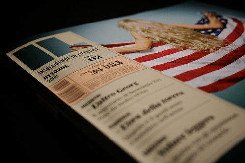
 IL.

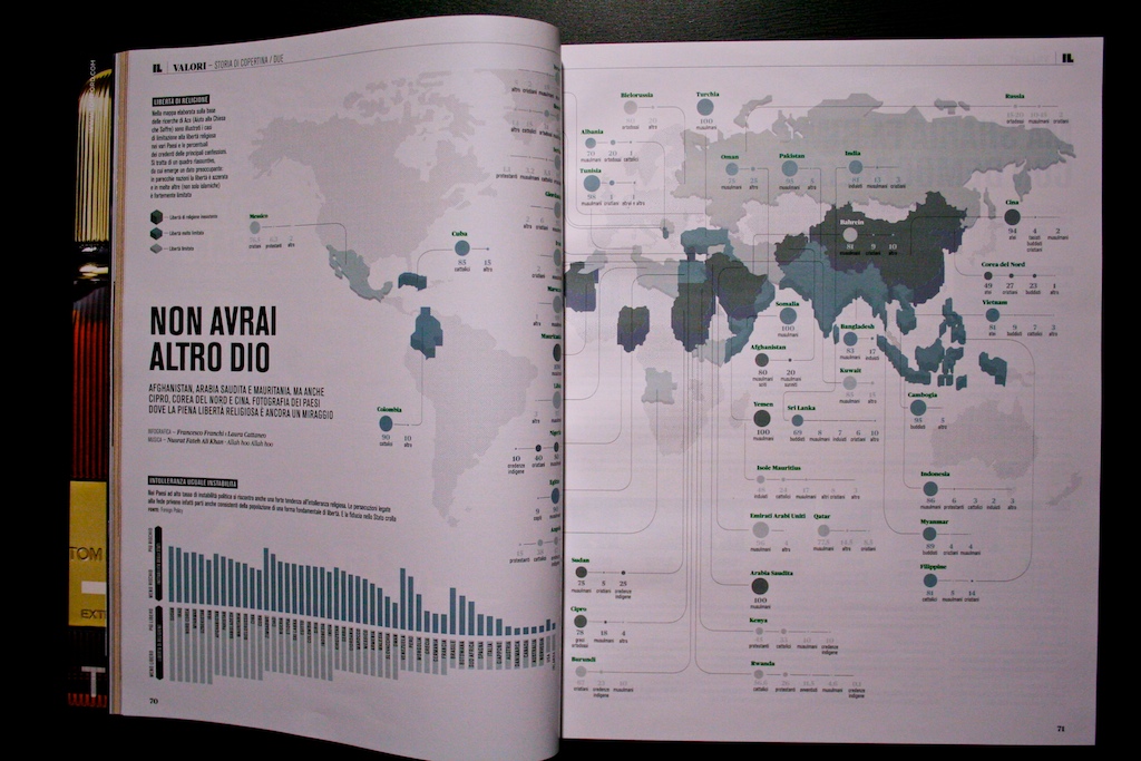
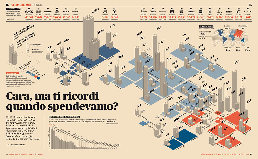
As our main common interest here is infgraphics, here you are some great examples from IL.


Its Art Director is Francesco Franchi, whose Flickr can be seen here, with much more examples of the magazine and it design.


I don't know the situation of graphics in magazines out of Spain (ok, not even in Spain...) but my perception is that it's not easy to see so many graphics in magazines here.


But what I've not seen before on spanish magazines is a bet like that for data visualization, modern style... A kind of what Wired does with Infoporn.


Clean style, great use of color, very smart, interesting data... And not forgetting the small graphics.


This is one of my favourites for the next Malofiej edition, and now more than ever, with the american magazines not so well as the pasts years...


Congratulations to Francesco for the maagzine, its graphics and all this fresh air.