My former Art Director at Público Fernando 'Rapa' Carballo exhibes these days and until february 27th is Antifichus at Casa de América in Madrid. A review of 200 years of his native Argentina seen with designers eyes.
To works exhibited are done with friends and collegues, and one of them is the inforaphics journalist of Publico Samuel Granados.
His project is very funny: a 3D cartogram about emigration and inmigration between american countries. But in true 3D: made with Lego pieces, as he explains, "to seize the space of the exhibition" and "allow you to watch teh cartogram from different perspectives".
One side of the map show the emigrants of each zone, the opposite shows the inmigrants (both represented by the volume of the pieces).
Probably you have watched this BBC video already, because it has been popping all around the web for some days, and not just in infographics-focused webs.
It's part of the BBC4 documentary 'The Joy of stats', which I'm really eager to watch, but it looks that, according to the BBC's iPlayer, I'm not in the correct region (internet is not so global, actually)
Hans Rosling (somebody already introduced on Infographics News), is teacher of International Health at Karolinska Institute (Stockholm), bacame famous in the visualization world by his tool Gapminder, that you would know for sure. He also starred on of the most inspiring TED conferences.
"Everything is not tradition, it's plagiarism". It's a message written on a wall of the Casón del Buen Retiro, one of the buildings of the Prado Museum in Madrid.
It's not talking about infographics, but makes you think anyway.
Geoff McGhee has been producer at nytimes.com, head of multimedia at Le Monde and now John S. Knight Journalism Fellow at Stanford University. These years at San Francisco are being productive, as we can see on this fantastic documentary about data visualization on the media.
My recommendation is that you visit the original site to watch the movie in an interactive way. And watch what people like Steve Duenes, Alberto Cairo, Sarah Slobin, Álvaro Valiño, Matt Ericsson, Nigel Holmes or John Grimwade, among others, have to say about this fashiongenre way of storytelling.
Ye.s, I'm still alive. I wasn't swallowed by a volcano. Soory for being out so long, too much work these weeks. But I'm back just to announce that the new edition of Death and Taxes, the famous annual poster depicting the US Government Spending (in 6 sq ft), has been released. You can take a look at deathandtaxesposter.com It's a short post, but I'm starting blogging again... Share
This remind me some graphic curricula I saw some weeks ago. One of them was at ColourLovers, this one by Greg Dizzia.
This curriculum is also available at Jumping Jester infographics, Aníbal Maiz's blog. There you can also find this opther example, by Jonathan Kaczynski:
Aníbal, found it at another blog, Isopixel, which writes about 30 creative curricula. One of them, this one by Michael Anderson.
Great poster by Timeplots explaining the evolution of the Supreme Court of the USA. One of those of the kind of Similar Diversity or History Shots. It's available to buy or look at it closer at Timeplots web.
Maybe it's just an sthetic exercise with a very good excuse: a campaign to donate coats for homeless people. But what a aesthetic exercise! They explain with simple but,a t the same time, ellaborated graphics (the concept is simple but the drawing it's not just iconic). It's a good cause and a beautiful site... so, this time, I won't be the usual boring professional complaining about 'less is more' and those kind of things... enjoy bigwarmup.com!
The Thyssen Museum of Madrid shares on its web an infographic to navigate through time and artworks of its collection. And when I say share, I mean they give you a code to include it on your own web. Your product could be old and classic, but you can sell it on the most modern ways
The location of the tweets during the match showed very interesting. And now, these kind of solutions with Twitter can be found on Trendmaps, a trendtopics visualizator for this microblogging service.
This is an example on the visual power of the crowdsourcing data. Visualization has become a powerful way to understand trends and what's happening on thsi interconnected world. So you know what you have to do: tell your children to become infographic experts: there's a future for them! :)
Some days ago a friend sent me this map developed by the European Union showing the accesibility of the different points of the world. It shows the time that takes to reach from anywhere to a city with a population bigger than 50,000.
DMultimedia, the new blog created by the responsible of the online graphics at ELPAIS.com, Carlos Gámez, I saw this 'Multiwidget' that explains what happens in the world right now. Click on the image to watch it!
And if you want to know more things on what's happening right now on Earth, you can check Breathing Earth (thanks to Mario Tascón for the link). It simulates the CO2 emissions, births and deaths by country on real time.
And a good example of that is the web A Village of 100 people, which takes world statistics and shrink them to the hypothesis that the whole world is a little village of 100 people. How many gays would be? And how many children will go to school? How many people would die per year? The web has very good things and some not-so-good (some data is told but not drawn, there's no a general example on how the village would be with the 100 people,, some examples play with percentages instead of keeping the metaphor...), but anyway it keeps being a great way of funny pedagogy
Jonas Dagson, legend of the swedish infographics (and still working) send me this map ellaborated for the swedish 'Save the Children'. The legend, as he translated, because my swedish is not fluent (I just know how to say hello, thanks and some meals) you could read 'Children's Worldmap'
It just show the places where spanking is forbidden, whch only happens in 24 countries. A very powerful idea.
There are usual sentences on tis blog 'Show Don't Tell!' or 'An Image worths 1000 words'. We always say a graphic needs much more information than a text about the same topic, and that the same amount of information, just in text, will take much more space and could be incomprehensible.We're visual creatures, and view is our main sense.
Maybe these things make taht someone are eager to 'see' their favourite novels. So, one of them, Russel Stutler, artist and reader of teh Sherlock Holmes adventures, have drawn the house of the famous detective. HE just need the descriptions of his 70 books.
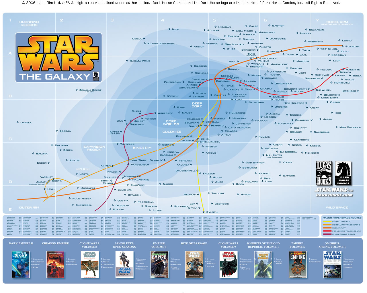
All the details are in the map, so, if you don't want to lose anything, you can have the map with anotations.
Same happens with Star Wars. Who can resist a map with the universe of teh saga? And with its main routes!
I've always defended than infographics and journalism can't be considered as art. That's why I prefer to use the definition 'infographic journalist' rather than 'infographics artist'. Art is about emotions, sensations and feelings. Journalism is about information. But, sometimes, the infographic lenguage can be used to create art works.
Apart from Maeda, who creates abstract images from databases, the lenguage of data visualization appears on another installations, as the one that shows the Italy-France where Zidane 'headed' Materazzi (Final of the World Cup of Soccer on 2006) on several screens. Some shw the distance of each player to te ball, other the play, and other the movements of ball and players, as the typical soccer/football graphics of the day after.
All the passes of the Spain-Russia of Euro2008, as we made it for Público
Other of the works looks for military words on databases of different enterprises of the world and locates them on a map. How many graphics of this kind hace you seen?
Almost everything can make a good graphic if we think enough. A marvelous example is Stefanie Povec's work with the novel 'On the Road', by Jack Kerouac. Making graphics of every detail in the book. The page shown above analyzes the lenght of the sentences. The rythm can be also have a visual reference. Below, a graphic with the punctuation marks.
Some may say this is a freaky task, but one of the freaky tasks I love. Thanks for the link, Carmen


