Tweet Share
Every single newspaper and news site has produced its new Titanic graphic for the 100th anniversary. But none of them have been so impressing as the one published by 'The Graphic' and other media in 1912. Without Google. Without Illustrator. Without Flash.
Most of them can be considered illustrations, but all of them have the goal of a visual explanation of the event. These are some examples from a special issue of The Graphic published on April 27th. Some sources says it was published on april 1912, otrhers April 2014. Maybe there was a reedition two years after, and the most reliable sources use 1912 as the date, but the work is impressive anyway.
The evacuation, one of the big controversies of the Titanic accident.
Showing posts with label Historics. Show all posts
Showing posts with label Historics. Show all posts
16/04/2012
12/04/2011
50 years ago: Gagarin in the space, a graphic on the frontpage
Tweet Share
50 years Gagarin was the first man in the space. And that big event took the russian pioneer to La Vanguardia frontpage. This is still hard to see nowadays... so imagine then.
Some texts are in english, so it makes me think that some stuff was taken form a book or any other place. BUt that's not the important thing. The important thing is to deccide and create this kind of work with 1961 technology.
Vía @aitorlagunas
Tags:
Historics
16/01/2011
3D in the age of 2D
Tweet Share
Veteran infographic journalist will tell you how documentation was when there was no internet in newsrooms. I consider myself young, but in my first years we also had a computer in the department, the one with internet, but most of the documentation came from maps, books and other stuff whe had there.
But there were more differences. Today, the big graphics with cuts for watching inside are done with 3D software. The they were done just with Illustrator or drawn by hand. Today many people still use Illustrator, and people that used to draw by hand are still doing so.
You can understand why seeing this example by Juan Colombato, head of infographics at the argentinian newspaper La Voz del Interior.
A 45º axonometric view, done 10 years ago. Take a look and remember 'the good old days'
But there's more. We're talking about someone who draws at the higher level. Watch his works, which I discovered ath Nicolás Ramallo's blog.
23/12/2010
2001-2010: a decade through infographics
It's nearly new year, so it's time for recopilations! My two cents at lainformacion.com goes on the evolution of infographics in this decade explaining the big events of these ten years. The text is in spanish, but I think visuals are enough. And if you want to read it anyeway, you just have to use Google Translate...
Tweet Share
Tags:
Historics
10/06/2010
The story of the one-column infographic category at Malofiej
Maybe you've wondered why the Malofiej Awards has, usually, a category for one-column infographics. Well, you can put the blame in this tiny infographic by Reuters from 1993.

Its author, Ciaran Hughes, working today at Daily Telegraph, was the one who told me this story. He worked then at Reuters, when Corrie Parsonson was the infographics editor. They sent this infographic to the Malofiej Awards, just one column wide. We were in a time when there were big double spreads about Olympics, when two little details were enough to build a big infographic about the first Gulf War. So, many judges liked the infographic, but they thought it was too little to deserv an award. By then, Peter Sullivan was the president of the Jury. He, on the contrary, thought that its small space was, not a handicap, but something that made the graphic better. It explained what it wanted to explain, was understandable, and didn't need half page.
Finally, the infographic got a bronze medal as best scientific infographic. The next year, Peter Sullivan proposed to create the one-column infographic category, to recognize those graphics that could explain many things in a very reduced space.
Share
23/12/2009
Infographics from WWII

Very interesting recopillation by Crack Two with infographics about WWII, explaining military devices or procedures.

Some of them, like this ship, could be done nowadays.

Other, as this one about how to build a bridge, are perfect examples of Show Don't Tell. The Ikea style, a bit decorated.

The original post doesn't say which is the original source, but I encourage you to take a glance to watch over all the examples.
Tags:
Historics
01/09/2009
History of infographics in La Vanguardia: we don't need computers
La Vanguardia, a spanish newspaper from Barcelona, published this january an article by Mercè Balada about the history of infographics at this catalonian newspaper. It starts with a definition of infographics, very important to understand what come next:
"Against what we use to think, 'info' on 'infographic' doesn't come from 'informatics', comes from 'information'. Infographics are, by definition, images created with informative purposes, including graphics and text."

This idea could be signed by Jaume Serra, today head of infographics at this same newspaper and who have never needed much computers to create great graphics. Tools are just tools.
This confussion in very common in spanish. But if infographics would be just those works made with computers, works as the 100 years old brazilian graphic published in this blog the other day or the examples shown in the article couldn't be infographics. And they are.Some as good as this one, made by an english scientist that calculated what a man could drink, eat or smoke in 70 years and published on La Vanguardia in 1899:

This idea could be signed by Jaume Serra, today head of infographics at this same newspaper and who have never needed much computers to create great graphics. Tools are just tools.
Tags:
Historics
23/08/2009
A 100 years old brazilian graphic

This graphic was published 100 years ago by O Estado de Sao Paulo (Brazil). I saw it in a tweet by @tattiana and it reminded me these other examples already published on this blog:

Image from the book Malofiej 14,article by Fermín Vílchez 'Origin and evolution of graphics in Spain, 1856-1936
This second example is from a spanish newspapers in the thirties. Bazil was 20 years ahead then...
Tags:
Historics
15/04/2009
What might have happened with the Titanic
Tags:
Historics
13/10/2008
Serra's bread
Gonzalo Peltzer has been commenting on the spanish version on this blog how some of the graphics shown here on some posts (1 y 2) regarded him the berad graphic made by Jaume Serra at Clarin some years ago. This graphic is more an opinion column than a graphic. With a very strong intention. It shows which percentage of the population preceive teh different scales of wages in Argentina. From left to right, from the biigests to the smallets. A 42,6% earns less than 500 pesos per month (155 $ on today's change).


Tags:
Historics
05/06/2008
Nazi graphics

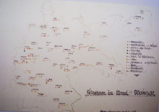
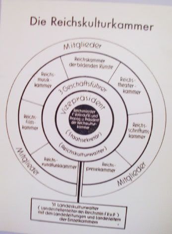
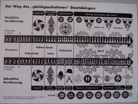
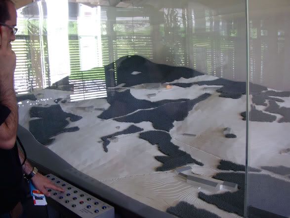
This holidays has taken me to some places, and one of them was Berchtesgaden, a little but impressive village in the german southeast. This zone of the Alps where Hitler used to spend long times and which he settled his second residence. There is placed a nazi documentation center, called Dokumentation Obersalzberg. As we were around, we went to take a look. Between newspapers, videos, photos and audios of the times there were some infographics, used by the government to 'explain' their ideas and the way of life they wanted for the people.

Among others, there were simple concetracion camps registers, with their color and geographic keys.

The distribution of some areas of the government has some 'circle' style so usual these days. A kind of Radial Map Tree.

But the one which calls my attention most was this one where is shown the steps in life that the good nazi citizens should go. For men and women. With the style of those years taht we could see on Tufte's books.
Adding to the old graphics, we could also join an interactive 3d graphic...

The bald one on the left it's me, testing the buttons with names of places on them and looking which of the buildings got the light. Easy and funny. For Bast and Lisa, as Matthew Ericcson use to say as Matthew Ericcson use to say
Tags:
Beyond newspapers,
Historics
15/05/2008
Touchdown graphics ancestors
Nowadays, we have our tools for getting screen captions and explain how was a tuchdwn or a goal the day after. Today, these kinds our graphics are sometimes not as useful as before, because the day after the match most of the people have already seen the action on TV several times. The big work was to do this on 1951,as on this page form LA Times.
Via Apuntes con Masaje

Via Apuntes con Masaje

Tags:
Historics
03/07/2007
Megan Jaegerman, the triumph of the simple

Infographics guru Edward Tufte uploaded on his web a ver interesting article with graphics examples by Megan Jaegerman, infographics artists of The New York Times between 1990-1998, the time when the first Gulf war made infographics the star section of the newspaper.
Jaegerman's graphics are a great example on how to do great graphics on a very simple way. On how color can be used as a reading guide and calling atention on what's really important. On how the hardest idea can be easily explained. I hope God will fogive me for what I'll say, but just cutting a little text on some of them we would be talking of the prefect graphics.Even more if we remeber the graphics how they were done then.
Visiting the article is a must.
Subscribe to:
Posts (Atom)


