Share
United States is not just the 'land of opportunities', but also the land of Open Data. From Spain, we are really jealous of how the government offers data in different lenguages and formats to be used and consulted by citizens and media.
One good example is the 2010 census: all kind of data about the population of such big and heterogeneous country is a very big opportunity to show what can we do with all that data and make it easy to access for citizens. Global and local, giving a general idea of the country, but also allowing people to check information of their own neighborhoods.
These are some examples of work with this information:
(If you know other interesting examples, just tell me in the comments of this post)
The New York Times
Mapping America: Every city, every block
I've talked about it separately. It really amazed me when I first looked at it. The different layers of information, the details, the fact that you can take a look to all the country, but also look for the data not just of your neighborhood but, in some cases, your own building!
Moonshadow Mobile
Censusmaps 2010: Washington, California...
It gives you the possibilty to go really deep and with many options, but only state by state (and just some of them). The creators of this technology think that what makes these maps different is the speed and the amount of data they can handle: "Our technology is software only and it is typically hosted in the cloud. As a result of our speed advantage we can work with much larger databases. Whereas others visualize 1,000 to 10,000 records in Google Maps we have visualized databases with over 100 million records. "
The Washington Post
Explore the 2010 Census
The Washington Post graphic is not as complete as the previous one, but gives you the option to compare the data with previous census. You could also seacrh for different visual stories on their main page of the census.
The Wall Street Journal
America in 2010
Although you can find different graphics of the census on WSJ.com, they are not as easy to use as WaPo's or NYT. The good thing is you can reach the information of each county, with goes more local than WaPo's, but not as detailed as its neighbour, the Gray Lady.
-----------
These are just some examples. Share in comments other interesting things if you know them, and I'll add them to this post.
Showing posts with label Maps. Show all posts
Showing posts with label Maps. Show all posts
13/06/2011
Census: a great opportunity for databases and maps
Tags:
Data journalism,
Maps
06/02/2011
World Map of Infographics journalists. Second round.
Tweet Share
Some time ago I started a map showing infographics journalist and departments around the world. It was an open collaborative map, and somebody deleted the data and add oil companies in the south of Spain. I guess it was a mistake, but I lost all the information.
Well, let's try again. Unfortunately, this time it won't be a open map. It's closed and I'm the only one who can update it (although I can give collaborator invitations to those interested). So, if you want to be on the map, just send me an email or write a comment in this post. I will add you to the map. Once it will have enough content, I will publish it on a static place in this web. It's Google Maps, so you can take it to your web too.
The map will show professionals related with infograhics on five different categories:
- Print infographics departments (blue)
- Interactive infographics departments (red)
- Integrated infographics departments (green)
- Freelancers or business (yellow)
- Teachers (purple)
At the moment, I just have some spanish departments and professionals, as a test. I will update it daily, but please be patient. I'm waiting for your maisl and comments. And if you want to be collaborator, just ask me.
Ver Infografistas/Infographic journalists en un mapa más grande
15/12/2010
Every city, every block
I don't have much more to say than absolutely amazing. This project of The New York Times with United States census is one of the most impressive things I've seen lately. An infographic, a visualization?Words are not enough. Is useful, complete, contains stories... Nothing better than taking a look.
- Share
- Share
Tags:
Maps,
Online graphics,
Trends
20/06/2009
Crime maps: hyperlocal and global
Infographics are, in the best cases, very useful. One of the uses that is succeding at this moment is the crime map.
The last one has been nytimes.com, with this graphic about homicides at The Big Apple. Very The Grey Lady style: clean and with a lot of options to choose how to visualize it.

But the first time I saw one was at chicagocrime.org, today inside of the hyperlocal news site everyblock.org. You can take a glance at the Chicago map here

But many times you don't need to cross the Atlantic Ocean to find examples. One of my hometown newspapers, La Voz de Cádiz, has its own criminal map

But there's also the global scale: Wikicrimes.org, a brazilian initiative for the whole world. This is not very popular yet, but it has the potential to become very useful

Because good and useful ideas have no frontiers
The last one has been nytimes.com, with this graphic about homicides at The Big Apple. Very The Grey Lady style: clean and with a lot of options to choose how to visualize it.

But the first time I saw one was at chicagocrime.org, today inside of the hyperlocal news site everyblock.org. You can take a glance at the Chicago map here

But many times you don't need to cross the Atlantic Ocean to find examples. One of my hometown newspapers, La Voz de Cádiz, has its own criminal map

But there's also the global scale: Wikicrimes.org, a brazilian initiative for the whole world. This is not very popular yet, but it has the potential to become very useful

Because good and useful ideas have no frontiers
Tags:
Maps,
Online graphics,
Trends
06/05/2009
Good and bad things about collaborative maps
Google Maps is a great tool, very easy to use. A perfect example of a 2.0 tool, where the user can be also a content creator. That's good. But it has problems, also.
It happened with the swineflu world map. Any citizen of the world could add cases at the beginning. Anyone who saw his neighbour coughin ran to place a pin. Alarming, and not helping as an informative map. Many placed suspicios cases, not so many erased them when they were discarded. In a few days the map was a mees. Now, most of the things are fixed. But it is no more a proper collaborative map. I tried to fix things and it was impossible.
View 2009 H1N1 Flu Outbreak Map in a larger map
But sometimes, having a helping hand from the readers is something wonderful. More if we have someone as filter. A media, as an example. That was what La Voz de Galicia (spain) did with this illegal landfills.

The map absolutely open has more problems. A good example is the infographic journalist map you have on the upper right corner of this blog. Is empty. It has data creted by me and yourselves... but someone entered once ... and erased all the content. I don't think that he/she meant it, but it happened...
I really think that the participation of the readers/users is a great help. Really important for media that want to connect with their audiences. But we are prfoessionals, and we have to offer professional content. We have to check that all the information given by the citizens is true, rigorous.
I say Yes to citizen journalism. Yes to collaboration. But I say No to wait for others to do what we should do.
It happened with the swineflu world map. Any citizen of the world could add cases at the beginning. Anyone who saw his neighbour coughin ran to place a pin. Alarming, and not helping as an informative map. Many placed suspicios cases, not so many erased them when they were discarded. In a few days the map was a mees. Now, most of the things are fixed. But it is no more a proper collaborative map. I tried to fix things and it was impossible.
View 2009 H1N1 Flu Outbreak Map in a larger map
But sometimes, having a helping hand from the readers is something wonderful. More if we have someone as filter. A media, as an example. That was what La Voz de Galicia (spain) did with this illegal landfills.

The map absolutely open has more problems. A good example is the infographic journalist map you have on the upper right corner of this blog. Is empty. It has data creted by me and yourselves... but someone entered once ... and erased all the content. I don't think that he/she meant it, but it happened...
I really think that the participation of the readers/users is a great help. Really important for media that want to connect with their audiences. But we are prfoessionals, and we have to offer professional content. We have to check that all the information given by the citizens is true, rigorous.
I say Yes to citizen journalism. Yes to collaboration. But I say No to wait for others to do what we should do.
Tags:
Communities,
Maps,
Online graphics
11/04/2009
Mantras: Joe Lertola's maps

When I was student I worked as staff at the Malofiej awards. I was amazed knowing face to face the big names of infographics. But a bigger surprise came when I saw that those big names were also amazed of knowing their own 'infographics idols'. There I met José Juan Gámez, then Art Director at Recoletos (Marca, Expansion...), but one of those years he was very glad because he could met Joe Lertola, the part of the Time Magazine trio with Ed Gabel and Joe Zeff. They were the big masters of the 3d when it was beginning.

Why am I telling this story? Because I've just rediscovered Joe Lertola when somebody (sorry don't remember who) sent me this link where Sarah Slobin interviewed him for his maps on a cartography serial. You better read it, but here you are some sentences. Taje a look to the maps if you thought that the cartography based on databases was invented by The New York Times...
"Time has a set of scrap books that contain a clipping of every map and graphic ever printed in the magazine. I was impressed by the design and craftsmanship of many of the older maps from the 40s, 50s and 60s. They had a way of painting airbrushed mountain ranges that was striking. That inspired me to work on adding dimension and depth to the maps I worked on."

"The main thing I try to do is present the graphic information as clearly as possible. Each graphic I work on is a fresh problem. I start by trying to get a clear idea of what information we are trying to present. Then I try to apply my sense of what will look good."

22/12/2008
Save the Children map
Jonas Dagson, legend of the swedish infographics (and still working) send me this map ellaborated for the swedish 'Save the Children'. The legend, as he translated, because my swedish is not fluent (I just know how to say hello, thanks and some meals) you could read 'Children's Worldmap'

It just show the places where spanking is forbidden, whch only happens in 24 countries. A very powerful idea.

It just show the places where spanking is forbidden, whch only happens in 24 countries. A very powerful idea.
Tags:
Beyond newspapers,
Maps
31/07/2008
Visual reconstructions
There are usual sentences on tis blog 'Show Don't Tell!' or 'An Image worths 1000 words'. We always say a graphic needs much more information than a text about the same topic, and that the same amount of information, just in text, will take much more space and could be incomprehensible.We're visual creatures, and view is our main sense.
Maybe these things make taht someone are eager to 'see' their favourite novels. So, one of them, Russel Stutler, artist and reader of teh Sherlock Holmes adventures, have drawn the house of the famous detective. HE just need the descriptions of his 70 books.

All the details are in the map, so, if you don't want to lose anything, you can have the map with anotations.

Same happens with Star Wars. Who can resist a map with the universe of teh saga? And with its main routes!
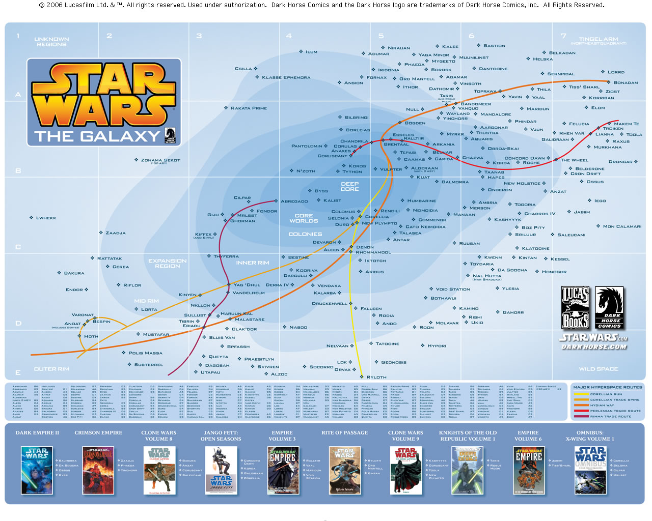
Via Que no se diga
If you love maps, I'm sure you already know Strange Maps
Maybe these things make taht someone are eager to 'see' their favourite novels. So, one of them, Russel Stutler, artist and reader of teh Sherlock Holmes adventures, have drawn the house of the famous detective. HE just need the descriptions of his 70 books.

All the details are in the map, so, if you don't want to lose anything, you can have the map with anotations.

Same happens with Star Wars. Who can resist a map with the universe of teh saga? And with its main routes!

Via Que no se diga
If you love maps, I'm sure you already know Strange Maps
Tags:
Beyond newspapers,
Maps
17/07/2008
The shape of the world
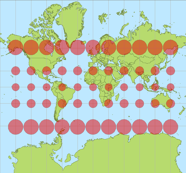
Mercator projection. Red circles show the deformation.
Since the world is (almost) spherical and the paper is not, when we draw bidimensional maps we have to project the sphere on the paper. There are many ways to do it. One of the most populars is the Mercator projection (above). But projecting spheres have a problem with deformations, and as is shown in the map, austral and septentrional zones grow with this kind.
We use the Miller projection at Público.

Miller projection. Stil not exact, but somehow a little less deformated.
But there is who complaints because of the 'unfair' of these projections. They think that get the north countries bigger doesn't help to the south countries, poorer. They think all this doesn't help the cause of equality. They think the best way to represent the spherical world is Peters projection.

Peters projection. Horizontal deformation compensated by vertical deformation.
A chapter of 'The West Wing'treated the use of this map.
But the polmeic doesn't end here. In Spain, having Canary Island in the map is a problem. They're far from the peninsula, so we get them in a little box on a corner to have them near.

But the real ubication is the shown on this map. Practical needs.

On Público we have a daily section called Cartas con Respuesta (Letters with answer) on which Rafa Reig answer letters written to the newspaper. Today, a reader make his complaints on having Canary Islands ona box in the weather map, instead of its actual ubication (having them in a box is something made on almost every single map of Spain). Our particular spanish Map of Peters.
It would be reasonable that, on the weather map, Canay Islands were placed where they really are, in front of Sahara. It's not logic that, adding to the long distance thay are form Spain, we have a geospacial desubication.
The answer deserves the reading because of its ironic point of view. (This is just an extract, for the whole text, in spanish, click here)
Now we face such serious situation, what could we do? First of all, complain, as you dare to do with braveness and fearless. Second, act forcefulness. I've made a roposal to Publico's leaders to have the weather map as a world map. How people would know where Canary Islands are without the reference of the poles? Without knowing the size difference between Canary Islands and Madeira? Isn't a try to lie, manipulate and antidemocratic? The problem is, as you already know, that Earth is spherical and maps are bidimimensional. Representing a threedimensional objetc just using two of its dimensions is never an innocent act: try to deflate a ball and stretch it on a table, and you'll see that not an easy work. Which projection should we use in order to stop lying to readers? Mercator, Winkel-Tripel or Peters? Which one would be the fairest with the situation and the real size of Canary Islands
Thanks for the information, Gonzalo.
Tags:
Maps
30/03/2008
When locators are absolutely useful
The Guardian again. Some months ag I complined about an absolute useless locator on its web. It was the following:

Maybe it's useful for people from Jokela, Tuusula (Finland), but I don't think the percentage of Guardian reader there would be very high.
In the other hand, this time happens just the opposite.
The new was that a private plane crashed on Kent. This was the locator:

Useful information on it:
1. Where in London crashed the plane
2. That it happened very near from the airport
3. That it fell very near from a hospital, that could cause a bigger disaster
Those are very good reasons to have locators on page.

Maybe it's useful for people from Jokela, Tuusula (Finland), but I don't think the percentage of Guardian reader there would be very high.
In the other hand, this time happens just the opposite.
The new was that a private plane crashed on Kent. This was the locator:

Useful information on it:
1. Where in London crashed the plane
2. That it happened very near from the airport
3. That it fell very near from a hospital, that could cause a bigger disaster
Those are very good reasons to have locators on page.
Tags:
Maps
14/02/2008
Summarizing absent days
Excuse me for my long absence. Spanish (and USA) elections and problems with blogger has been a big burden these days. But there hasn't been lack of interesting things.
Who has the oil?

Luis Yujipolo, again, reommends to look to a good graphic on the spanish version comments. A map showing who has and who uses oil.
Originally published on Andrew Sullivan's blog
SND awards polemic blog
SND Update blog has been following the SND judging. We could see on it some 'milestone' awards, the most awarded and other data about the awarded. But, some days after finishing the judging, we still don't know the compelte list. For this reason, Juan Antonio Giner complaints on his blog, about the leaking of medals and not having the list published once the contest is finished. Discussion continued on Update
Wors of the german graphics agency KircherBurkhardt
Robb Montgomery uploaded on VisuelEditors a video about this agency, which is doing a great job. One of his best values is how they can provide conceptual and spectacular graphics keeping the same high level.

Supertuesday graphics
Infosthetics showed a lik of the blog This is totally gonna work... on which a analysis of supertuesday graphic on northamerican newspapers was done.
On Público we've used USA parties elections to start publishing online-something (I won't dare to call them graphics at the moment), still without time and without idea to develop somethng decent, but making the first steps. Critiques are accepted and desired.
Who has the oil?

Luis Yujipolo, again, reommends to look to a good graphic on the spanish version comments. A map showing who has and who uses oil.
Originally published on Andrew Sullivan's blog
SND awards polemic blog
SND Update blog has been following the SND judging. We could see on it some 'milestone' awards, the most awarded and other data about the awarded. But, some days after finishing the judging, we still don't know the compelte list. For this reason, Juan Antonio Giner complaints on his blog, about the leaking of medals and not having the list published once the contest is finished. Discussion continued on Update
Wors of the german graphics agency KircherBurkhardt
Robb Montgomery uploaded on VisuelEditors a video about this agency, which is doing a great job. One of his best values is how they can provide conceptual and spectacular graphics keeping the same high level.

Supertuesday graphics
Infosthetics showed a lik of the blog This is totally gonna work... on which a analysis of supertuesday graphic on northamerican newspapers was done.
On Público we've used USA parties elections to start publishing online-something (I won't dare to call them graphics at the moment), still without time and without idea to develop somethng decent, but making the first steps. Critiques are accepted and desired.
Tags:
Awards,
Maps,
Online graphics,
Trends,
World
21/06/2007
The other side of the maps
Most of us have maps and locators making our days. So, you better visit the blog Strangemaps to stop hating them and discover the other face of maps beyond shapes, rivers and locators. Some theorics say maps are not infogaphics, but some of these really are: they explain.
Some examples
This USA map shows different names of countries inside its states, comparing de Domestic Gross Product of each state with the one of the country written. California as France, Michigan as Argentina or New Jersey as Russia.
Could it be just a table? Maybe, but then it won't be shown here!

EMaybe you know this one, it appeared at The Guardian A1 months ago. Shows the Europe climate map at 2071, and how some eruopean cities will change their temperatures comparing with nowadays ones.

And this one it's not an infographic, but it's also a good reason to take a look to this blog

Some examples
This USA map shows different names of countries inside its states, comparing de Domestic Gross Product of each state with the one of the country written. California as France, Michigan as Argentina or New Jersey as Russia.
Could it be just a table? Maybe, but then it won't be shown here!

EMaybe you know this one, it appeared at The Guardian A1 months ago. Shows the Europe climate map at 2071, and how some eruopean cities will change their temperatures comparing with nowadays ones.

And this one it's not an infographic, but it's also a good reason to take a look to this blog

22/03/2007
Help for understandig war
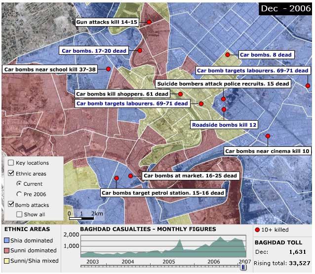
We like to insist on the idea that it's not necessary for a good graphic to be beautiful. It must be clear and informative, it has to make easy to understand a complicated information. An example of what I'm saying are BBC online graphics. Thay are not much pretty, they are not full up of 3d and animation, but thay make affordable big amounts of interesting data.
This kind of wrk is shown on this graphic about violence in Baghdad since war started. Really interactive, undertandable and with loads of information. A must click
Vía Innovations in Newspapers
LINKS
- Baghdad graphic at BBC
- Article on Innovations in Newspapers
Tags:
Maps,
Online graphics
22/02/2007
First, the reader
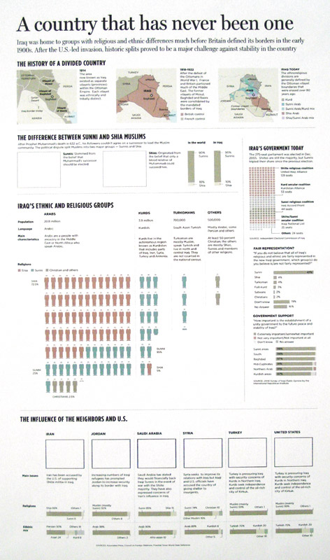
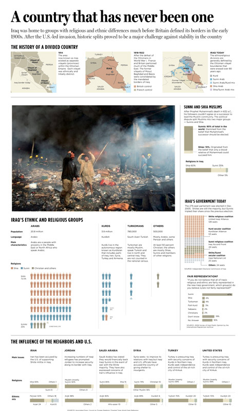
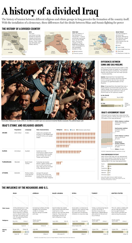
That's what The Dallas Morining News staff thinked when they did this graphic about ethnic and religious differences in Iraq. Take a look to these graphics.
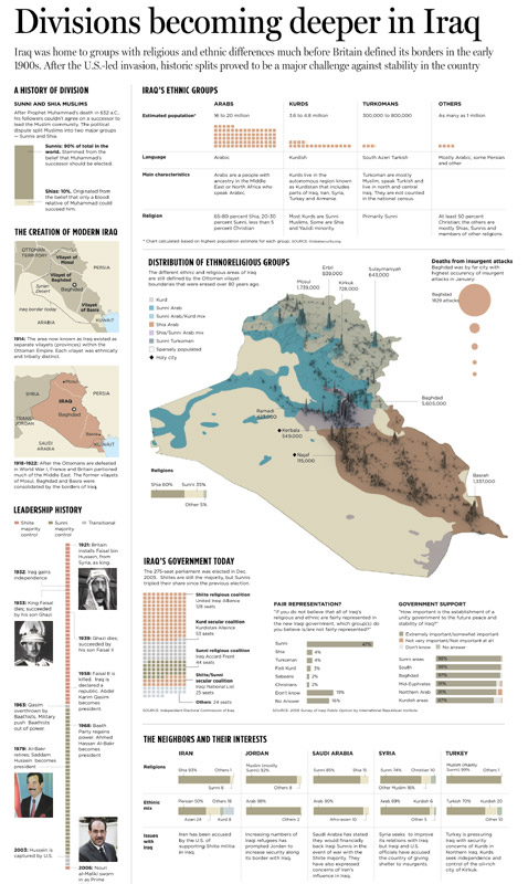
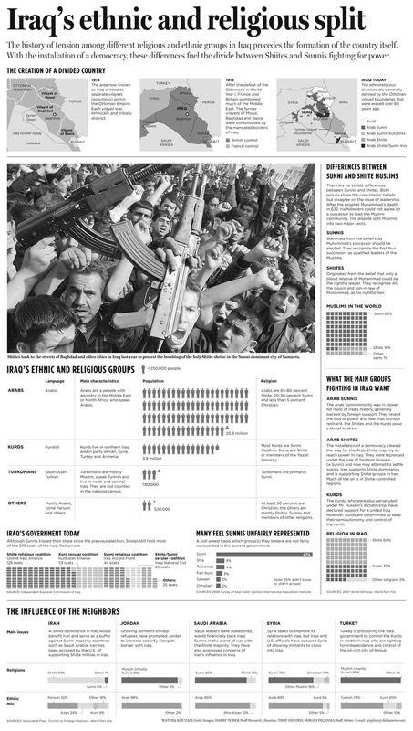
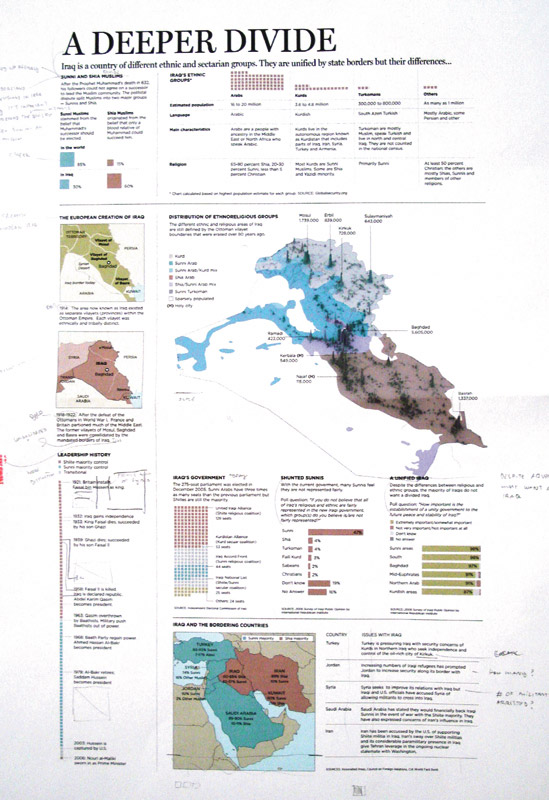
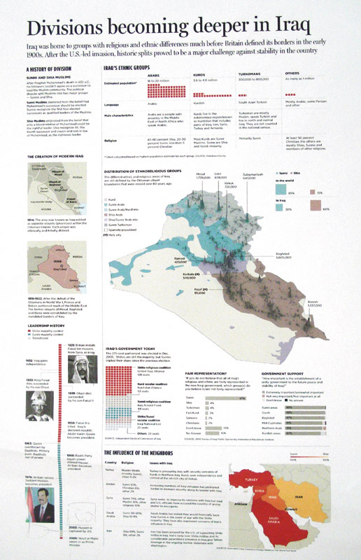
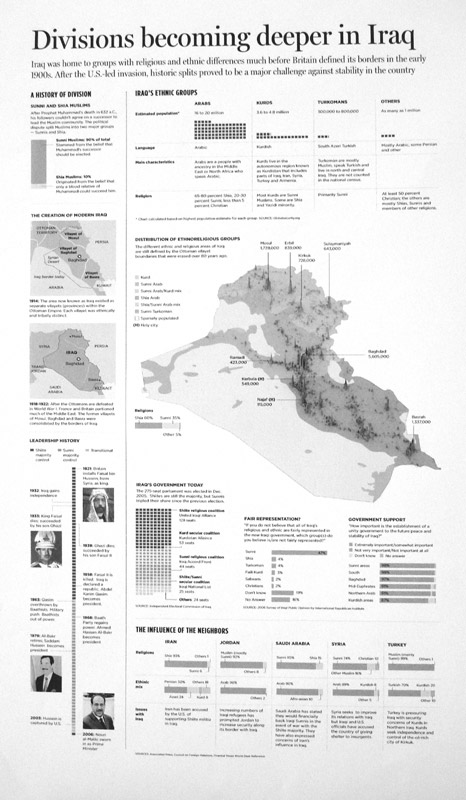
At first sight, the first looks like a more interesting graphic, more visual. But DMN graphic staff though than going this way would be a mess for the reader, so they decide to clearer and made the graphic of the right. Most of the times we sacrifice a clear graphic because we want a spectacular one, and we're not supposed to do it. Readers go first.
Sergio Peçanha, graphics director at The Dallas Morning News, explains the process himself:
"In the first graphic (left of the two above) you'll see we had the graphic pretty much ready, with that map at the center. But when you tried to read the graphic, we were making it very hard on the readers. We started with the Sunni/shia divide, then a couple of historic maps and a timeline.
On the right side, we had Iraq's ethnic groups and the 3D map, showing population and ethno-religious groups in the country. The circles on the right showed the deaths among Iraqis in January (Baghdad is the big circle).
At this point we decided to make the graphic more linear, it was very heavy to read. So redesigned it, simplified things and cut some of the information. We felt there was too much stuff stuck in the graphic.
On the definitive graphic (right of the two above) you see the final graphic. We grouped history of the borders at the top. That shows that when Iraq was formed, it's borders were merging together several different groups. That's a recipe for conflict.
Then, at the right, it's the difference between Sunnis and Shiites and what they want in the conflict (we didn't have this last part before). Finally, we added a photo that we thought would display the rage better. Below the photo we have Iraq's ethnicities. At the bottom, foreign interests."
You can take a look to the whole process here


Thanks to Sergio Peçanha fo all the infomation and the images and he and all his staff for this great lesson


At first sight, the first looks like a more interesting graphic, more visual. But DMN graphic staff though than going this way would be a mess for the reader, so they decide to clearer and made the graphic of the right. Most of the times we sacrifice a clear graphic because we want a spectacular one, and we're not supposed to do it. Readers go first.
Sergio Peçanha, graphics director at The Dallas Morning News, explains the process himself:
"In the first graphic (left of the two above) you'll see we had the graphic pretty much ready, with that map at the center. But when you tried to read the graphic, we were making it very hard on the readers. We started with the Sunni/shia divide, then a couple of historic maps and a timeline.
On the right side, we had Iraq's ethnic groups and the 3D map, showing population and ethno-religious groups in the country. The circles on the right showed the deaths among Iraqis in January (Baghdad is the big circle).
At this point we decided to make the graphic more linear, it was very heavy to read. So redesigned it, simplified things and cut some of the information. We felt there was too much stuff stuck in the graphic.
On the definitive graphic (right of the two above) you see the final graphic. We grouped history of the borders at the top. That shows that when Iraq was formed, it's borders were merging together several different groups. That's a recipe for conflict.
Then, at the right, it's the difference between Sunnis and Shiites and what they want in the conflict (we didn't have this last part before). Finally, we added a photo that we thought would display the rage better. Below the photo we have Iraq's ethnicities. At the bottom, foreign interests."
You can take a look to the whole process here


Thanks to Sergio Peçanha fo all the infomation and the images and he and all his staff for this great lesson
05/01/2007
USEFUL infographics
 The Sun says that this is a real envelope. The map is the address. And, the weird thing is that this letter reached its target. A strike of luck, because a postal worker recognized the addressee, but is incredible anyway. You can't say graphics aren't useful!
 Via Visual Editors
Tags:
Beyond newspapers,
Maps
22/12/2006
First attempt: failure. But there's an attempt...
 Days ago we talked about Rocky Mountain News daring to use a A1 big graphic as the only illustration. Today, Diario de Burgos (Spain) tried something like that with this A1. I agree with Juan Antonio Giner in one point: I don't understand it at all. It is supposed to be a map showing the inmigrants procedence. But there's a big problem: countries are drawn with people icons, and it shows an idea, that the number of icons in the country show the nuber of inmigrants from there. But it is not that way. I love his kind of maps (or charts) that shows country sizes on statistical ways to give data. That's could be a good opportunity for that.
 But, it's always good attempting new things. This one was a failure, but it's a step. We need more steps.
21/10/2006
Maps of War
Maps of War offers us an interesting animation. It explains the different empires that have controlled Middle East in a clear, simple, natural, and very informative way. Good example in an era in which much of us are blind for 3d. Most of times easier is better
Tags:
Beyond newspapers,
Maps
Subscribe to:
Posts (Atom)


