Showing posts with label Redesigns. Show all posts

03/09/2008

Infographics departments around the world: Big changes on El Heraldo, Barranquilla (Colombia)

This summer I had the luck of contributing on two InnovAtion projects. One of them has been the redesign of the brazilian newspaper Correio, from Salvador da Bahía, from which I'm still receiving stuff to write a post focused on infographics, although I strongly recommen you Juan Antonio Giner's posts (1, 2, 3, 4, 5, 6 y 7) in order to see the great changes on this newspaper.

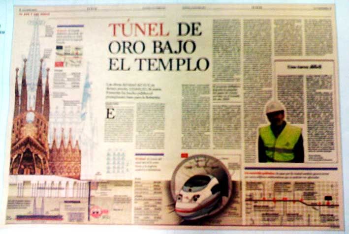
Th other has been El Heraldo, from Barranquilla. The press leader on Shakira's hometown, a city where newspaper are growing and growing.


This project had a design by Javier Errea and the work of Marta Botero, Eduardo Tessler, Gabriel Sama, Pablo Errea and myself, adding of course Juan Antonio Giner and Carlos Soria. If you're interested on the design and editorial sides of the re-birth, the best is to visit Innovations in newspapers blog, which will be uploading stuff about this these days.
El Heraldo had no infographic journalists. Two designers made graphics when they were needed, They will keep helping on graphics, but, with the changes, El Heraldo hired Johan Romero Montes, who previously worked for El Tiempo (Bogotá). His arriving has been a very helpful hand to get the dramatic changes we wanted for the newspaper.
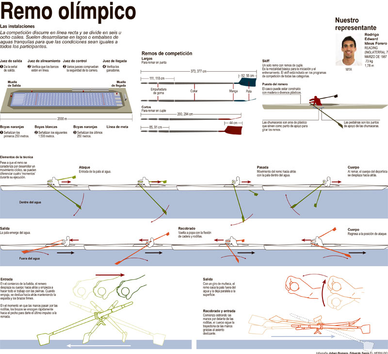
A good example of the new graphics are these from the Olympics Games, the big test for this new changes.


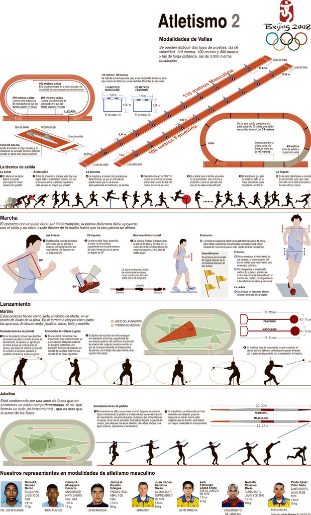
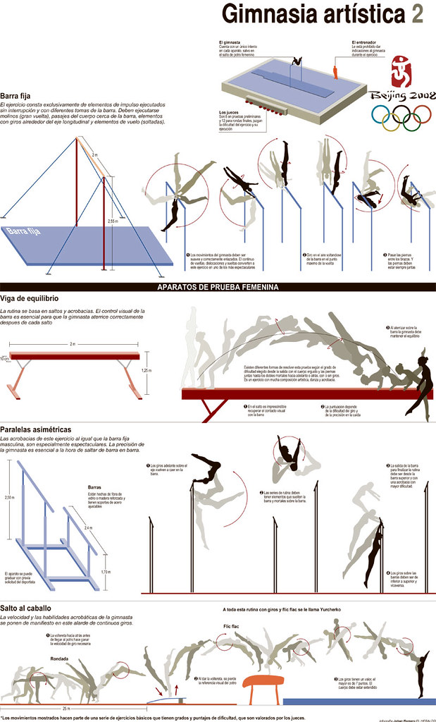
The guidelines for this project were those you're used to be on this blog: be clear and clean, the main thing on a graphic is the information, avoid decoration, use color as guide... With all these ideas and the people of El Heraldo (Johan, Jan, Eduard, Fabián...) they've got an Art Department which will be responsible of very nice visual surprises this year.
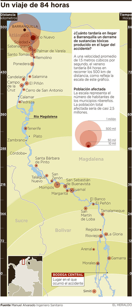
The first issue was released this monday, and this was the firs graphic:


Not an spectacular example, but with very good and useful information. I hope to keep showing some examples these days. Anyway, congratulions to Johan and all the team.

10/07/2008

God Save the Queen and the Graphics

The new of the week, month, year on news design is the Sunday Times redesign. Some, like Juan Antonio Giner (whose blog I took these images) or Mario García have no doubts to give their biigest congratulations to Al Triviño,head of his project. Others, as his Guardian colleague, Mark Porter, are not so glad with the result.


I can't follow very much The Times from Spain (my newspapers subscriptions just include The Guardian and The Independent among our british newspapers) and not even its Sunday edition. And it's a pity for me, as one of the biggests supporters of english newspapers. But now, taking a look to the pages of the redesign, discovering those big graphics among them draw a smile on my face. OK, that's not the biggest bet for graphics on the world, but shows that something's changing. If that's forever or just for today, we'll need time to know it.


England is not the country with most pages dedicated to graphics lately, despite of the great ifluence of its infographics artists, as Peter Sullivan, one of the best and the firsts masters of this discipline in Europe. But the triumphs of Michael Robinson's Guardian on Malofiej, the work of Michael Agar on IOS, the online infographic labour of BBC and this blink from Murdoch's newspaper appears to be very good signs for graphics on Queen Elizabeth's land.

As Cuatro Tipos show in their blog, the idea of launching infographics to a new dimension on Sunday Times is a srong point of the new times. The Infographics Style book, was made Al Triviño and John Smith's (graphics Director at Sunday Times) team (Some days ago, I wrote here that Charles M. Blow was hired for this task, but he wrote me to say he just did a little consulting for the redesign and his task ended some months ago. Excuses for the mistake). Behind the new style for online graphics, Rafa Höhr (former ELPAIS.com graphics director) and Manolo Romero (former Diario de Sevilla graphics director, and former chief of mine). When you spend money on such great professionals, it means you really want to do something good. And those are very good news. God Save the Queen, and the new infographics era at United Kingdom

22/11/2007

Eleftheros Typos, the best designed european newspaper


The greek daily Eleftheros Typos (Free Press) has been awarded best designed european newpaper on this edition of the European newspaper Awards, on the national daily category.
The Mayo News (Ireland) was chosen best local, El Periódico de Catalunya (Spain) best regional and Welt am Somtag (Germany), best weekly.

I got an enormous luck working in the InnovAtion team in charge of the redesign of the daily. Great luck, colaborating with great professionals as Juan Antonio Giner, Juan Señor, Javier Errea, Marta Botero, Mike Fairhead, Gabriel Sama, Pablo Errea or Eduardo Tessler, and also Pablo Ramírez, the other infographics consultant. Maybe the two weeks of my life when I've learned the most.

About the graphics, which is this blog about, here you are some examples of the graphics which are being made at the ET infographics department. InnovAtion idea for teh graphics was, as I hope is seen, clarity, simplicity, as teh marvelous design by Javier Errea. Colors as guide.


In addition, on teh graphics category of teh European newspapers Awards, these have been the winners:
- Svenska Dagbladet (6) Sweden
- Expresso (3) Portugal
- Äripäev (1) Eesti
- Berliner Morgenpost (1) Germany
- Frankfurter Rundschaa (1) Germany
- Het Financieele Dagblad (1) Netherlands
- Hufvudstadsbladet (1) Finland
- Östersunds Posten (1) Sweden
- Presso (1) Finland
- Süddeutsche Zeitung (1) Germany

LIKS
- All Eleftehros Typos issues on PDF and updated daily
- The new at Innovations in Newspapers
- How Eleftheros Typos was (Infographics News)

02/10/2007

La Vanguardia: New design, same spirit


Today has been released the new design of the catalonian newspaper La Vanguardia, a new InnovAtion project, on which have participated, adding to the newspaper staff, people like Carlos Soria, Juan Antonio Giner, Juan Señor, Javier Errea, Javier Zarracina, Marta Torres, Claude Erbsen or Thomaz Souto Correa. A redesign trying to look for a more modern concept but keeping the same spirit as alaways.
If we focus on gaphics, the idea can't be better. A project brought by two of the biggest geniuses of infographics, as Jaume Serra and Javier Zarracina. And these are the results:
(Images from Innovations in newspapers and Maquetadores)


A first view the ambition is very clear, the bg bet for graphics in this newspaper where this ¿genre? loooked slept for years. The Jaume Serra's own style is entering in the paper, and that's very good news. I'll keep an eye on the evolution, because the return of Jaume is one of the biggest news for infographics at the moment.

06/06/2007

Weather in the new The Virginian Pilot

Today was launched the redesign of The Virginian Pilot. And its weather page called inmediately my attention...


We'll talk another day about if the weather page is adesign or an infographics matter (in my opinion is a mix of both), but, as it is a daily mission for most of us, I'll tell what surprised me.

First of all, we're seeing here the rotated page. Actually, it is printed vertical, and you have to rotate the paper to read it.
The are no icons of suns, clouds... on the map. This information is showed with a text. Something I'm not used to see. They just use icons to show the weather in the week. With a child as anchorman (I suppose we'll have a different kid each day). A way to involve reader.
They also have the Navy Bases weather (my european mind doesn't understand it very well).
Big space for tides, natural, in a state with so many kilometers of coast.

I can't say nothing good or bad about it. Weather pages depend so much on their target taht, without having ever been in Virginia in my whole life, I can't have a reasoned opinion. I just can say that it's original. And it has the same target that the general redesign: involve readers, and this is something that hardly can be a failure. Original. Not a usual thing in this kind of pages...

24/01/2007

Astronomy in Milwaukee

It looks like you've got two big papers redesigned at the States everyday. This time was Milwaukee Journal Sentinel. It's not usually to show graphics on this redesigns presentations, although most of them have a much more visual redesign. This wasn't a exception, but there's a good detail: the weather page. Upper zone of the page shows bars that explains time for dawn and dusk, nt just for sun and moon, but also other planets of the solar system (sorry Pluto, you're not in this club any more).


I don't really know how much people would be interested in this kind of information... Maybe Milwaukee it's a great place for astronomy. But I don't really think either mucho more people would be interested on many of the data whe show on our weather pages: isobars, temepratures of all around the world (do we really have to know the temperature at El Cairo everyday????). But this one is original, and that's a good point.

To take a nearer look, you can do it at Visual Editors