Showing posts with label Process. Show all posts

25/05/2011

Working for National Geographic:

Share

Fernando Baptista, graphics editor at NG, explains it on the spanish blog La Buena Prensa (amazing images...). It's in spanish, but it's Show-Don't-Tell-expalined... So it's worths a visit.


And if, even with those images, you don't get the whole picture, National Geographic has released a video with explanation (click on iamge to watch it at NG's web)

28/04/2011

Making the best online infographic of the year

Share

This is the translation to english of an article written by me at 233grados.com, the communication blog of lainformacion.com. The original Q&A were in english, so just the lead is translated. I have to thank Joe Ward very much for his time and help with this interview.


This is an explanation for general public, if you want a more specialized explanation, you have it at  Xocas.com


The New York Times won (once more) the Peter Sullivan award to the best online infographic of the year with 'How Mariano Rivera dominates hitters'. This video explanation was told to be 'the path for the future of infographics'.
We talk with Joe Ward, sports infographics editor at The New York Times and one of the authors of this work, about this particular infographic and about how does one of the best infographics department of the world works.

With all the possibilities that interactivity offers, why did you decide to use a video for the Mariano Rivera graphic?
Making a video wasn’t our first idea for the graphic. Shan Carter had been fooling around with all the pitch data we had and wrote a program to see what the data might show.


This led to an idea for making a user-based interactive that would allow the user to sift through the data themselves.

Rivera interactive

But this presented a lot of problems. Only serious baseball fans would want to spend the time manipulating the data and we wanted this to appeal to a broader audience. And the idea was to show what made him so good and this approach would not accomplish that.
So we decided on two things. First, we wanted to do the work for the audience; figure out what the data showed and present only that data without any other noise. Second, we thought that if we could give people the sense that they were trying to hit against him, that might show how hard it is and why he was so good. Graham Roberts, using Maya, did a nice job creating the sensation that you were going against Rivera.


We had a handful of points we wanted to show, which included the speed of the pitch coming in (0.4 seconds, which is accurate in the graphic); how hitters identify pitches by their spin (and how his cutter was hard to identify); and a map of how accurate he was with his pitches.
So to make these points and to give people the experience of what it must be like to hit against him, we thought it made the most sense to just let them watch it and with narration we could explain what it was they were seeing.


Do you think the success of the NYT sports graphics that mixes video and graphics would be the next fashion in infrographics?
I certainly think that the mix of graphics and videos have a lot of benefits. The history of graphics is filled with attempts of trying to show motion in print. But, of course with the Web, we no longer have to fake it, we can show motion when motion is called for. It seems like the natural progression. But I think that audio can also be very effective and is underused. I think even simple charts can have some added value if they are accompanied by well-edited and simple narration. Interactivity certainly has a place in Web graphics, but I also think that the more work you can do for the viewer, the better. And sometimes that means narrating the explanation instead of making them read it. The more things you make them read, the less time they will spend looking at your charts or drawings. What we all try to do is tell stories and oftentimes it is better to actually TELL them.

What particular thing do you think that makes NYT the best infographics department?

Well, it is nice that you think we are the best.
There are a lot of factors that go into making a successful infographics department. The Times has a rich history of cartography and graphics that has continued to evolve through the years and the newsroom has long embraced these as viable and critical ways to tell or enrich stories. Under the stewardship of Tom Bodkin, the assistant managing editor who has overseen our department for many years, our group has grown in stature and in number. Steve Duenes, our graphics director and Matt Ericson, his deputy, create a productive and creative environment where we are free to try new things and attempt to expand what we do. Collaboration is also a key ingredient at The Times. We have a staff with diverse skills and Steve and Matt are very good at putting the right people together on projects to best exploit those skills.

What are the keys to create graphics for both print and online products?
The basic principles for each type of graphic are the same: make it clear, informative and easy to navigate. The online versions allow for more options, and if used properly, can aid in achieving the goals of those principles. For instance, no matter how well a print graphic is designed for navigation, you can never really control where a reader is going to look. But with an interactive, you can control how much information the viewer sees and in what order they see it.
Some people think that many NYT graphics are too complicated for the regular readers. What do you think about that perception?
Sometimes graphics are complicated because the information itself is complicated. But our job is to make sense out of the information and try to make it clear for the reader. Do as much work for the reader as we can. But sometimes the graphics still remain complicated. These should be the exception, though.
I think when infographics people get in trouble is when they design graphics with other infographics people in mind, instead of with the reader in mind. I think it is a part of all of us to try to impress other people in the business with the work we do, but those instincts need to be kept in check most of the time because in the end we are doing this for the reader, not for each other..  

16/01/2011

3D in the age of 2D

Share

Veteran infographic journalist will tell you how documentation was when there was no internet in newsrooms. I consider myself young, but in my first years we also had a computer in the department, the one with internet, but most of the documentation came from maps, books and other stuff whe had there.
But there were more differences. Today, the big graphics with cuts for watching inside are done with 3D software. The they were done just with Illustrator or drawn by hand. Today many people still use Illustrator, and people that used to draw by hand are still doing so.
You can understand why seeing this example by Juan Colombato, head of infographics at the argentinian newspaper La Voz del Interior.
A 45º axonometric view, done 10 years ago. Take a look and remember 'the good old days'


But there's more. We're talking about someone who draws at the higher level. Watch his works, which I discovered ath Nicolás Ramallo's blog.

04/06/2010

Behind the scenes: All the passes of the Spain-South Korea match


All the passes of the Spain-South Korea. Click on image to access the interactive graphic.

The image above shows one of my lasts infographics at lainformacion.com (as a friend uses to say, the-web-that-pays-my-food). That graphic has its own little story behind, so...

The first idea about this graphic was something alike publishe at the austrian newspaper Der Standard during the Germany 2006 World Cup. Sorry, I don't have any images although I have shaken Google for long time. If somebody has, I would appreciatte it if you to send it to me.

Years after that, during Euro 2008, I was working for Público (where Álvaro Valiño, Samuel Granados, Miriam Baña, Mónica Serrano and Artur Galocha are having huge success). And many of you know how we love data visualization there. We got Geca (today OptaSpain), a service which gave us lots of statistical data, including all the passes of the match. I made this graphic for Euro 2008:

For some reasons I won't explain here, the infographic was not published. We had a 'lite version' of it, but not what we liked at the infographics department. And also, I kept thinking on how cool would it be as an online graphic But that was just impossible for us then.

Two years after, I'm at lainformacion.com and the World Cup is coming. ESpain is playing some friendly games before it. And the I remembered this graphic that kept floating on my mind. So, facing the World Cup, I decided to do something like that for the friendly games, just to check if it would be possible to do something for the World Cup games.

First problem: we don't have statistical services here. No problem. I just had to do what they do by myself: watch the match and draw all the passes. One by one. The facts:


At the beginning I though that, as in Publico, I could draw who gave the pass and who received it. Bad idea. It was just a mess. To much for one person, a TV and a ballpen. So I decided just to draw the connections between players. A line he first time two playyers are connectted and a little mark over the line all the next ones. A new page every 15 minutes. And also a new one for each replacement. Now, the graphics are published 1 h and 45 minutes after the match. I hope to do it in onehour.

Now, friendlies have 6 substitutions per game, so I'm using two fields: the initial and the final formation. For the official games (just three substitution), I'll try to make it understandable with just one field.


Share

11/04/2009

Mixing 3d and reality

How did The New Paper this graphic?


With this toy


And this 3d model


The solution on this photo pool by Parka

Via Michael Stoll's Twitter (@mstoll)

12/10/2008

Behind the scenes: How did Pizarro die?

South(and center)America is a great talent factory on the infographics field. One of the most productive plants is Peru, and teh most important newspaper of the conutry is El Comercio (Lima). One of its infographcis journalists, Raúl Rodriguez, explains the process tehy followed on one of their last great graphics.

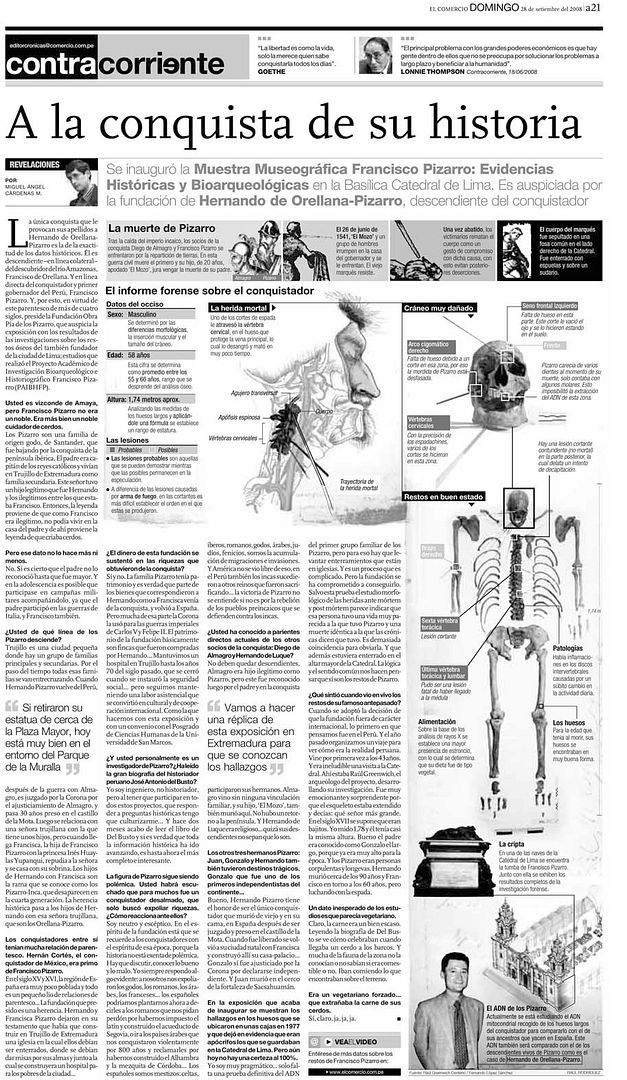
"Some weeks ago was released an exhibition at the Lima Cathedral about the conqueror of Peru Francisco Pizarro, whose corpse rests there. The exhibition focused on teh investigation by the Peruvian Anthropolgy Forensic Team, who has identified and examinated the body of this historic character. The team is well known on the country and Bosnia for different investigations.

Months before this, the press department of the Lima Archbishopric contacted our department in order to know if there was a possibility of developing a graphic with the stuff they have over this matter . When we knew it, we all put faces of 'Are you kidding? Of course!'

When we watched the stuff and the way they worked we knew we must do a forensic graphic, as they started forkm the very beggining the examination of the corpse. First of all, they confirmed that it was a man, and then determined the age of the bodyparts.

Once they knew the gender, age and aproxiamted year of the death they tried to find the causes. The chronists of that age sorrounded this fact with many legends and many historians 'recreated' the circunstances of the death. I remeber a book talking about the sentences said by Pizarro when he was fighting for his life:
Imagination FC:5 – Real Facts Utd.: 0."


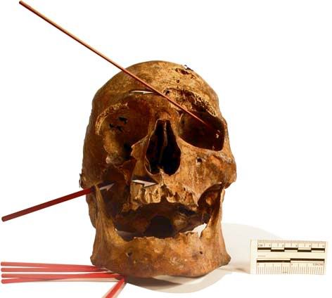
What called my attention the most was the skull. It shows many wounds that are coherent with the most difunded versions about Pizarro's death. They talk about a conspiration whose head was Diego de Almagro's son, his partner of the conquest, and who was betrayed by Pizarro on the ground deal. The skull shows many wound on the cervical vertebres, which denotes the great skills of the swordmen (many of them, as show the great amount of wounds) and the intention of cutting the head to put it on a spear."

When we had all the stuff I asked for the space we had for the infographic. We had a B&W page with an interview to Hernando de Orellana Pizarro, one of Pizarro's descendant and president of Obra Pía de los Pizarro Foundation, placed in Trujillo, Spain.

We had to deal with that circunstances and the main thing we had to explain was the known reasons of the death. So we used for that the small pieces that open the graphic. This helping pieces are very important on infographics,as in forensic sciences, because is good to start from teh very beggining- We have to assume that the reader is new to this data, and so we can reach everybody.


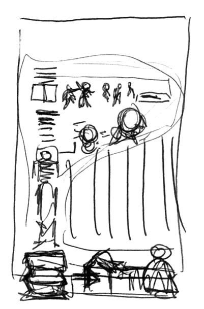
The structure (an inverted L) suggested by the page, conditioned how we had to tell the story (watch sketch). We started with a drawing of the head adn neck where we place the photos or teh damaged vertebres and then we analyze the skull and the wounds on it. The long piece of the L is used to fit the shape of the complete skeleton where other wounds and problems are placed."


Finally we explained where is Pizarro buried and used a photograph os his descendant, whose DNA will be studied. Past, present and future.

08/04/2008

Making of. The 11M judgement graphic

We finally have drawers at Público. This made us to take another look to the great mountains of papers we have create on these six months of life.
Among disastarers we wouldn't like to have seen again and little good things were the sketches for the 11M judgement graphic by Alvaro Valiño.


This is the fnished graphic. A relationships diagram and a table with resolutions which share a color code. The graphic was a breaking news, made the day the judge gave the resolution, but we started thinking on it before. And this is hw we made it.
We had the name of the judged, and, with the terrorism specialist of the newspaper (I'm talking about a journalist, not a terrorist), Óscar López Fonseca, we reviewed the charges and which could be the sentences for each one.


We took the name and we think the way to organizate the relationships between judged, just as we supposed, waiting for the judge and his resolution.


We thought on the style that could have the diagram ad decided that the table should have the same colors. We thought (never seriously) on just using the skecth. We really liked it.


As you can see, there were a lot of changes (if you really look at out, we just used 3-4 faces for the scheme). We were constrcting the relations meanwhile Oscar was reading the sentence the day it was released.
The final result is the one above all. People from the newspaper liked it, many people we asked liked it ant it had a gold at Malofiej and a SND Award of Excellence. We think is a very easy and clear way to explain the information and have the reader informed, that was what whe tried.

07/12/2007

Working in the peruvian El Comercio


I could discover on Alberto Cairo's weblog the fantastic blog of the infographics section of El Comercio (Peru), La Combi Visual, very intersting for the graphics they upload and to discover the procedures they follow. A good example of it is this slideshow, where you can see how was done the graphic presented above

12/06/2007

Life of a graphic

Óscar Corvera, infographics artist from La Prensa Gráfica (El Salvador), sends this interesting document about the steps given to make one of his breaking news graphics and other following the facts, a great example of how an infographic artists can (should) work as a journalist.
I'll let him speak:

HOW I MADE THIS GRAPHIC


I receive call at dawn from my boss, telling thata car was shot, and there are some dead people.

Sketches
I go to the place and start to research information, from witnesses and policemen, telling me what happenedM
I've got to focus on one of the testimonies, make sketches about how the robbery happened, the street, cars, trees, deads...


Notes
I collect all the information and write the crime step by step.


Final sketch
I get the space in the page with designers. Graphic data is collated with the article to handle the same version.


Final work
After writing the texts and work with the images, graphic is just reviewed by correctors. Finally, the graphic gets into the page.


Following the news
After the fist publication, I decie to keep investigating. I asked sources from police and office of the public prosecutor. I visited the place of the crime and studied it. Finally, I got in the palce where the shot car was in custody. I counted the bullet holes and their positions. With help from the investigators I reaffirmed the palce where the victims were and reconstructed the version of the witness.


Publication
The infographic made the editors to choose a journalist to write an article to go with it.


Award
The graphic was sent to an international contest, and got an Excellence Award (SND).