
I have some little problems to understand the key at first sight, but I should put the blame on my english in this case. But, I agree with Michal Agar, chief of infographics at thel IoS, who spok about it with the terms 'modern infographic'. I wouldn't use the word 'modern', but because in spanish it has several connotations, more suitable for fashion than innovation. But I think is a kind of infographics we need now and in the future. It manage to explain, visually, a lot of data, and with order. Maybe the general reader need a little time to get used to it, but people now have a wider visual culture. Of curse, it depends on the topic. Each graphi, topic, country... has it own reader and style. But some news,maybe for their complexity, need a visual system beyond bars, pies and evolutions.
NYTimes.com is in this trend. As Matthew Ericsson, ma of the house, said about online graphics: "You've got t build graphics for both Bart and Lisa Simpson. Lisa will get a lot of information and will take cloncusions, and Bart can play with it".
Newspapers (print) have to offer a plus that internet, radio and TV can't offer. And it could be reflexion. Time. Tv and radio don't have time to get inside the new, analyze it and take a time to explain it. Sit in teh sofa with a graphic and observe all the variables and possibilities is proper pf print. And just internet can be a competitor for that.
Elections (spanish and american) are coming ahead. Good moment to start trying these kind of graphics. Because we have a big bunch of boring data that we have to present on an attractive way, because people want o know about that. Explain hard data on a visual way.
Thanks to Michael Agar
3 comments:
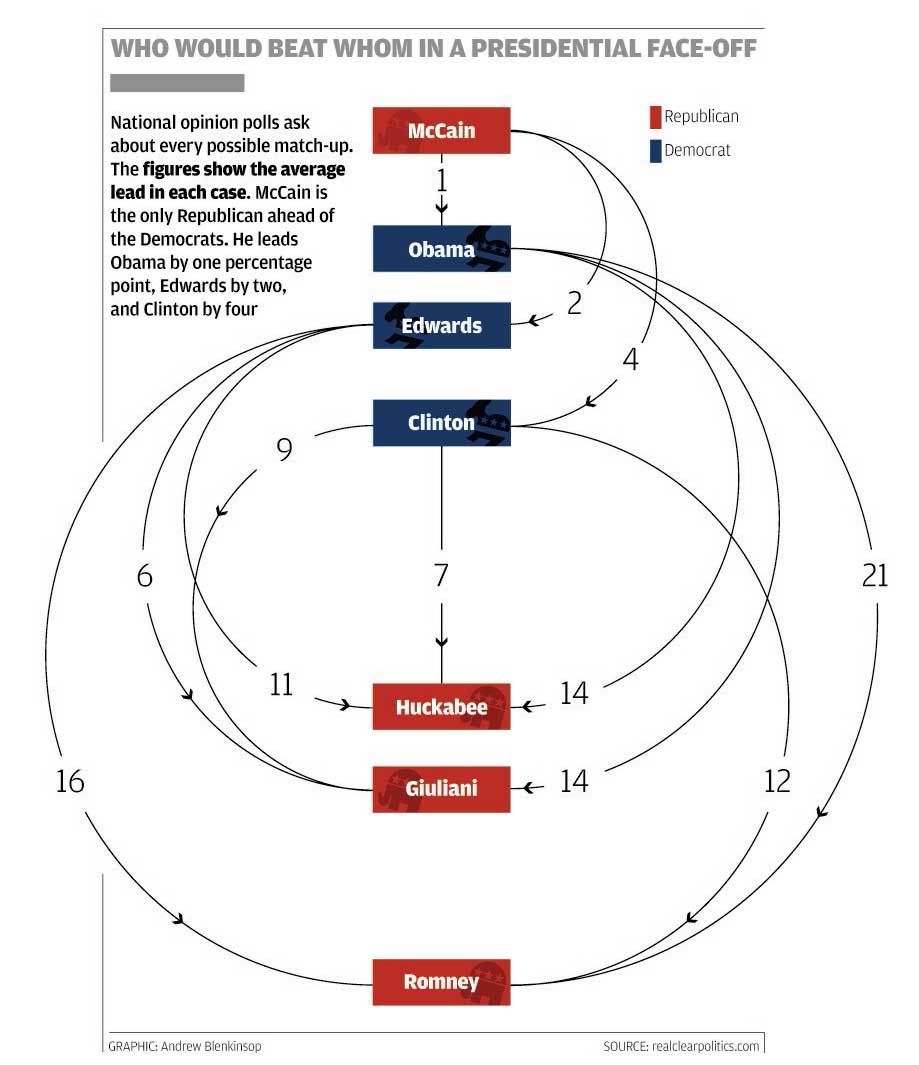
It's a cool looking graphic but I find it very hard to visually read the information in the graphic. Why are the candidates in the order they are? Is the spacing important? Why are they spaced the way they are? I keep expecting the size of the arc to correspond to the size of the polling differential but it doesn't. I think there must be a better way to present this information so it isn't a struggle to interpret.
What I think is that the order show the 'wining strik'. McCain goes first because he would defeat everybody and ROmney the last because everybody would defeat him (and the others follow the order). The distance of the lines depends on the order. I would like that the stroke would be wider depending on the percentage of the victory, but I guess that this would create a mess...
The graphic has already created a mess ... it's almost unreadable. If it had been presented as a simple 3x4 grid of numbers, you would have seen the trends immediately (and more importantly, you would have been able to read it).
Post a Comment