
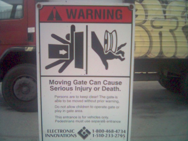
Flick-r revolucioned internet, as YouTube or MySpace have done. You can find everything on it, like this complaint of The boy who loved Bellum, not very happy about the icons used on these signals. If you read the text it looks like an advice to mind the door, just for cars. But, as a comment said, it is likely to advice about the risks of being squashed by a giant credit car or having your hand damaged by a yo-yo.
Other calssical example about wrong icons are these on the Tokyo underground

It's not trying to explain the reproductive cycle of a seating person. Just explains that you have to leave free the seat for people with broken arms, with toddlers, pregnants or withpout on leg. What I really think is that the japanese designer who made that was looking for some relevance.
Other times is just that the pictogram is not the best election, thinking about sensibility, as this signal of San Diego (USA), advicing about the risks of illegal inmigrants crossing roads on a hurry.

Or this one from Estonia, asking for not throwing babies to litter

All of them have its particular problem, but my favourite one (excluding the classical japanese) is this one

It mut be a gas accesible for disabled... but looks like another thing
No comments:
Post a Comment