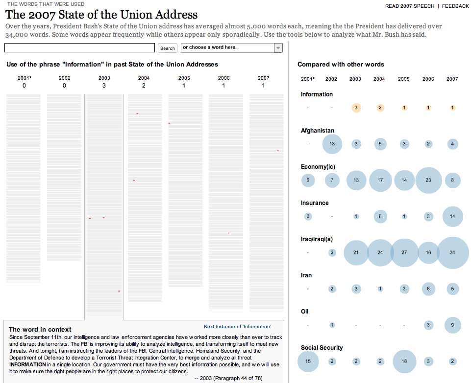
The New York Times online graphics are sometimes a technological affair beyond infographics. The information they provide is so interesting that deserves time to explore them. This time, the analysis is focused on the annual speech of the president about the state of the Union. Year by year, form Bush's first speech, we can look for words over the texts, watch the frequence of its apparition, the context... Visual information provided is very clear: over grey columns, analogy of the speech, words searched appears in red, showing the repetition and the place where it was said. On the side, frequency can be compared year by year with other words, now on the media everyday: 'Oil', 'Iran', 'Iraq', 'Economy(ic)'... Other great graphic? Or more than it?
If you want to take a look,
click here

No comments:
Post a Comment