
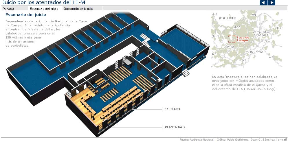
And so did elmundo.es, with its 3-graphics special, that explains, not just the places where people sat, but also all the crimes imputed and who are the accused. This information that could looks like not as a great graphic is perfectley explained, with not spectacular interactivity, but there were no need of it. On my opinion, much more interesting than the other.
But is not that what worries me. Is the fact that just now is when newsroom had infographics artists on mind. These lasts months have been much more "graphicable" stories which didn't get the graphic and just got a video which didn't go deep. Why now? Because thsi is a big stor and we have to show how many resources we have?
Is the print fight carried to web. When bombing happened, most of spanish papers gave a double spread graphic to explain it. And the information dind't need it. We know it now and very much knew it then. The thinking was: terrorist attack=double spread. It worked on 9/11 because tehre were much more things to tell, but not this time.
It didn't work then and it's not working with the trial. Offering the graphic of where is everybody is a good idea, but we had more interesting garphics and we forgot them bacause the story wasn't so big, and that's the real problem.
Examples
* elmundo.es
* ELPAIS.com
* Vocento
No comments:
Post a Comment