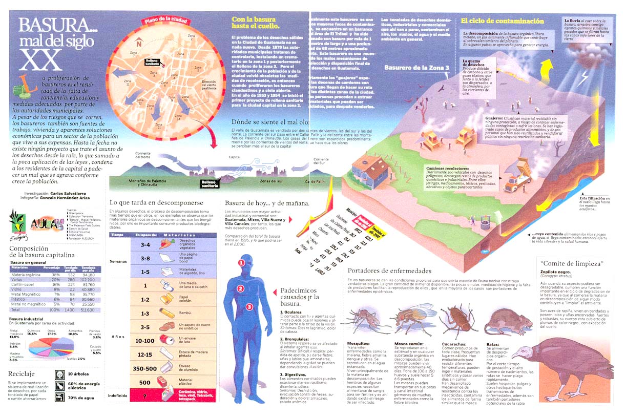
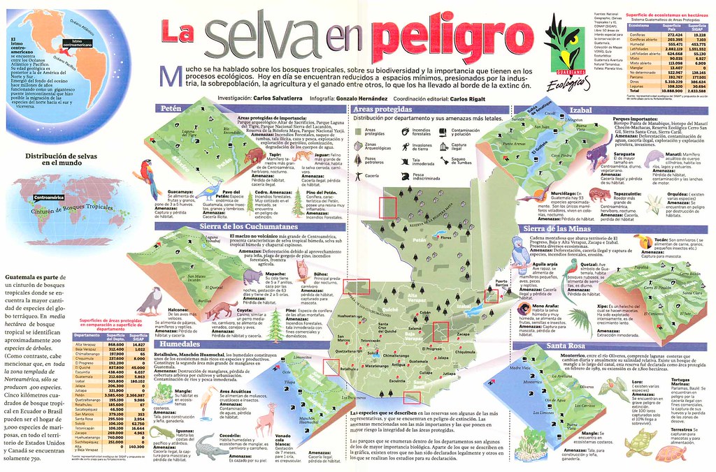
These are the good thing, now we're focusing in the bad ones (it's a joke). Gonzalo sends two graphics made for Prensa Libre (Guatemala) years ago.

This first talks about problems caused by trash. Gonzalo talks himself about it: "it's a colorful carnival, editors didn't read the texts -and I didn't ask for it- head and introduction text is trapped in a color which does not allow a clear readinge.... I didn't know or I just didn't try to administrate well this information. I wanted to get all the information in the graphic and the final result... is terrorific to try reading it!"

He talks also about the second one: "It's about natural diversity of Guatemala forests, threatenes by men...this one is worse..it's like a monument to disorder..main text is very far from head, the Guatemala map is literally into an information chaos, the visual navegation concept arrived here, and came back the same way"
In my opinion, these are the typical mistakes we have when we're full of information and we don't have the time or simply we don't really try to analyze what's the main thing, how do we want to explain it, what shoud be on a graphic and what's not and how are we going to make understable all the data. Problems grow when we have a double spread. But we can learn a lot from mistakes

No comments:
Post a Comment