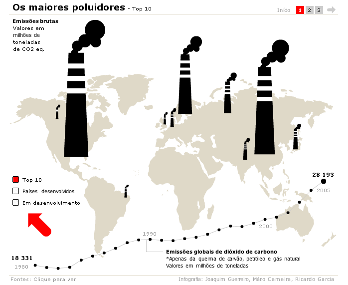
A short time ago (don't know exactly when) Público (the portuguese one) redesigned its webpage, converting it in one of the ost abicious of the lusitan country. A web that, as the print edition, has a Guardian look, althought te differences between webs are much bigger. In this new web version, the page includes an infographics section, somethig typical at the big spansih papers, but not so common at the anglosaxon news webs, where they come along in the multimedia section or just inside the related news.
Having an eye over the online graphics and not being an expert on this field myself, I have a bittersweet feeling (but sweeter than bitter). The big sweet point is to have done this section. But looking graphic by graphic my sensation is of irregularity. Mybe this come because I'm used to the great graphics by ELPAIS.com or elmundo.es. But they deserve more time. They've just started and that's more that what I could say.
Congratulations to our neighbours!
- Online graphics section at publico.clix.pt


No comments:
Post a Comment