
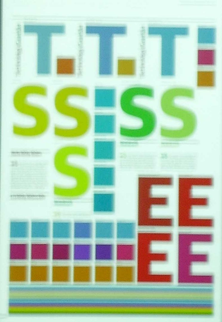
Color palette and graphics elementes used by the infographics section of The Guardian
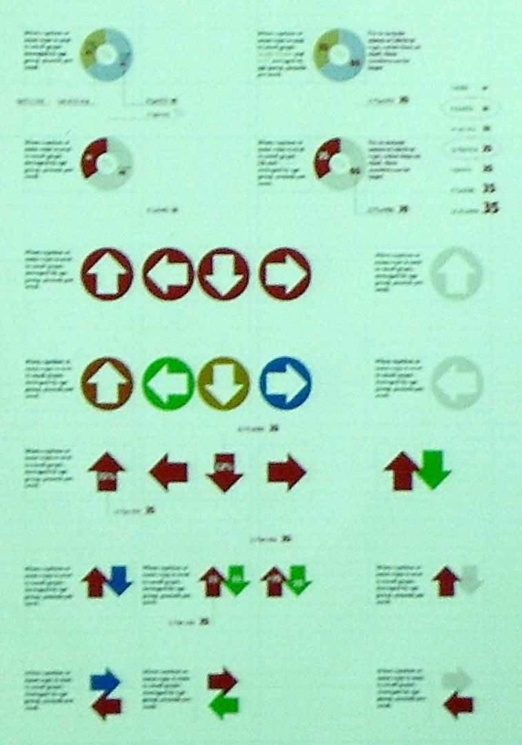
Robinson talked much about the newspaper design. It made visible how the decissions which were taken through Mark Porter's famous redesign had a huge influence over all the newspaper department. And obviously over infographics. Decissions about fitting graphics on page, color use, sizes or styles of the graphics look for the perfect integration with the rest of the newspaper. We could also see how The Guardin is not apat of the 'recent' fashion of using circles to show statistic data. Most of the graphics shown on the talk used them.

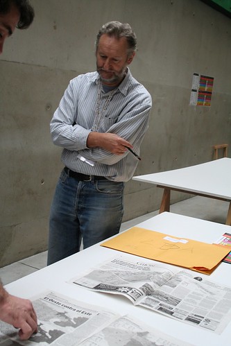
Left: uone of the graphics shown on the conference. Right: Michael Robinson judging at this Malofiej edition (image from Malofiej16 photo pool on Flickr
The talk was abouth how The Guardian deals with graphics. The conclussions were: the integration I told you before, the strong bet for clarity on graphics, few but clear data, great use of color and charts... and always looking for smart graphics.
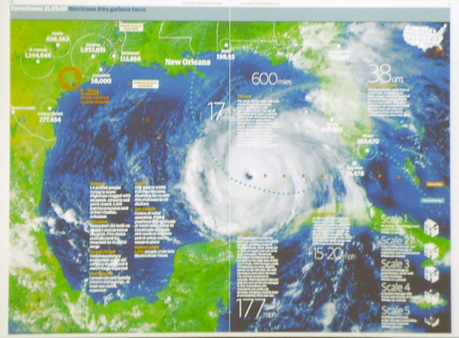
Sometimes, the centre doublespread photo leaves its place for a doublespread graphic
No comments:
Post a Comment