1. INFORMATION
In journalistic infographics, information goes first. The goal of the graphic is to give information. Design in this discipline is a tool, not a goal. Rigor and make information accessible and understandable are above stethics. Spectacle just for spectacle doesn't hel the reader.
2. ORGANIZING INFORMATION
Graphics are fast reading elements. The content must be organized to guide the reader and don't waste his time.
3. COLOR
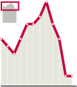
To guide the reader, color could be our best tool. And it doesn´t matter if we print on B/W. Clear tones for the less important, dark for those elements on which we want to focus teh attention. John Grimwade and his 'red line' became famous for his good use of color on inforaphics

(Click to enlarge on John Grimwade's portfolio)
4. CLEAN AND CLEAR
If we want color to focus the attention, the rest of the elements should be clean and clear. Not just on their tones. Avoid horror vacui. Baroque graphics usually doesn't work on newspapers.
5. SHOW DON’T TELL
Always think on this sentence. Newspapers are full of text. Use graphics to explain things on a visual way.
6. COMPARE AND MEASURE
In journalism, context is very important. Infographics help a lot on this field. Comparations, measurementa and actual scales make information easy to understand in many cases.
An example, about the steps of Buzz and Aldrin on the moon:

(Click to enlarge on StrangeMaps)
7. DON'T BREAK SCALES (IF IT'S NOT ABSOLUTELY NECCESARY)

Many tiemes, on economics issues above others, we use to break teh scale to show a trend. But we're changing the real trend doing this. If we have to do it, include a locator of the actual scale.
8. DOCUMENTATION
To develop good graphics, many times we need great amounts of data. A graphics needs mre information than a text. A text could say 'in Somalia'. When you do a graphic, you need to place the spot on a exact place.
9. WRITERS ARE ALLIES
On every job, team is basic. On this one, when we don't know what does the client (reaers) exactly wants and the perception of it is subjective.
10. KEEP LEARNING
Keep attention on new trends, and not just on infographics: design, rests of journalism, infovis... Never think that what you know is enough. That is a mistake on any professional field, but more on this one, where the product lasts one day maximum.
Of course, comments with additions, rectifications or any different ideas are absoluteley welcome. Thanks in advance.

2 comments:
AWESOME info...thanks for the tips for a graphic designer and fan of infographics. I'm just wondering why tips on creating infographics is WRITTEN. :)
1. Nice tips, thanks!
2. If you don't have time to actually proofread your texts, at least consider using a spell-checker :)
Post a Comment