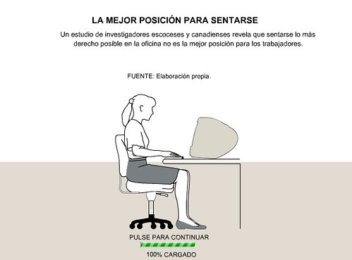
 Change from elpais.es to ELPAIS.com looked like wasn't reevant for online graphics, but there are little diferences, as, for example, the way they present the graphics colllection, the fact that they're along with photos or the fact that sometimes they're "publicited" on the main page. Isthe case of this graphic. It's took my attention for its simplicity, just the basic information, no complications. Maybe you could get more "movement" or interactivity on the image of the main page (was just a simple image with a link), for its light weight and simplicity, but I don't know if it's possible. Clear, simple, fast, useful.
29/11/2006
Clear and simple
 Change from elpais.es to ELPAIS.com looked like wasn't reevant for online graphics, but there are little diferences, as, for example, the way they present the graphics colllection, the fact that they're along with photos or the fact that sometimes they're "publicited" on the main page. Isthe case of this graphic. It's took my attention for its simplicity, just the basic information, no complications. Maybe you could get more "movement" or interactivity on the image of the main page (was just a simple image with a link), for its light weight and simplicity, but I don't know if it's possible. Clear, simple, fast, useful.
Tags:
Online graphics
Subscribe to:
Post Comments (Atom)

No comments:
Post a Comment