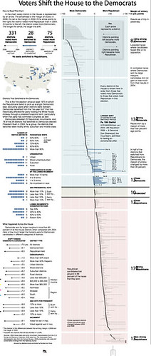
 One so-called article was published this november 17th by Jeremy Gilbert at the Poynter Institute web. He talks about the best way to visualize elections results. Archie Tse, Graphics editor of The New York Times, defenden the typical and clear half-pie, talking about the challenge of getting something better, but as clear as the half-pie. He talks about the difficulties to show how republican and democrats votes changes, until Matthew Ericsson found the solution. This was published. Tse commented that to explain all this data you'll ned 3000 words and few people would darre to read it. Now, and that is just my opinion, I don't think most of the people would read the whole graphic. But it's obviously clearer. I love above the section What happened across the House, about the voting change, although it's just a bar graphic.
Very clear, very clean, very... New York Times

No comments:
Post a Comment