 If you like to suffer and enjoy the envy, Alberto Cairo has uploaded the second task of the year of his pupils in Chapel Hill. This time, it's focused on Iwo Jima battle (the one of the flag!), in WWII.

30/11/2006
'Freaks' again
If you like to suffer and enjoy the envy, Alberto Cairo has uploaded the second task of the year of his pupils in Chapel Hill. This time, it's focused on Iwo Jima battle (the one of the flag!), in WWII.
29/11/2006
Clear and simple
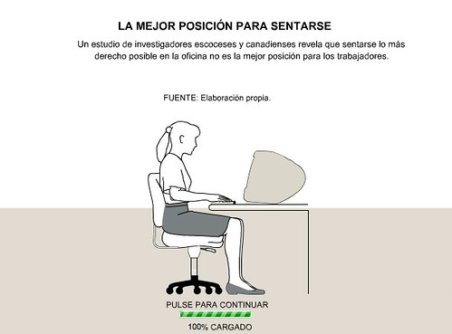 Change from elpais.es to ELPAIS.com looked like wasn't reevant for online graphics, but there are little diferences, as, for example, the way they present the graphics colllection, the fact that they're along with photos or the fact that sometimes they're "publicited" on the main page. Isthe case of this graphic. It's took my attention for its simplicity, just the basic information, no complications. Maybe you could get more "movement" or interactivity on the image of the main page (was just a simple image with a link), for its light weight and simplicity, but I don't know if it's possible. Clear, simple, fast, useful.
25/11/2006
Don't fear deep graphics
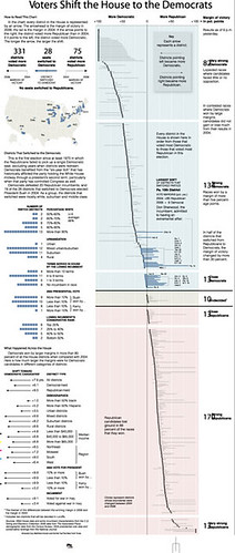 One so-called article was published this november 17th by Jeremy Gilbert at the Poynter Institute web. He talks about the best way to visualize elections results. Archie Tse, Graphics editor of The New York Times, defenden the typical and clear half-pie, talking about the challenge of getting something better, but as clear as the half-pie. He talks about the difficulties to show how republican and democrats votes changes, until Matthew Ericsson found the solution. This was published. Tse commented that to explain all this data you'll ned 3000 words and few people would darre to read it. Now, and that is just my opinion, I don't think most of the people would read the whole graphic. But it's obviously clearer. I love above the section What happened across the House, about the voting change, although it's just a bar graphic.
Very clear, very clean, very... New York Times
23/11/2006
Unseen infographics

I alaways say that in this little world of infographics we know who's everybody, baecause we're just a few and most of us are very enthusiatic with our job. If you don't know someone face to face from any summit, you know each other professionally, if he got any Award and his (or her) graphic was published on Malofiej or SND book or, usually, by graphics uploaded at some pages, as Newspagedesigner. But there are infographics artists who don't send graphics to awards who don't know or don't use Newspagedesigner or, for any other reason, their works don't reach us. And, many times, are good works. These days Rafal Piekarski, polish graphic artist of Dziennik Axel Springer, uploaded some works on NPD. Althogh I can't understand the text (I'd have to study polish as Machado learnt german to read Schopenhauer...), his graphics are visually very atractives and you can understand many of them without reading them. If he wouldn't uploaded his graphics there, I wouldn't know him. As I'd never seen Alberto Aragón's (Mandrake) graphics if I friend of mine wouldn't worked with him and told me about his web. As I was surprised by the graphics of a free rural newspaper for other friend's comments... And I'm sure this world is full of 'stars' working in his local newspaper without being 'discovered'. A big pity
22/11/2006
The man who criticized (in public) John Grimwade
 Preparing the previous postI found out a new web (new for me), one by Xaquín González (Xocas), Alberto Cairo's heir in elmundo.es and Xoán González's (infographics chief of La Voz de Galicia and my real teacher in this world) son. Last actualization was time ago, but it worths. And it's not just for the portfolio (it makes me envidious), or the articles, which worths themselves. My favourite section has beencritiques, strating with John Grimwade, one of his own "gurus". The critic (constructive) deserves a reading, for the structure and the concepts shown.
 If you want to see it, just click.
21/11/2006
Spain needs more online
 Some posts ago I told Spain was great about online graphics, but I was wrong. It's not Spain, just elmundo.es (with multimedia graphics, beyond interactive or animations) and the "reborn" ELPAIS.com. These two take all the glory of the Spanish online graphics, because beyond them there are very few spanish media offer this service. Marca.com was one of the pioneers, but now is very difficult to find graphics on its web. It's a pity, its goals reconstructions looked like the starting of something good, but they were the starting for nothing. Graphics from as.com are made by people from ELPAIS.com (being just two people, two of big ones, Rafa Höhr and Carlos Gámez, but just two). El Correo Digital offers some graphic, but most of the times it's just a pdf of one of the amazing graphics of its print team. There is an oasis in the desert, graphics of consumer.es, made up by Aitor Eguinoa and Christian Werb (also published in ELPAIS.com), including an atractive: you could download them for educational use.
 Lavozdegalicia.es just offers statical images, Matías Cortina left Terra and it stands without infographics artists, not ABC neither big papers from Catalunya got invlved in online graphics and we can't beg for more to local newspapers, without resources for the daily pint edition...
Things so, beyond greats graphics (Health section above all) made up by Xocas (Xaquín González) and his guys at elmundo.es and the amazing works of PRISA guys, Spain doesn´t "move" at all. They're good, but they're few.
And, with the video irruption, big bosses already have "something moving" on thier webs and the bet for graphics would be decrasing. Unless they'd notice that on the web, as on the print edition, people need graphics to understand some kind of things
16/11/2006
History Shots: explaining history with diagrams

Journalism, as universities say, have three objectives: inform, educate and entertain. Infographics, as a journalistic genre (or lenguage) , has these same objectives. History Shots is a web focused on educate, about history about all, as its name shows. On it, we can find all kind of diagrams about politics, sports, military topics, society... It worths to have a look. Graphics are made poster size and is possible to buy them on the web
15/11/2006
What is an infographics artist?
 Aula, the education section of El Mundo, showedthis way what is an infographics artist (Graphic in spanish, by 5W Infographics). Do you feel represented?. There's a thing I like, and is that it try to explain how should be this job. I have it on my wall...
13/11/2006
Karl Gude, on Youtube
Surfing on Youtube I found out this interview with Karl Gude, former graphics director at Newsweekand and amazing guy. He talks on it about how he worked on Newsweek, infograhics in generañ and his new job as teacher of Journalism at Michigan State.
09/11/2006
Total design
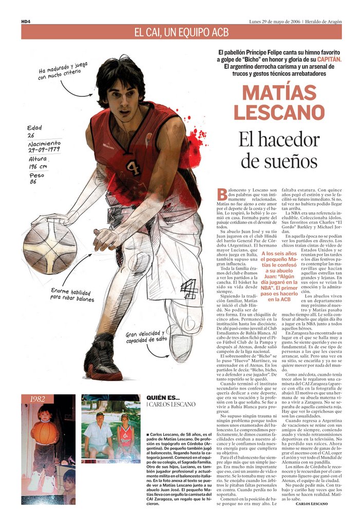
The designers from Heraldo de Aragón have a blog, Caja de Imagen (Image box). On it, they show us the magazine they made about the promotion (which finally didn't happen) to the upper league of the hometown basket team, CAI Zaragoza. An image worths more than 1000 words and you can take a look above to one of the pages. The work of the infograhics artist Alberto Aragón merge illustration, infographics and fotography getting a result not full of information, but spectacular and stethically superb, in my opinion. Congrats!
07/11/2006
Brain Drain
News about Zarracina's coming back to USA are not a big surprise. More and more spanish infographics artists are going the other side of the Atlantic. Javier itself was previously in San José Mercury News, and now he arrives to Boston. But he's not the one and only. I remeber when, time ago, Alberto Cuadra came to Malofiej and lots of people (including me) who didn't knew him before were surprised by the fact that he was working in USA as infrograpics artist being Spanish. But now, each year, we have some dropping of somo of us going west. Javier and Alberto are there with Juan Velasco, Alberto Cairo and others. And there are still some to cross the ocean.I wrote days ago about Chapell Hilll as "infographics development league", with a spanish teaching the future generations of USA, but, it's looks life if the best development leagur for America was Spain
06/11/2006
Celestia, much more than "Google Space"

Celestia is an incredible web. Above all, I recommend the program with the same name offered for downloading. It's a kind of "3d Google Space" in which you can take a look in real time, follow orbits, travel, look for objects... incredible. But Celestia offers much more. In the principal web you can get 3d hi-res images of all kind of objects related to astronomy,a nd you can also upload yours. Worths to take a look!
02/11/2006
How to use a wire graphic

When a wire graphics arrives (Reuters, AP, Graphic News...) you always have the temptation of fixing styles and publish it, but this example from Fernando Róbato (As), show how we should use wire graphics (obviously, when we have the time). Some days ago, Christian Iton, from Reuters Asia upload in Newspagedesigner this graphic. Some days later, As published the graphic shown above. Is a very simmilar information, and I suppose that Fernando based on it, but, the result is amazing. He uses the information, but not the illustration and get an unique graphic. Usually, we don't have the time to do it, but is an example we should take
Subscribe to:
Posts (Atom)