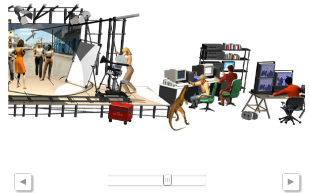
 Even the gratests make mistakes. I don't like too much to criticize people who knows so much more than me, but I think that online graphics team of ELPAIS.com went wrong with his graphic about Goya Wards (the spanish Oscars). The graphic is a 3d reconstruction of "awardable" categories of this edition. You can see the cinema team working and clicking on every character to get to the nominees. The result is spectacular, but not very clear. You've got to click every character, because some categries are not very clear. Maybe a simplier solution would have been clearer, or faster. It looks like someone forma above asking for "something original and not the usual tab". Something the usual is usual because it works
30/01/2007
When a graphic doesn't make it easier
 Even the gratests make mistakes. I don't like too much to criticize people who knows so much more than me, but I think that online graphics team of ELPAIS.com went wrong with his graphic about Goya Wards (the spanish Oscars). The graphic is a 3d reconstruction of "awardable" categories of this edition. You can see the cinema team working and clicking on every character to get to the nominees. The result is spectacular, but not very clear. You've got to click every character, because some categries are not very clear. Maybe a simplier solution would have been clearer, or faster. It looks like someone forma above asking for "something original and not the usual tab". Something the usual is usual because it works
Tags:
Online graphics
Subscribe to:
Post Comments (Atom)

No comments:
Post a Comment