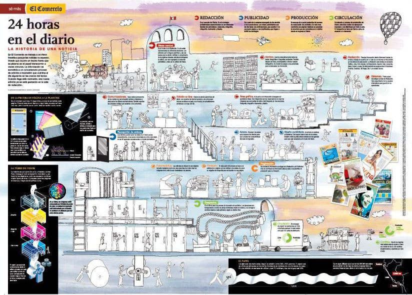
1. Don't matter if this is topic you control, all that you know about working in a newspaper. Thsi time you're going to lie and you know you're doing it. You should change the headlines "How a newspaper works" and write "How a newspaper should work but we haven't managed yet"
2. Nobody in the newsroom agree with the definition of his job. And they can't explain it in less than half page. And you just have two lines for each.
3. Every single department (and even person) wants to appear in teh graphics. It doesn't matter if marketing does not work in the newsroom. It doesn't matter if security guards have nothing to do with the journalistic process.
4. This is gonna be the graphic most people in the newsroom want to check before its publication. Everybody will change things. These kind of thing that happen also with circulation data graphics.

GRAPHIC: El Comercio (Perú)

No comments:
Post a Comment