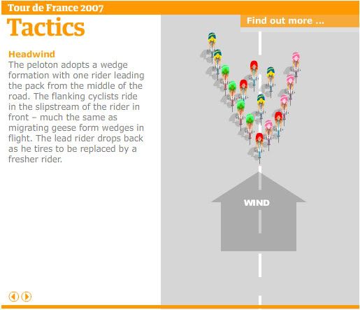
Preparing this year Tour graphic, one of these not very original graphics of every year (we can and we must be original, but I must confess I wasn't either this time...) I had a look on The Guardian to this very simple but great graphic. There should be thousand like this one, but, as I haven't seen them, I comment this one. The main part of the graphic is the tactics. I must say I am not used to watch to cycling, but I put the blame on that I don't understand the sport. I don't know why the riders do the movements they do, or how the colleagues of one rider allow him to escape easily. But this graphic explains all that in a very easy way. Very simple. Very effective. You could have this graphic done in the firsts days of Flash. Other example on how abilities for drawing are not a very important thing. Is the way you explain information.
A journalist (writer) must tell stories, and how he writes is not the important thing (although is a good plus, of course)!. A infographics artists must explain, drawing better or worse is not the main thing.
These are obvious things, but we forget them many times.
Congratulion to the graphics team of Guardian Unlimited.

No comments:
Post a Comment