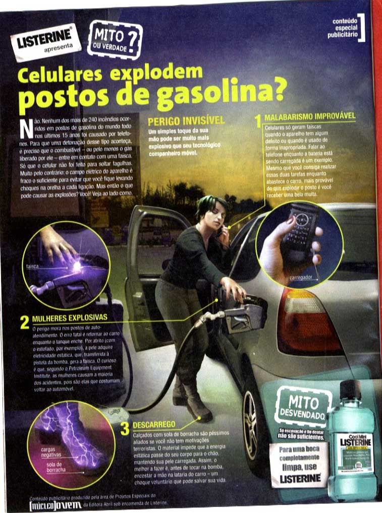
1. One practice is becoming a sponsor of the graphic. Two ads on the corners are enough to do it.

Listerine sponsors the Super Interessante mythbusters. Typical TV or radio sponsorship on magazines
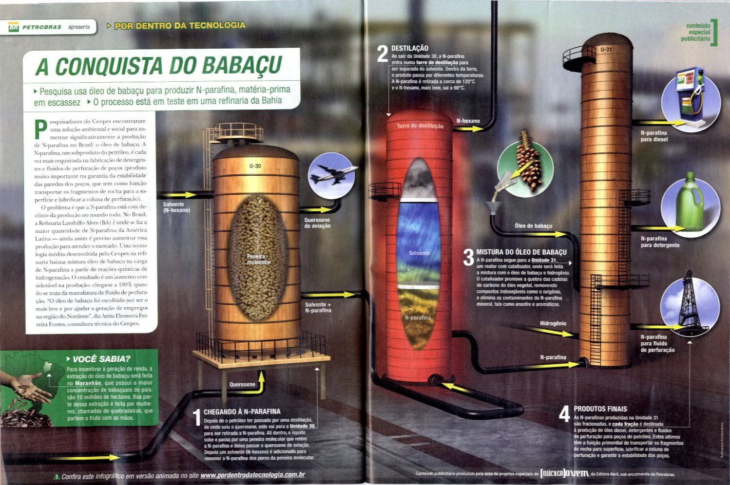
2. The ads goes beyond the usual sponsorship. One of the big announcers of the country, Petrobras, uses a little strip at the beggining, but also place its trademark on a gas pump used as an element of the graphic.

Product Placement and use of the colors of the announcer for the design
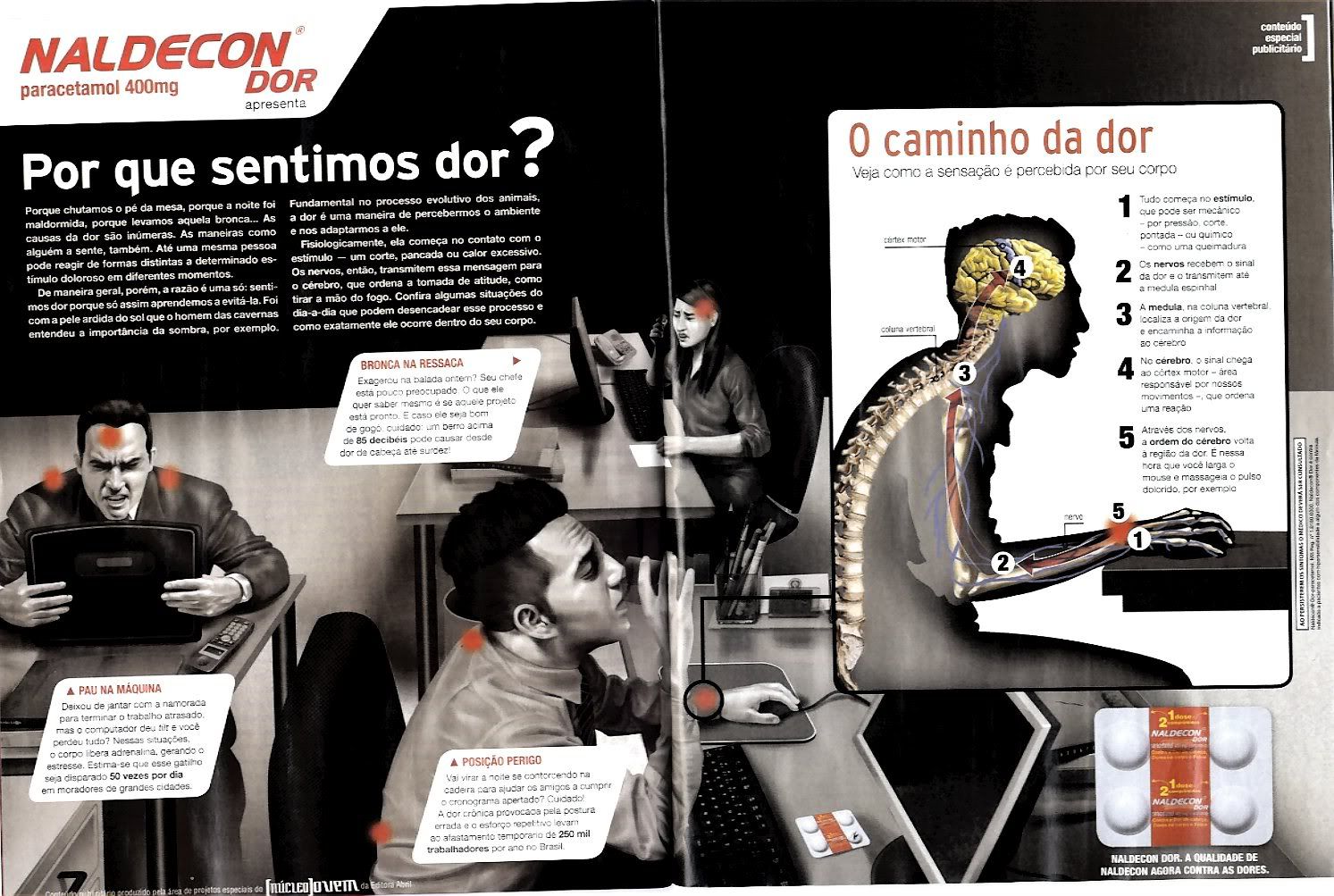
3. And third step: three ways to place ads. A big stripe at the beggining, an ad at the end, and product placement, placing the analgesics announced on the table of the infographic.

Great topic for an analgesic trademark: pain caused by job. And using a practically B/W graphic to call the attention on the ads.
Some would see this as a complete disaster. Others, a good way to earn money with graphics. Aberration or solution, what I think is that we will keep seeing this kind of things. More, and more.
UPDATE
On a comment of this entry on the spanish version of this blog (infografistas.com), Alessandra Kalko, Art Editor of Super Interessante talks about this topic:
What appears on these pages aren't really sponsored graphics, but ads that try to get closer to the lenguage of the magazine readers. Is a practique that have generated great discussion on the journalistic media.This pages are called 'Publieditorials'. A work is done to get a 'godfather' and trying to be clear for the reader what is an ad.
I call them sponsored because of sentences as 'This myth revealed by Listerine'. And I think that's a great idea for announcers. I don't know if it's so for magazines, but the truth is that is really clear that it's advertising: look at the upper right corner of each graphic.

No comments:
Post a Comment