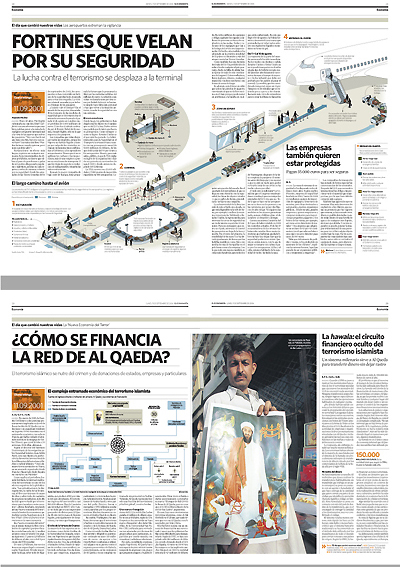
 As El Economista keep winning design awards, on of its "fathers" Miguel Buckenmeyer pubish at Visualmente a great article about the process to create this design.
 Here, as we must, looked forward the infographics stuff, and there was a piece of the text about it... (sorry about the translation... I'm improving my english, but I still need more practice!)
"Infographics. The lack of adecuate graphic stuff (photos) made me to lend a lot of attention to infographics and support information. In both I got distanced from the initial proposals. I chose a range of lines for all the newspaper and I applied them for the support information. I mixed supports with nutrum backgrounds, depending on the contents with others with white backgrounds. This was against a old news design rule, which was against grey backgounds to emphasize contents. But this rule was applied when newspapers were B&W and print quality was poor.
The final result shows that we reached the goals we imposed ourselves at the beggining.
"This newspaper is very visual, with great print quality, is well done and very clean. Graphics and illustrations, on A1 as on inside pages, have a special strength. The typograhy is modern, but with a classsical touch. Color help remarking the important things, with very little distractions. There is a big amount of visual variations on its pages and an eneormous attention to the detail, which gives na interesting fussion of freshness and seriousness.", as SND judging members recogniced."
Truth is that, personally, El Economista attracts me a lot. It's the only economic newspapers that I read for more than 10 minutees (I don't put the blame on economic newspapers, it's my fault, I don't understand any about economics...). A strike of luck put El Economista in my hands and was a great discover for me: graphic and illos were perfectly united with design, the great amount of bars and pies these newspapers needs didn't made it boring... I thought I would like to work for an economic newspapers, something I've always refused to...
If you have the opportunity, take a look
LINKS
- Miguel Buckenmeyer's article on Visualmente (spanish)
- Introducing El Economista on Maquetadores (spanish)
- Explanation about El Economista design on Innovations in Newspapers (english)

No comments:
Post a Comment