

The complaint comes from the fact that, not having a scale form zero, the valeu looks like been multiplied several times, when it's "just" really the double.
The problems of the scales from zero has been always on the infographics. If you use it, most of the times you can't see the evolution, and if you start from above, the scale is not real. Hard solution. But The Washington Post, and I suppose that several like them, use an "intermediate" solution for this problem.
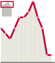
They include a sort of "locator" of teh evolution, bars or whatever, drawing the graphic with scale from zero, and having the big graphic for the intersting part. Something like this lttle example on the right.
So, you can see how it increases or decreases and, at the same time, you don't loose the scale. Anyway, this particular case of NY Times has less excuses because, as the value is the double, the difference is visible. Not so espectacular, but visible. And telling the truth. But, let he without sin throw the first stone.
Via XBlog
No comments:
Post a Comment