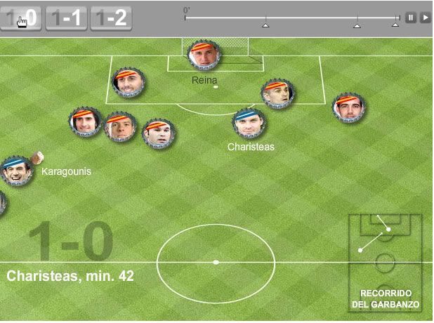
Many were who talked against those graphics. Some of the used good reasons, as using the video should be a much better solution, but here we face broadcasting rights. Myself said that I didn't like them, but more for a personal like matter than thinking that they were 'bad' graphics.
But, tday, I want to support this kind of graphics. It's not a matter about if that' the best way to explain an information. They are one of those hybrid genres which Javier Errea talks. Or con los gráficos those graphics for 'Bart and Lisa' of Matt Ericsson.
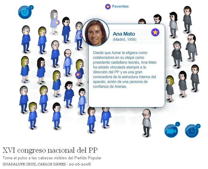
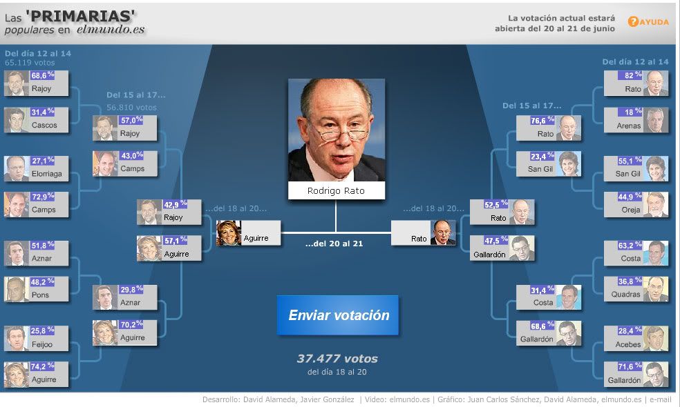
The target of the online media is more heterogeneous than the print media. They are not the same readers. On print, we find a more reflexive and paused reader. People at a computer read less, faster, and sometimes has to cheg their screens because their bosses are coming. But they also wants explanations.They want to understand hard informations, as the one about the Summit of the spanish Popular Party which took place this weekend. ELPAIS.com and elmundo.es have on their webs graphics about this topic (click on images to access)

This first example is from ELPAIS.com. They big names of the Popular Party (PP) are shown as Miis (avatars used by the videogames of the Wii) divided on two groups and clickable to have more information.

This one, of elmundo.es, is more a popular poll to choose the next leader of the party (on the summit there was no poll because there was just one candidate, but the editorial position of El Mundo is against him).
The PP Summit is hard and politic. This is a way to make the topic nearer to the reader. To make them play with the data not losing rigour and information. That's the goal. Is that the best way to explain the information? At least is a good way to 'attrtact' the reader to an information than, otherway, could be 'abandoned'. Would the reader have easier access to all this information with other genre?
Other discussion is if these are 'infographics'. As a said before, I think they are an hybrid of infographics illustration, participation... Hard to define.
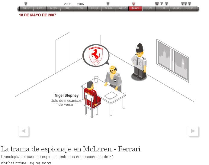
The graphic by ELPAIS.com about the problems with the spying to Ferrari by McLaren in the F1 Championship. A very critiquised online-comic-graphic, but with a great audience success


No comments:
Post a Comment