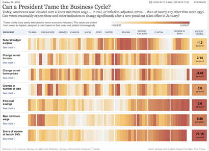
YEs, I know I'm being a little monothematic lately (and not very fast). Please forgive me. But the american elections graphics have a name (although this one is more about the crisis): nytimes.com. And this example is not just a big database (Which it is also). Is a great example on how communicate visually on a very easy and clear way. Just click on the image to play a little with it.
Thanks to Guillermo Nagore for the advice

No comments:
Post a Comment