13/06/2010

World Cup predicitions: football(soccer) doesn't work that way

World Cup is just beginning and those like me that have published an infogrpahic with predictions for the championship are showing how far soccer is from maths. These are just some examples I've found (If you know another one, just tell me)

lainformacion.com

Click on image for interactive graphic

For this prediction I used some different data: points on the FIFA ranking, percentage of victories in the qualifying, experience in World Cups, individual trophies of their players... With all these numbers, I gave a numerical coefficient to each team. Then, I udes it to simulate the matches, mixing that coefficient with the results of previous matches between the teams and results of the latests matches of each national team. The first results showed how far were those results from the reality.
Prediction for the final: Spain will defeat Brazil in a very hard match

The Wall Street Journal


This graphic by Alberto Cervantes shows another simulation using the quality of the players, previous performances in World Cups, location (no European country has ever won the World Cup outside Europe)... They explain the method in this video


Prediction for the final: Brazil will defeat Spain

Wired


This maybe the most famous infographic about predictions for this World Cup. They have used such original data as GDP per capita or population added to experience or goal averages. They recognize GDP per capita is the most important value. Anyway, their predictions are running as badly as mines, if not worse...
Prediction for the final: Brazil will defeat Serbia

All of us think Brazil will make their way to final, two of us think the other team in Soccer City will be Spain. And just me believe Spain will win its first World Cup. I hope I'll be right...

Share

Live matches of the World Cup at NYT or why they're the bests

Take a look to how NYT is covering live the matches of the World Cup. As an example, the Argentina-Nigeria played yesterday...


They don't have anything that others don't have.
Touches per player, you cand find it on some sports media.
Passes by players. I do it myself at lainformacion.com.
Minute-by-minute comments. I've seen it everywhere.
Shots located. Nothing new.
Heatmaps. Not so usual, but not new.

But they have all of them.
Visually.
Live.
Updated minute by minute.
Very easy to understand, easy to play with.
That's why they are the best.
And all that in a country where soccer/football is not so important...


Share

12/06/2010

The World Cup into pieces

I don´t know if you remeber the megagraphic of Luis Chumpitaz's team in Dubai for Olympics built using several individual infographics.
They were not the first ones doing something like that, not the last ones, but was a really good effort to show something spectacular and different.
And now, with the World Cup, we have some variations on the same idea.

One side, La Prensa Gráfica, from El Salvador. Óscar Corvera explains the idea:


"Twleve consecutive sundays, La Prensa Gráfica published a special infographic on the World Cup of South Africa 2010. During three months, and with different topics (evolution of the ball, stadiums, trophy, goals, georgraphy and climate of South Africa...), readers could know more about how important this XIX World Cup is."


And this was the result:


On the other side, and maybe you've seen already this if you're fan of thr Facebook page of Infographics News, Estefan Cuanalo alse sent an example by the sports mexican newspaper Record.


Twelve people collaborated to creathe these infographics: Carlos I. López, Crhistian Ávalos, Estefan Cuanalo, Engelbert Chavarría, Iolani Ferraez, Jesús Sánchez y Octavio Jiménez with the infographics; and texts by Carlos Gorozpe, Estela Garrido, Luis Salazar, Mónica Ocampo y Jorge Carricart.


Share

10/06/2010

The story of the one-column infographic category at Malofiej

Maybe you've wondered why the Malofiej Awards has, usually, a category for one-column infographics. Well, you can put the blame in this tiny infographic by Reuters from 1993.


Its author, Ciaran Hughes, working today at Daily Telegraph, was the one who told me this story. He worked then at Reuters, when Corrie Parsonson was the infographics editor. They sent this infographic to the Malofiej Awards, just one column wide. We were in a time when there were big double spreads about Olympics, when two little details were enough to build a big infographic about the first Gulf War. So, many judges liked the infographic, but they thought it was too little to deserv an award. By then, Peter Sullivan was the president of the Jury. He, on the contrary, thought that its small space was, not a handicap, but something that made the graphic better. It explained what it wanted to explain, was understandable, and didn't need half page.

Finally, the infographic got a bronze medal as best scientific infographic. The next year, Peter Sullivan proposed to create the one-column infographic category, to recognize those graphics that could explain many things in a very reduced space.

Share

08/06/2010

Infographics News on Facebook

Finally...
If you want to follow the updates of this blog (and its spanish version Infografistas) and get some extra links and content, just have to enter in Facebook and click on the 'Like' button, in the new Facebook page of Infographics News.
See you (also) there!

Share

05/06/2010

Visual Communication advices x4


The swedish design magazine CAP&Design asked to four visual communicators (me among them, something I really have to thank to Jonas Mattson, the writer of the article) for some advices on infographics.
The article is in swedish, so here you're a translated briefing (with Google Translate, don't think I'm so smart) with the advices on infographics:

Christoph Niemann
Has his own bussiness, with clients such as New York Times, New Yorker, Wired, Business Week, Newsweek, Google, Nike, Amtrak, Moma...

- Make it legible
- Check that a simple text won't explain it better than your infographic
- You could think turquoise is a very ugly color, but you can use it if you have a really good excuse (as to make graphics for Miami Dolphins).
- Avoid light stockphoto picturea for the background.

Chiqui Esteban
That's me! New Narratives director at lainformacion.com, infographics consultatn for Innovation and editor of this blog

- Do not limit yourself
- Think first what you want to tell, not how you want to tell it.
- Don't think in terms of beautiful and ugly, think on meaningful and meaningless.
- Talk with writers and specialists, don't try to do everything by yourself
- Use color as a guide for readers

Stefanie Posavec
Cover designer for Penguin, but she also produces computer based infographics.

- Visualizations must have an input, which provides information that helps the reader to analyze the data, if they wish
- Visualize information that has never been visualized in the past instead of using concepts that most people understand
- As photographers use his medium to capture the beauty of everyday life, you can analyze data as a way to discover the beautiful design details that are hidden around us
- Get your inspiration in the topic you want to visualize
- Remember that visualizations not only represent the data, they can also act as a visual metaphor that can be used to stimulate feelings in the viewer

Derek Kim
Wieden + Kennedy and freelance, with clients as Esquire, Nike, Target, Artist As Citizen, Coca Cola, Youworkforthem, Die figure...

- Keep it simple. Simplify your information so your readers can better understand the data
- Present information visually and not by words. Otherwise, the reader loses focus
- Do not compromise function for form's sake
- Take advantage of color. Colors are visual markers that can help the reader to focus on a particular area in your infographics
- Keep the information focused


Share

Share

04/06/2010

Behind the scenes: All the passes of the Spain-South Korea match


All the passes of the Spain-South Korea. Click on image to access the interactive graphic.

The image above shows one of my lasts infographics at lainformacion.com (as a friend uses to say, the-web-that-pays-my-food). That graphic has its own little story behind, so...

The first idea about this graphic was something alike publishe at the austrian newspaper Der Standard during the Germany 2006 World Cup. Sorry, I don't have any images although I have shaken Google for long time. If somebody has, I would appreciatte it if you to send it to me.

Years after that, during Euro 2008, I was working for Público (where Álvaro Valiño, Samuel Granados, Miriam Baña, Mónica Serrano and Artur Galocha are having huge success). And many of you know how we love data visualization there. We got Geca (today OptaSpain), a service which gave us lots of statistical data, including all the passes of the match. I made this graphic for Euro 2008:

For some reasons I won't explain here, the infographic was not published. We had a 'lite version' of it, but not what we liked at the infographics department. And also, I kept thinking on how cool would it be as an online graphic But that was just impossible for us then.

Two years after, I'm at lainformacion.com and the World Cup is coming. ESpain is playing some friendly games before it. And the I remembered this graphic that kept floating on my mind. So, facing the World Cup, I decided to do something like that for the friendly games, just to check if it would be possible to do something for the World Cup games.

First problem: we don't have statistical services here. No problem. I just had to do what they do by myself: watch the match and draw all the passes. One by one. The facts:


At the beginning I though that, as in Publico, I could draw who gave the pass and who received it. Bad idea. It was just a mess. To much for one person, a TV and a ballpen. So I decided just to draw the connections between players. A line he first time two playyers are connectted and a little mark over the line all the next ones. A new page every 15 minutes. And also a new one for each replacement. Now, the graphics are published 1 h and 45 minutes after the match. I hope to do it in onehour.

Now, friendlies have 6 substitutions per game, so I'm using two fields: the initial and the final formation. For the official games (just three substitution), I'll try to make it understandable with just one field.


Share

02/06/2010

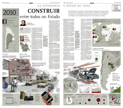
Three infographics and 200 years of argentinian history


This post is written by Juan Colombato, infographics editor at the argentinian newspaper La Voz del Interior.

Telling the story of a life, the changes, and the evolution of a country since the May 25th 1810 revolution in three dates: 1810, 1910 and 2010.


Graphics were planified in these three eras to show the comparison of the different parameters of the everyday life and statistical data: homes, fashions, transport, work and industry; all mixed with maps, composition of the national boundaries and the city of Córdoba, the external trade with imports and exports, the internal trade with routes and regional production; and the social and ethnical composition of the population with the main points of entrance of the country.


It was very hard to find the same parameters for such different times, and also classifying data with different markets, kinds of production and currencies. And taking all this data and dealing with the information.


Another intersting thing is that, oppositte as the usual way of woking in this newspaper, one of the supplements of the Bicentennary was plannified from the infographics point of view. ISx out of eight pages will have graphics (all except for front and last page). But, once we thinked about the historical and political meaning of the facts, we decided to incorporate a text to each date. These articles were written by three important wirters at local and national level.


Share