
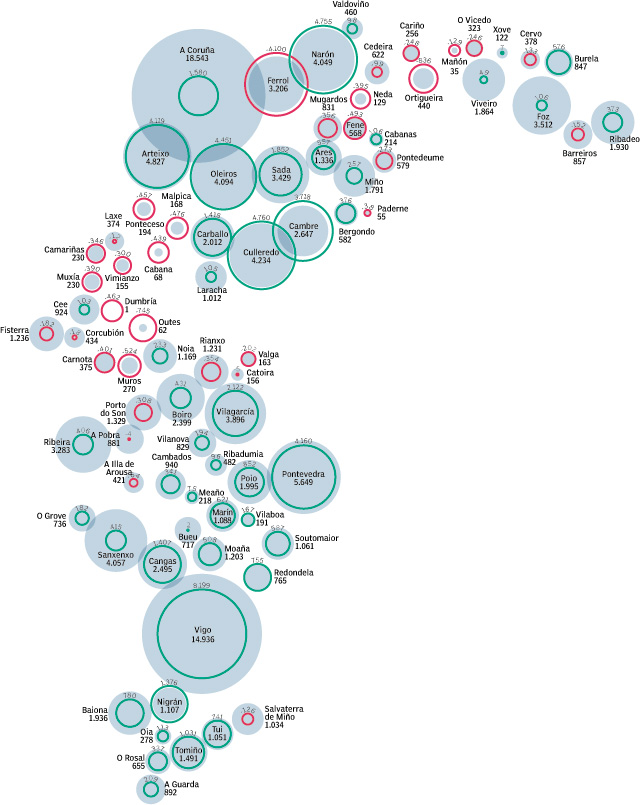
This graphic of La Voz de Galicia, made by Manuela Mariño, was awarded on the last Malofiej. It's about the urbanization of the coast. Although I don't show here the key, I can tell you that blue circles means the new houses built the past year on each village or city, and the circunferences are the change of the population last year (green if it grows, red if it decreases). One of those graphics, a little Juan Velasco look-alike, usuallly succesful at Malofiej (absolutelly deserved, from my point of view). At first sight, you can see how some villages have their population decreasing and the number of houses houses growing. If you don't know Galicia I shoul tell you that the shape of the graphic is showing the galician coast. Inner villages have a more balanced system, meanwhile coast villages are the opposite.
A good example about how to explainhard data in a visual way, showing the problem clearly. No spectacular 3d, but a lot of information.
But, the big problem with this graphic was other. It was just published in ono of the seven editions of La Voz de Galicia, the first printed. The rest of editions have the same information, but with a photo instead the graphic. I don't know the reasons. Do editors thought that the graphic was too confusing or too plain? Maybe, but I don't know. Was it a clear, useful and good graphic, giving extra value to the information? Of course.
No comments:
Post a Comment