31/03/2007

NYTimes gets Peter Sulllivan in a hard Malofiej edition

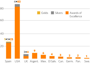
Malofiejs are awarded. Few medals this year, maybe that means that awards this year are especially significant. The big one, the Peter Sullivan, went to The New York Times for an interactive feature called Sector Snapshot. The Miguel Urabayen Award for the best map went to Die Welt am Somtag for a graphic about german migrations on II World War
These were the gold medals:

PRINT
- Expresso (Portugal) Wars since 1945
- The New York Times (USA) Katrina's Diaspora
- San José Mercury News (USA) How Stock Options works
- The Oregonian (USA) River of goods swells via port
- Dagens Nyheter (Sweden) Keepers up against the wall
- The Guardian (UK) Space Station
- Welt am Somtag (Germany) Meduses of teh World Seas
- National Geographic (USA) Ways to go
- Mundo Estranho (Brazil) Sexo tô por dentro
- Clarín (Argentina) Portfolio World Cup

ONLINE
- NYTimes.com (USA) Elections Results and Analysis 1 and 2
- NYTimes.com (USA) Sector Snapshot

LINKS
- All the awards
- Onaline awards with links
- SND Spanish Chapter
- Update blog, blogging online from Malofiej

Some of the awarded graphics (I'll be updating...)
:

30/03/2007

First lesson: graphics for Bart and Lisa

Although this year I didn't manage to go to Malofiej, thanks toSND new blog I keep the contatc about what's going on. From yesterday lessons, I choose one:
"You've got to make graphics for both Bart and Lisa Simpson". It's The New York TImes Matt Ericson's sentence, refering to online graphics, but also useful for print graphics. He explains himself on this video by Jonathon Berlin uploaded at Update

28/03/2007

Color Palette Generator

¿Do you want to use the color pallete used on The New York TImes? ¿Want to know the CMYK of the water on this graphic you liked so much? Want to copy the gold used on Chris Morris' illustrations?
So, it looks like somebody got you on his thoughts and created this web where you can look at the web color range of an image uploaded in the web.
To access to ot, click here


Via Design Notes

27/03/2007

Malofiej online

SND is introducing its new blog Update, on which Matt Mansfield and Jonathon Berlin (both from San Jose Mercury News) are posting about the Malofiej Awards, taking place this week in Pamplona (Spain). As they comment on the blog, this will be a special edition, bacuase John rimwade won't be there. He is preparing the new Portfolio magazine. Is the first Malofiej edition I remember without John, although my remembrances are just from 2000.
Good luck to everybody!
To access the blog, you can click on the image or here

26/03/2007

This graphic really helped people


I commented in the previous post that BBC News graphics weren't beautiful, but useful. Other example of that is this infographic, made up by Patricio Rivas, from Diario El Sur (Chile). It's a very simple graphic, no spectacular views. The important thing is the information it contains. Patricio exlains it himself:

"This is a graphic about Biovías Prooject II, which try to comunicate the towns of Gran Concepción. On them appears the towns of Lota and Tomé, the ones with the bigger unemployment rate all around the country, and that's why people from there need to get integrated to the regional capital.
After the publication of this graphic, little towns started to be added, after they demanded teh opportunity of being integrated in this project.
A interesting topic, cause the Biovias project is on bankrupt. They thought they were going to movilize big amounts of people, but they couldn't fo some problems: towns with big unemployment rates, trains on bankrupt and a project of million dollars. This the reality of one of the most industrialized zones in Chile, is also the first on unemployment.
Chile has two faces: a Chile walking to the future with big highways and underground trains, almost all in Santiago, making bussiness deals of free trade with the big countries and the forgotten Chile, with a train on bankrupt. There are two Chiles: santiago, and the rest."

Patricio is not an infographics artist, he didn´t study Design, he's staff writer of CUlture and Arts department. He didn't need to be an infographics artist. The graphic was just data easier to explain graphically than written. That's graphic journalism.

22/03/2007

Help for understandig war


We like to insist on the idea that it's not necessary for a good graphic to be beautiful. It must be clear and informative, it has to make easy to understand a complicated information. An example of what I'm saying are BBC online graphics. Thay are not much pretty, they are not full up of 3d and animation, but thay make affordable big amounts of interesting data.
This kind of wrk is shown on this graphic about violence in Baghdad since war started. Really interactive, undertandable and with loads of information. A must click

Vía Innovations in Newspapers

LINKS
- Baghdad graphic at BBC
- Article on Innovations in Newspapers

20/03/2007

Google acquires Gaminder's Trendalyzer


I've talked before about Gapminder, a web which explains social and econocmics differences around the world. This web used to use a statistical tool called Trendalyzer, which shows data recurring to several variables, as you can see on the image. Now Google have acquired this tool. Lokks like smart graphics finally could make money...
Via Infosthetics

LINKS
- Gapminder
- Post about Gapminder on this blog

18/03/2007

Graphics made by readers

I can't remember where I read that citizen journalism makes him as comfortable as a doctor hearing that someone decided to proceed to self-surgery. I'm not so radical, although I have my doubts on this system, I have to recognize that many times, are usual citizens who reaches what journalists don't. At lavozdegalicia.es (a spanish journal web) have taken advantage of it. In this graphic they denounce illegal garbage dumps on its region. You can see on it images, a list, their situation on the territory... And all made using citizen's denounces. New garbage dumps are added anytime a reader send an image or a commentary about it. Is there a better interactivity than one in which the readers make the graphic themselves?
I know it's not the first one, not the only one. But it's an example

ENLACES
- Garbage dumps graphic
- lavozdegalicia.es

15/03/2007

Indonesian news infographics

you can find almost verything on YouTube. Th last thing that called my attention (talking about infographics, obviously) was this animation on indonesian channel RTCI, explaining the drowning of a ship. It's very curious, because you can appreciae the differences between styles through rhe cultures. I can't imagine occidental media choosing that texture for ship.

12/03/2007

Different ways to understand infographics

Explain what infographics are to people without realtionships wiyh journalism is a hard task. My grandmather, in fact, still think I'm the cartoonist. A high percentage of Journalisms Faculties students themselves don't know what infographics are. Ourselves, graphics artists, don't agree on the definition of our job.
But some peole try to explain it. This first example is form Nigel Homes' book On information Design adn now rescued by Nicolás Ramallo at his blog Haga clic para continuar. It expalisn way you need to be a graphic communicator, which it's not the same as explaining the job, but clarifies it a lot.


The second example is... funnier. Chris Morris, Art Director from Las Vegas Sun, found this graphic and uploaded it at NAO. A dog, with a mouse in one hand and a pencil in the other, draws bananas and apple to illustrate an information about savings... Confusing and "bizarre"


And this third example appeared before on this blog. It was made by 5W infographics, Juan Velascos's project, for Aula, a sopublication of El Mundo.


Anyway, being this one such particular profession, each newspaper has a very different way to manage with infographics.

10/03/2007

My fault: Brazil exists, and wins awards

I told some days ago that I was surprised about the lack of SND infographics awards to brazilian media. Their infographics artists are soeme of the best, and they didn´t got any awards. But I was wrong. As Marcelo Pliger, from graphics despartment at Folha de Sao Paulo, tells me, " brazilian journals don't use sending entries for graphics. Almost ever, they are sent on pages categories".
Folha de Sao Paulo received 9 Awards of excellence this year, six of them with infographics starring the page.
The truth is that now I understand his politic. Their graphics are prefectly emsembled on the page, they're a whole with the design. It's not a square box with a grahic inside, nor a "L" disposition. Is much more. Is a good example: we don't have an information with a graphic. We have a new, or a feature. graphic is a part of it.

Here you are the awards...


LINKS
- Marcelo Pliger's personal blog (graphics included)

08/03/2007

Infographics for the one of the best designed newspaper of the world

As El Economista keep winning design awards, on of its "fathers" Miguel Buckenmeyer pubish at Visualmente a great article about the process to create this design.
Here, as we must, looked forward the infographics stuff, and there was a piece of the text about it... (sorry about the translation... I'm improving my english, but I still need more practice!)
"Infographics. The lack of adecuate graphic stuff (photos) made me to lend a lot of attention to infographics and support information. In both I got distanced from the initial proposals. I chose a range of lines for all the newspaper and I applied them for the support information. I mixed supports with nutrum backgrounds, depending on the contents with others with white backgrounds. This was against a old news design rule, which was against grey backgounds to emphasize contents. But this rule was applied when newspapers were B&W and print quality was poor.
The final result shows that we reached the goals we imposed ourselves at the beggining.
"This newspaper is very visual, with great print quality, is well done and very clean. Graphics and illustrations, on A1 as on inside pages, have a special strength. The typograhy is modern, but with a classsical touch. Color help remarking the important things, with very little distractions. There is a big amount of visual variations on its pages and an eneormous attention to the detail, which gives na interesting fussion of freshness and seriousness.", as SND judging members recogniced."

Truth is that, personally, El Economista attracts me a lot. It's the only economic newspapers that I read for more than 10 minutees (I don't put the blame on economic newspapers, it's my fault, I don't understand any about economics...). A strike of luck put El Economista in my hands and was a great discover for me: graphic and illos were perfectly united with design, the great amount of bars and pies these newspapers needs didn't made it boring... I thought I would like to work for an economic newspapers, something I've always refused to...
If you have the opportunity, take a look

LINKS
- Miguel Buckenmeyer's article on Visualmente (spanish)
- Introducing El Economista on Maquetadores (spanish)
- Explanation about El Economista design on Innovations in Newspapers (english)

06/03/2007

Spain and USA, top at infographics

If we make a classification by countries with SND awards at infographics categories, we could see two countries above the rest, Spain and USA. They're the classics. Although this has been always a trio, including Argentina, but economic crisis affected to infographics too, with a huge infographics artists emigration.
Britain gives quality, but not much quantity, and this mmust talk good about how things are done there.
Latin America shines with the awards got by Prensa Gráfica (El Salvador) and Presente (Mexico).
And we miss Brazil, which only can say they got two indirects awards, those got by Dallas Morning News, where Sergio Peçanha commands the infographics department.

BY COUNTRIES
1. Spain. 1 gold, 1 silver and 25 AOE
2. USA. 4 silvers and 83 AOE
3. UK. 3 silvers and 4 AOE
4. Argentina. 9 AOE
6. Mexico. 6 AOE
7. El Salvador. 4 AOE
8.Canada. 3 AOE
9. Germany. 2 AOE
... Panamá. 2 AOE
11. Sweden. 1 AOE

BY CONTINENTS
1. Europe. 1 gold, 4 silvers, 32 AOE
2. North America. 4 silvers and 86 AOE
3. Center America*. 12 AOE
4. South America. 6 AOE

* Mexico included in Center America

04/03/2007

Haga clic para continuar

That's the name of a new blog about infographics (sorry, it's in Spanish), which means "Click to continue". Th eblogger is Nicolas Ramallo, online infographics artist of El Universal, Venezuela.Precissely online graphics are the subject of this blog, although it talks about other infomation design subjects also. It's still new, but it's a good beggining.
YOu can check it here

SND Awards, Infographics categories

Sorry, I'm late, but I'm having a little holidays... But here you are a resume about infographics awards of the SND. The big guys this year have been El Mundo, NY Times, El Correo and The Guardian

Single entries
1. El Mundo. 1 gold and 4 AOE
2. The New York Times. 3 silvers and 18 AOE
3. The Guardian. 2 silvers and 2 AOE
4. Washington Post. 1 silver and 4 AOE
5. Svenska Dagbladet. 1 silver
6. El Correo. 9 AOE
7. Clarín. 6 AOE
8. South Florida Sun Sentinel. 5 AOE
9. Times Picayune. 4 AOE
... Presente. 4 AOE
... Press Democrat. 4 AOE
12. Prensa Gráfica. 3 AOE
... The Oregonian. 3 AOE
... Diario de Sevilla. 3 AOE
... LA Times. 3 AOE
... Globe & Mail. 3 AOE
16. Frankfurter Allgemeine. 2 AOE
... The Dallas Morning News. 2 AOE
... Houston Chronicle. 2 AOE
... El Economista. 2 AOE
... The Observer. 2 AOE
And with 1 Award of Excellence was Washington Post, Atlanta Journal & Constitutional, Bangor Daily News, The Boston Globe, The Charlotte Observer, COlumbus Dispatch, Diario Médico, Fort Worth Star Telegram, San Diego Union Tribune, Staten Island Advance, The Orange County Register and Tribune.

Portfolios
1. El Correo. 1 silver and 2 AOE
2. The Guardian. 1 silver
3. The New York Times. 10 AOE
4. LA Times. 5 AOE
5. The Oregonian. 4AOE
6. Clarín. 3 AOE
... El Mundo. 3 AOE
8. San José Mercury News. 2 AOE
... Panamá América. 2 AOE
And with 1 Award of Excellence, El Comercio (Asturias), The Boston Globe, Denver Post, Fort Myers New Press, Houston Chronicle, Indianapolis Star, Presente, South Florida South Sentinel and Tabasco Hoy

The infographics artists awarded at the individual portfolio category (included above)were Susana García from El Comercio, Fernando G Baptista from El Correo, Raoul Rañoa from LA Times, Mariano Zafra and Rafa Estrada from El Mundo, Hannah Fairfield, Joe Ward, Graham Roberts, Archie Tse and Frank O'Connell from The New York Times, Steve Cowden from The Oregonian, Belinda Long from South Florida South Sentinel and Gonzálo Hernández from Tabasco Hoy

if you prefer to do any research, you can do it at SND